.png)
Avatar
Representing a person, business, or concept, the Avatar component is a foundational element used throughout the platform as a quick and visual identifier.
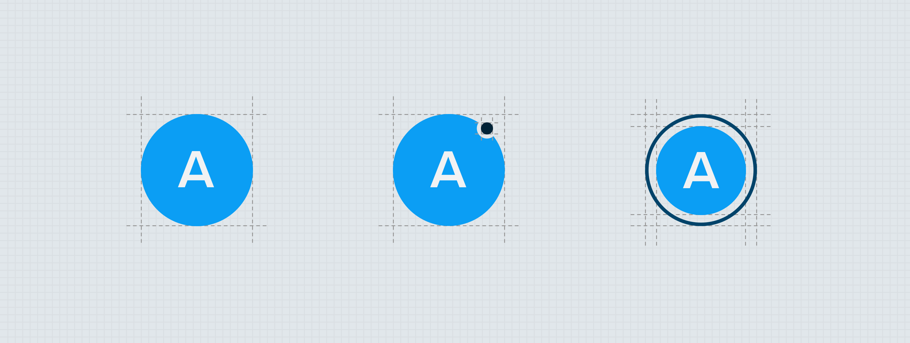
Anatomy
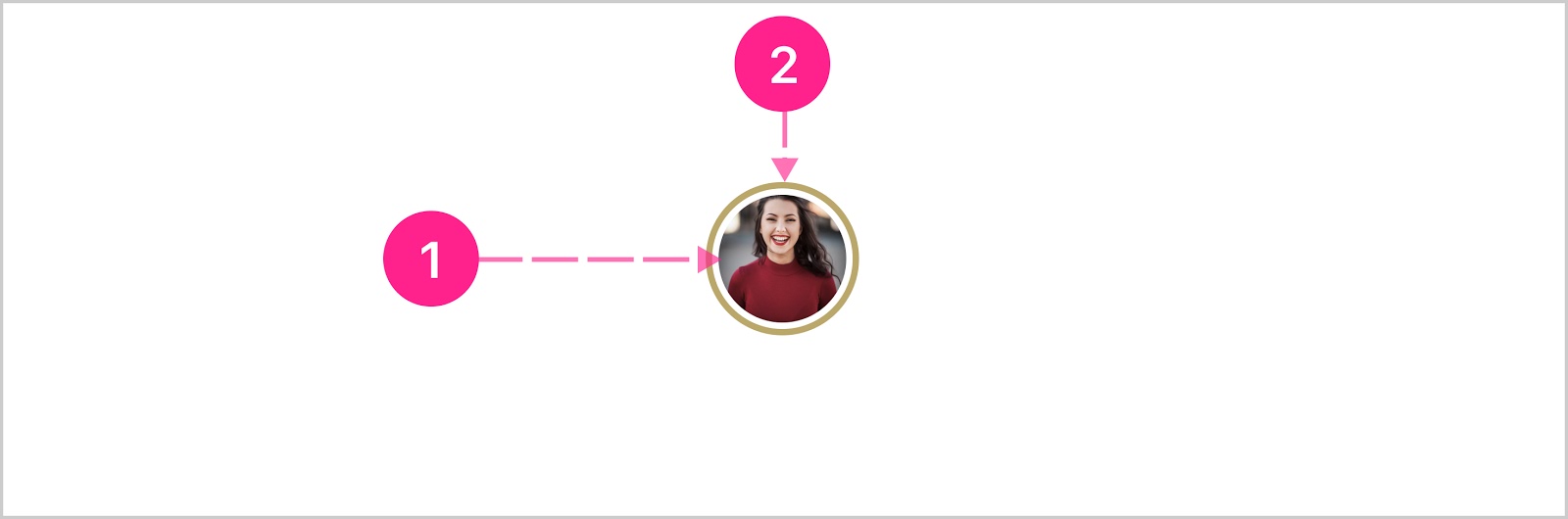
The essential parts of the avatar is the identifier, and the container. All other elements are optional, and act as extensions to further increase the functionality of the component. The basic variations of the avatar component are Icon, Numeric, Alphabetic, and Photo. The functionality of the avatar component (and each variant) can optionally include the Badge, Status Line, Progress Bar, and Stacked Quick Action Button. Avatars can be set to xsmall, small, medium, large, and xlarge.

- Surface
- Status line (optional)
- Icon/Alphabetic character/Numeric character
- Badge (optional)
- Status line (optional)
- Image (optional)
- Border (optional)
- Stacked quick action button (optional)
Please note: If the avatar is not utilizing the image variant, either the icon, alphabetic, or numeric variant is required.
Please note: The avatar component, when used solely as an avatar (not nested within another component), does not utilize a border. To achieve the right engineering and construction logic, a border is present/possible but is only used when nested inside the quick action button component (as of this writing).
Icon
The icon variant is constructed with a surface stacked with an icon vertically and horizontally centered.

- Surface
- Icon
Numeric
The numeric variant is constructed with a surface stacked with numeric characters vertically and horizontally centered.
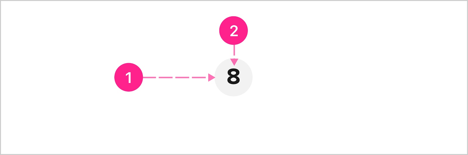
- Surface
- Numeric character(s) — Various type levels
Type levels
Since avatars can be set to display at several different sizes, the type treatments need to adjust at each level. See type table below.
Please note: Due to space constraints, limit to two characters. Some characters take up more horizontal space than others, so the type size should shrink instead of wrapping when running out of space. When shrinking, refer to the optional type level column in the type table below.
Alpha
The alpha variant is constructed with a surface stacked with alphabetic characters vertically and horizontally centered.
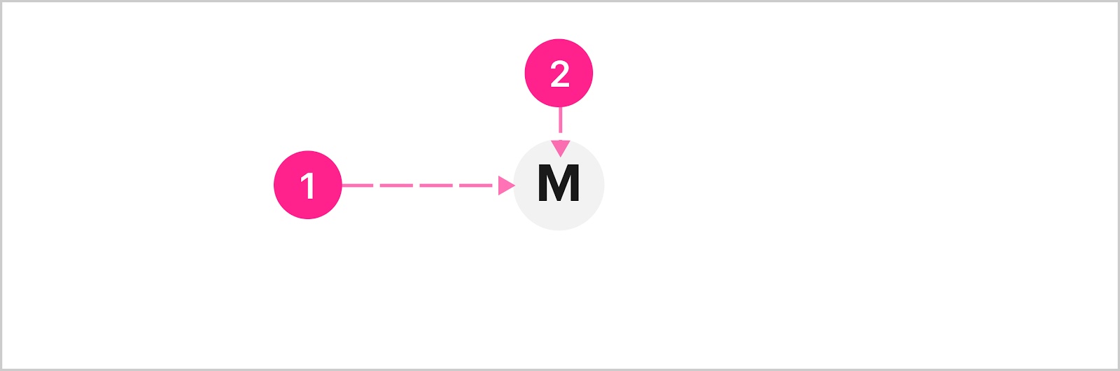
- Surface
- Alphabetic character(s) — Various type levels
Type levels (same as numeric)
Since avatars can be set to display at several different sizes, the type treatments need to adjust at each level. See type table below.
Please note: Due to space constraints, limit to two characters. Consider using the badge component instead of the avatar if more than two characters are needed to represent a concept. Other nouns, such as a person or business can be represented easily by one or two characters. Some characters take up more horizontal space than others, so the type size should shrink instead of wrapping when running out of space. When shrinking, refer to the optional type level column in the type table below.
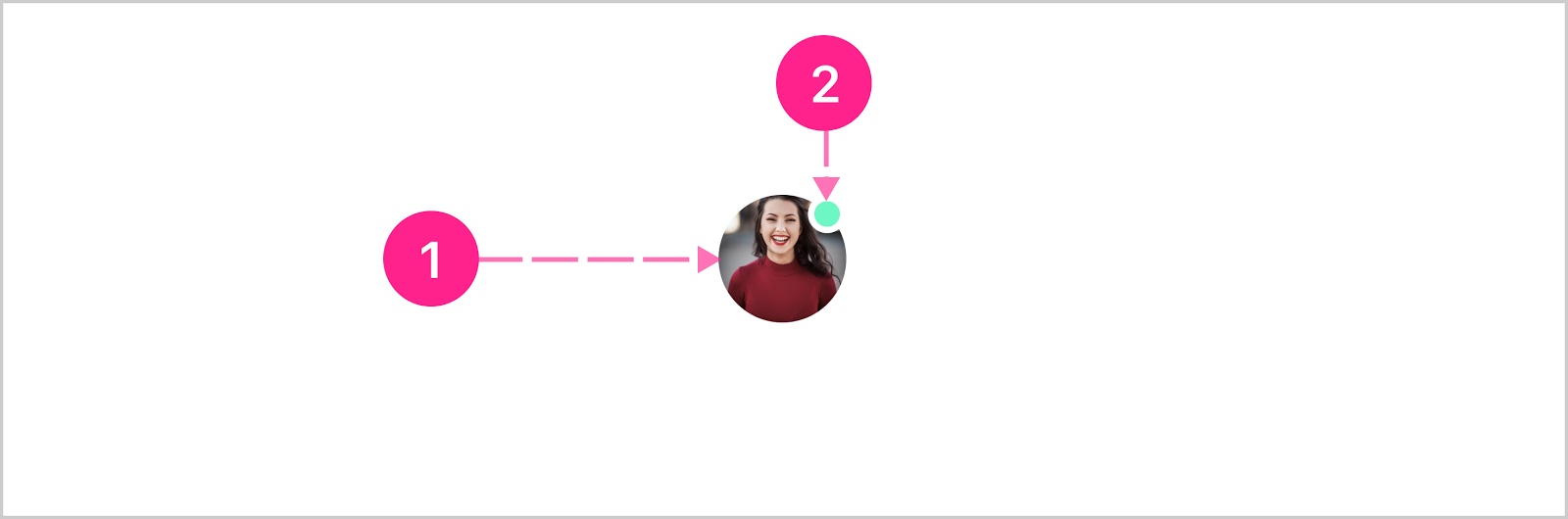
Photo
The photo variant is constructed of a surface and full-bleed image vertically and horizontally centered.

- Surface
- Image
- Text description (not shown)
Image handling
A few things to keep in mind for handling images:
- Scaling from the center point of the image, the image should scale up or down to fill the surface completely — no whitespace should be visible — even if the aspect ratio is not perfectly square.
- The photo variant should have the alpha variant set as the fallback in the event an image file is corrupted, doesn’t exist, or is not passed in successfully.
- When the alpha variant acts as a fallback, the characters come from the first letter in the text description or the first letter from the first two words if the description is the name of a person or business.
- A text description should be pulled from the thing represented by the avatar (a merchant name for example) and should have additional descriptive words added (“merchant name logo” for example).
- Support/handling for animated gif
- Support for .gif .png .jpeg file types
Badge
The badge extension is simply the badge component stacked on top of the avatar aligned to the upper right corner with a slight inset or overhand (depending on themed shape).
- Base avatar component
- Badge
Status line
The status line extension is a border surrounding the surface, and is used as a way to communicate the status of the person/business/thing the avatar represents. For example many customers have rewards programs for their users, and the status line is used as a way to represent the users reward status (gold, silver, platinum).
- Base avatar component
- Status line
Progress bar
The progress bar extension is a border surrounding the surface, and is used as a way to represent a percentage complete. For example an avatar can be used to represent a savings goal, and the progress bar represents the current percentage of goal completion.
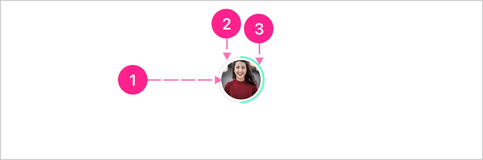
- Base avatar component
- Track
- Progress indicator
Stacked quick action button
The stacked quick action button extension enables a contextual action to be placed on top of the base avatar component. See the quick action button component and the embedded variant specifically for more details. Only the medium, large, and xlarge sizes can utilize the stacked quick action button extension.
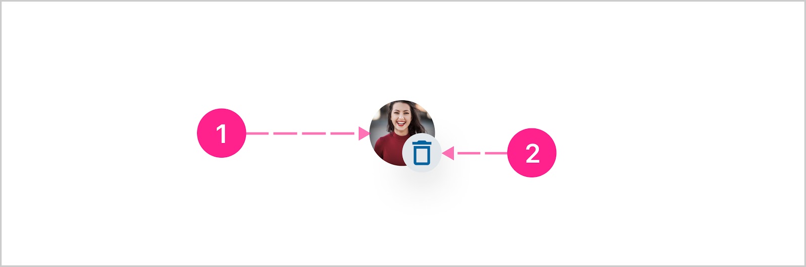
- Base avatar component
- Quick action button — Embedded quick action button


States
The base avatar component is not interactive, and no states are considered. The quick action button extension should follow all the interactive states documented in the quick action button doc.


Placement
Avatars can be placed anywhere, and can be used as a nested component.
Developer Docs
Vue Developer DocsComponent documentation coming soon!