.png)
Date Picker
Date pickers allow users to select a single date or a range of dates. The component has distinct mobile and desktop variants with similar attributes. Date pickers are especially helpful when users need to see the context of a date they are entering or selecting. The dates within the picker can appear in a variety of styles, signifying variations of meaning.

Anatomy
Iris Vue Date Picker
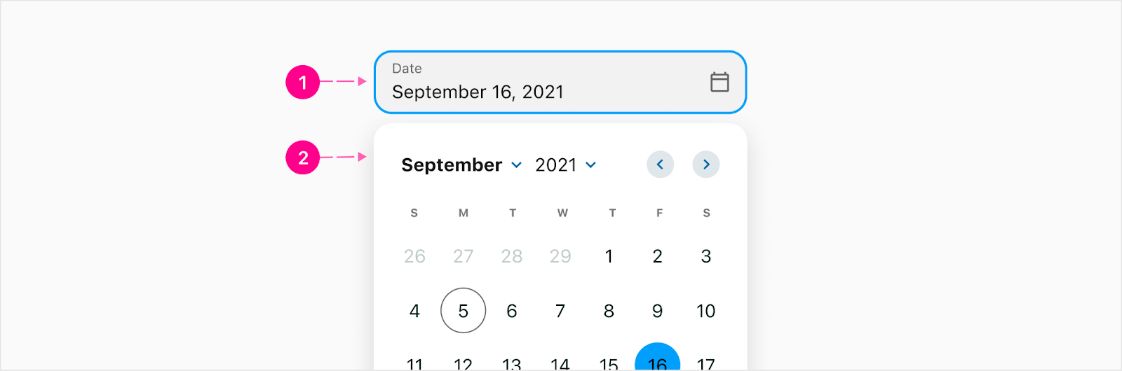
The Iris Vue date picker will be attached to a trigger that acts as a dropdown.
Trigger
The date picker trigger will take on the same styling as all other text fields. It will have a calendar icon to the right to indicate that this is a date picker trigger. Once a date is picked, it will be reflected in the trigger. Note: The user cannot type into this trigger. If you are needing to input a date, use the date text field.
- Trigger
- Date picker
Date picker
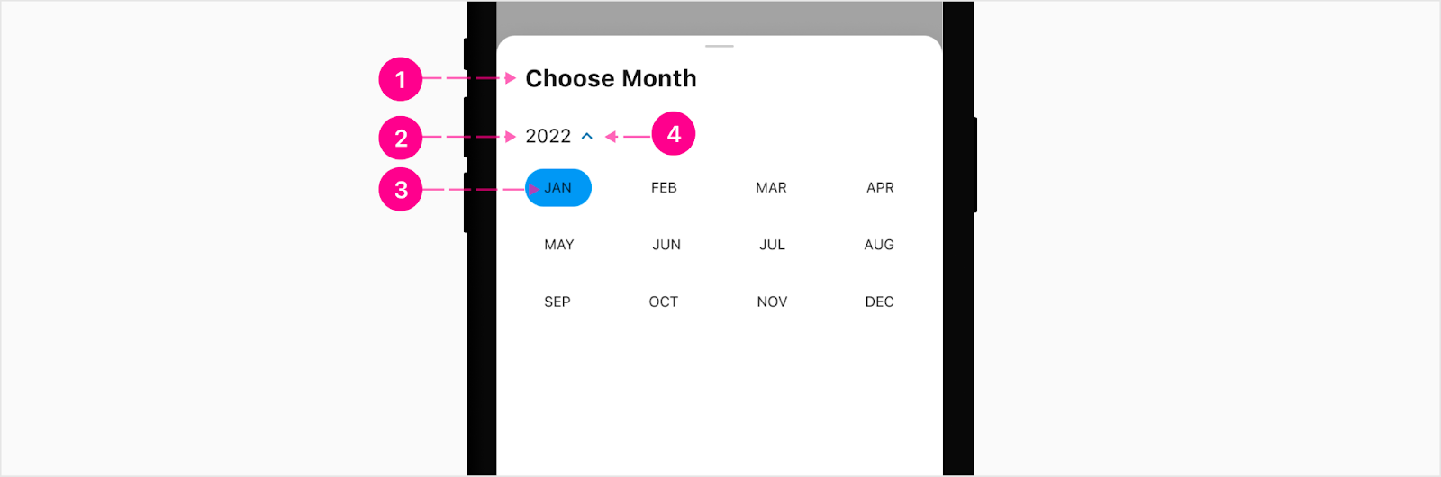
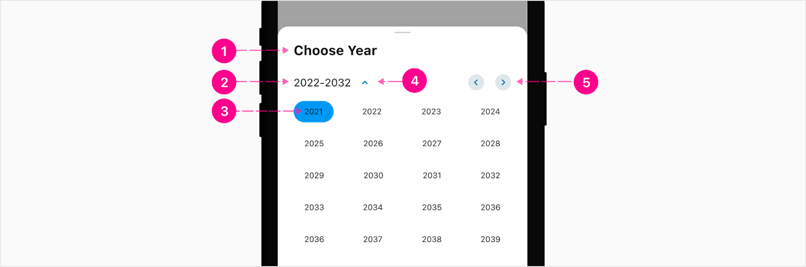
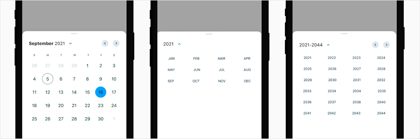
The date picker allows the user to search through the months to pick a date. If they are needing to change the year, they will click on either the up or down arrow to move throughout the year. To move between the months, they will click the back and forward arrows to the right of the date picker. Note: The month and year titles will open a browser styled dropdown to choose the new month/year. The entire label and caret are clickable to open the month/year switcher.
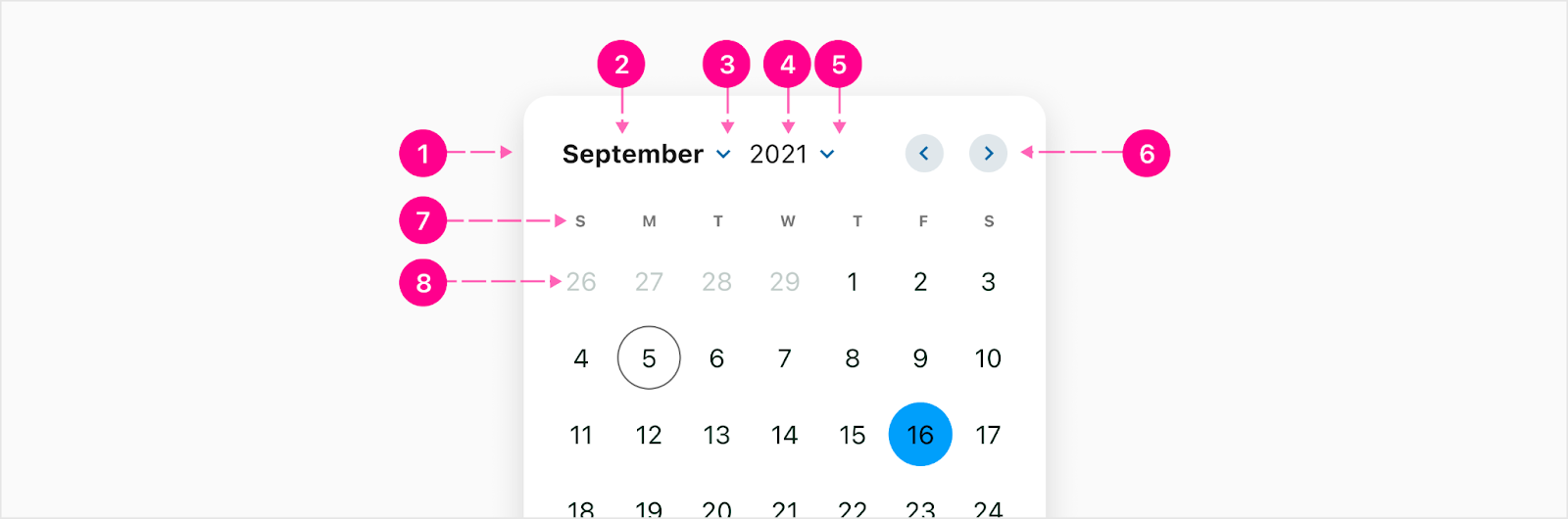
- Raised surface (Optional)
- Month label - Subtitle 1
- Month switcher - 24px Icon
- Year label - Body 1
- Year switcher - 24px Icon
- Month pagination triggers - x-small embedded medium emphasis QAB
- Day of the week labels - Overline
- Day - 40px circle & body 1
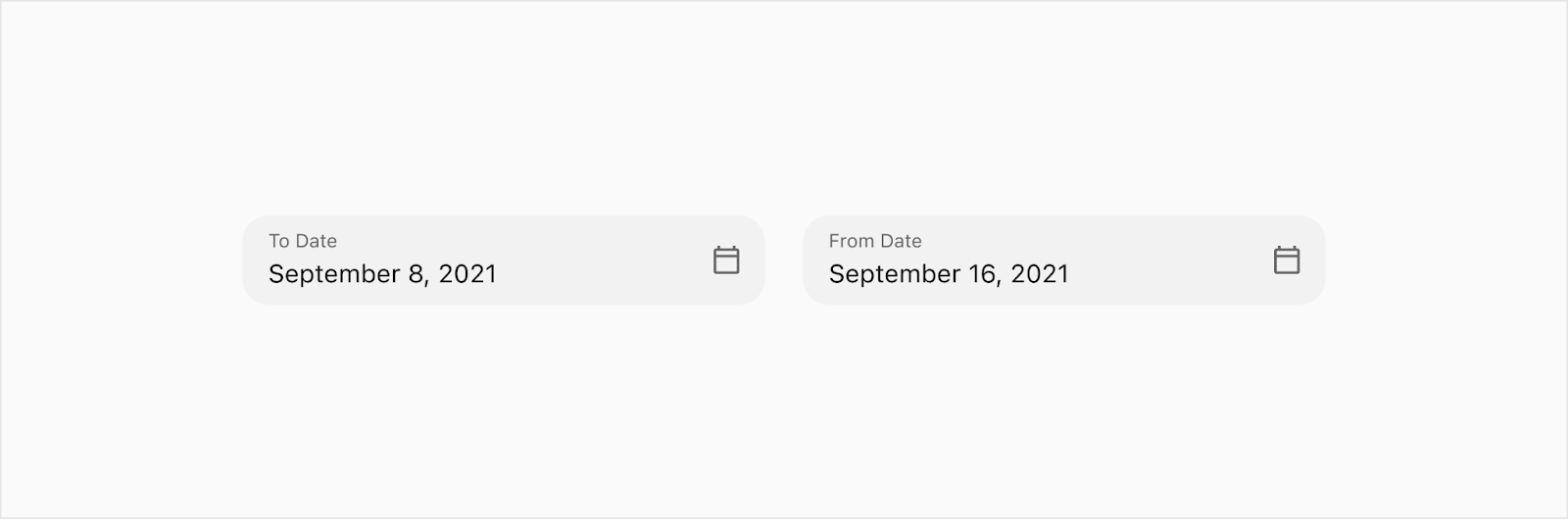
Date Range
The date range is when a user needs to choose a start and end date. The date range will only be used across two text fields. The user will pick the start date in one text field then the end date in another.
Flutter Date Picker
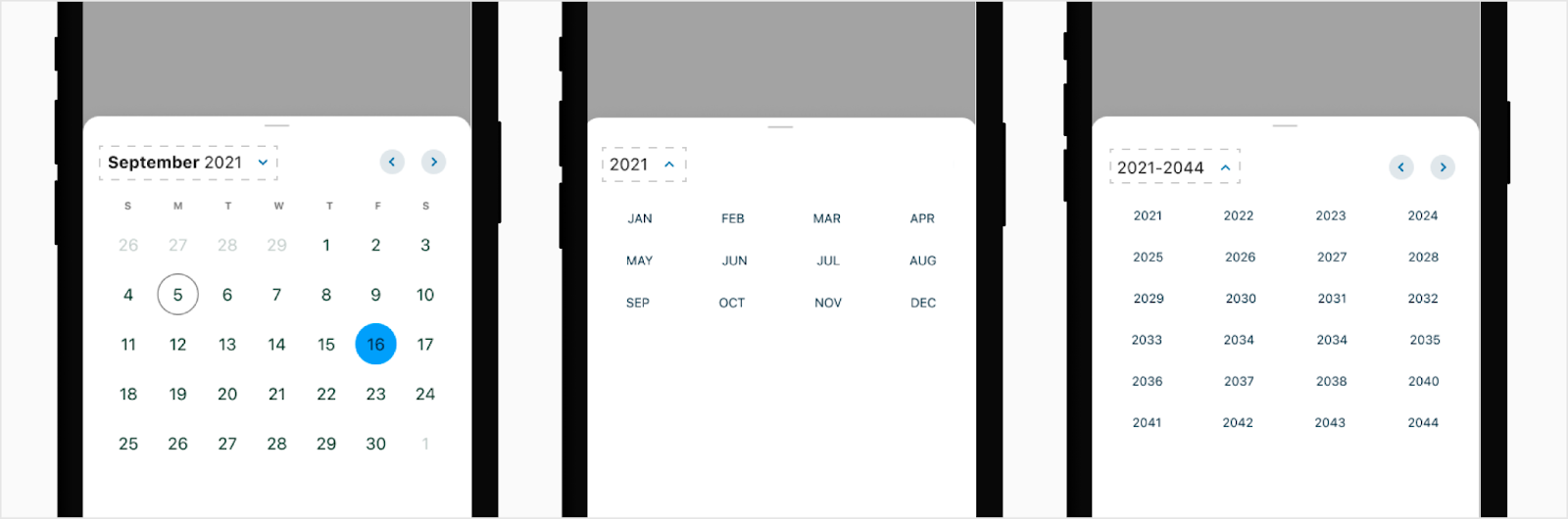
The flutter date picker will reside inside of a partial bottom sheet and is activated by a date picker trigger. The date picker can switch between different pick views; monthly, month, and year date picker. When switching views, the height of the bottom sheet will stay the same as the monthly picker.
Trigger
The date picker trigger will take on the same styling as all other text fields. It will have a calendar icon to the right to indicate that this is a date picker trigger. Once a date is picked, it will be reflected in the trigger. Note: The user cannot type into this trigger. If you are needing to input a date, use the date text field.

Monthly
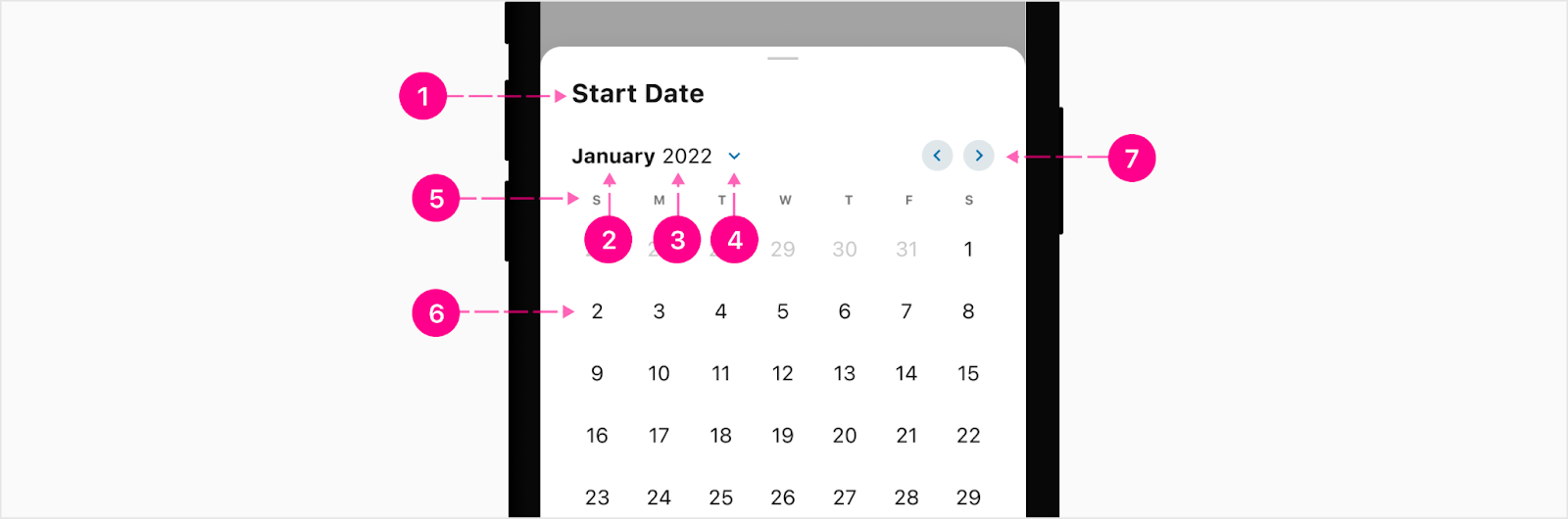
- Bottom sheet title - Small Heading (Optional)
- Month label - Subtitle 1
- Year label - Body 1
- Month/Year Trigger - x-small embedded no emphasis QAB
- Day of the week labels - Overline
- Day - 40px circle & body 1
- Month pagination triggers - x-small embedded medium emphasis QAB
Month
- Bottom sheet title - Small Heading (optional)
- Year label - Body 1
- Month/year switcher - x-small embedded no emphasis QAB
- Month label - Caption
Year
- Bottom sheet title - Small Heading (optional)
- Year range label - Body 1
- Month/year switcher - x-small embedded no emphasis QAB
- Month label - Caption
- Next month pagination trigger - x-small embedded medium emphasis QAB
Month/Year Trigger
To make it easier for the user to tap the trigger to switch between month and year, the entire title section along with the quick action button will have a tap hit spot. Note: The QAB will showcase the pressed state but there is no pressed state for the month and year labels.
Action buttons
The action button is an extension of the date picker where if needed, you can have up to two buttons as a sticky footer at the bottom of the bottom sheet.

- Bottom sheet sticky footer with up to 2 buttons
Date range
The date range is when a user needs to choose a start and end date. The date range will only be used across two text fields. The user will pick the start date in one text field then the end date in another.


States
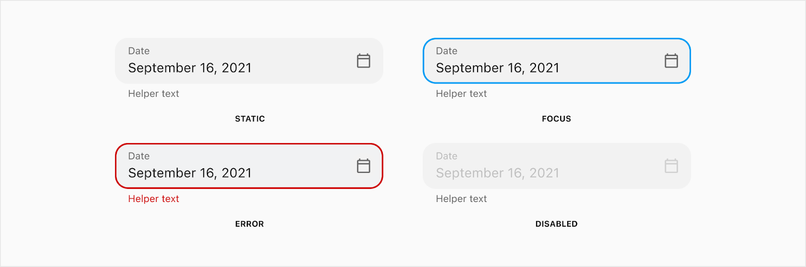
Date picker trigger
Day

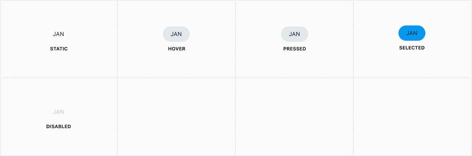
Month
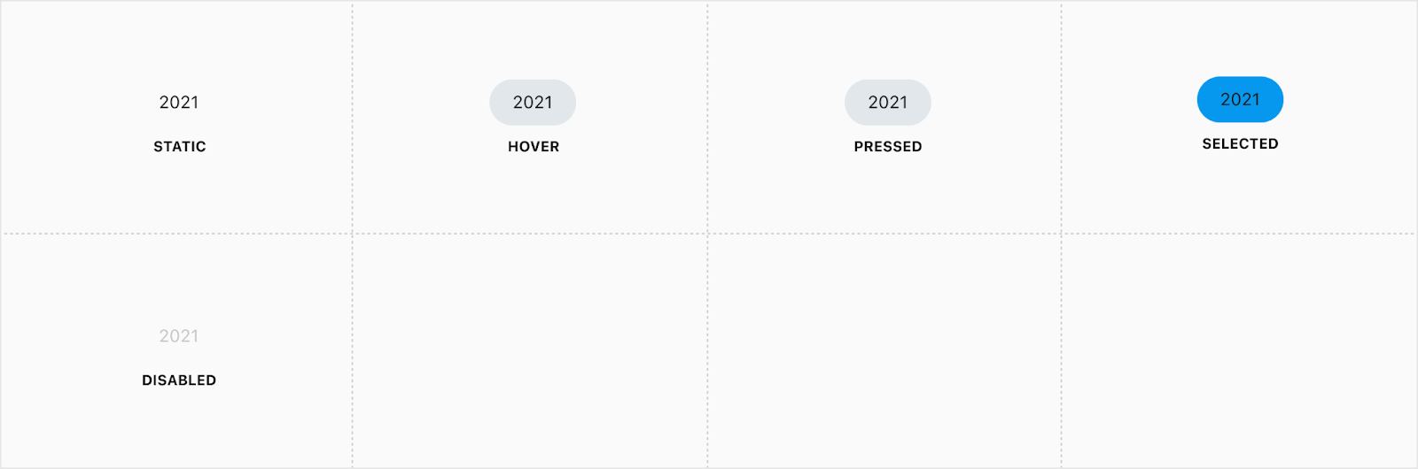
Year
Iris Vue Date picker switcher

Note: The entire label and caret are clickable to open the month/year switcher.


Placement
Iris Vue Date Picker
The date picker is directly below the trigger.

Flutter bottom sheet
A bottom sheet will be used on native mobile instead of the traditional dropdown date picker. The height of the bottom sheet will stay the same as the monthly calendar when switching between month and year views.
Action buttons
Action buttons in a bottom sheet will turn into a footer with up to two CTA buttons at a high and no emphasis level.


Developer Docs
Vue Developer DocsComponent documentation coming soon!