.png)
Dropdown
A dropdown provides a raised surface for displaying a list of contextual actions in front of the current view. The major benefit of utilizing dropdowns, based on the principle of progressive disclosure, is the ability to reduce clutter and cognitive load by grouping contextual UI behind an interaction. Dropdowns can be used for both Vue and Flutter experiences.
Anatomy
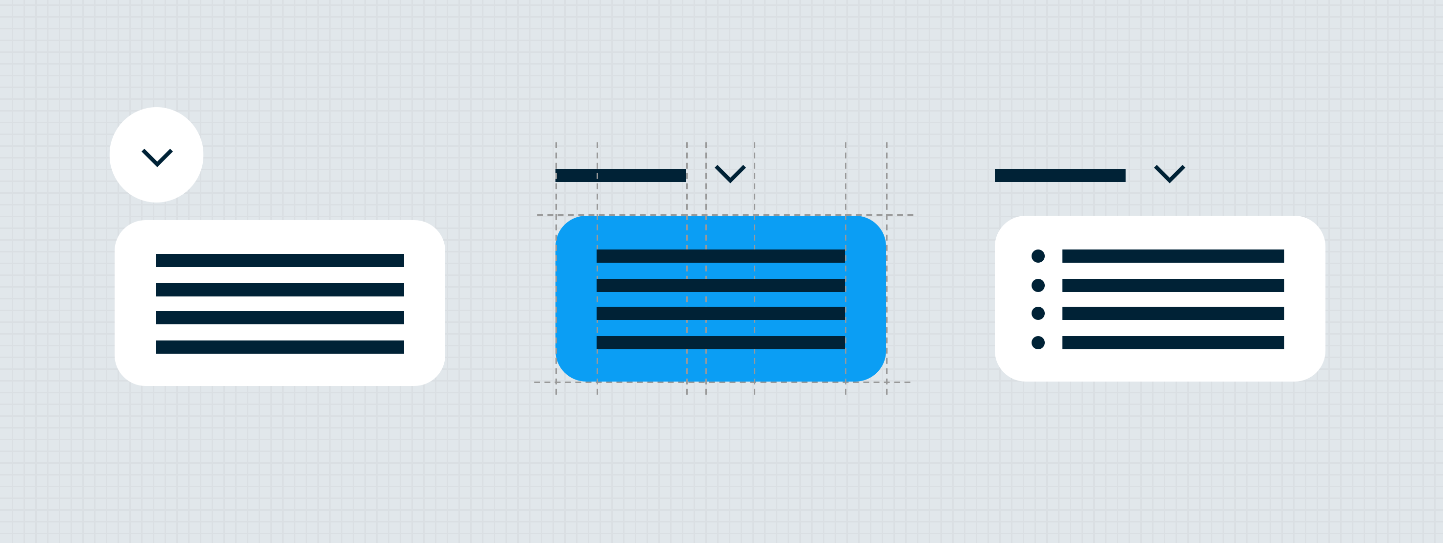
The dropdown component is made up of a trigger, raised surface, and a list of choices for the user to select from. The dropdown variations: menu dropdown, selection dropdown, and text field dropdown. Note: Only the menu variant can be used as multi-select.
The extensions of the dropdown component (and each variant) can optionally include search or slot. The list items for the dropdown component can include text, Icon and text or account options.
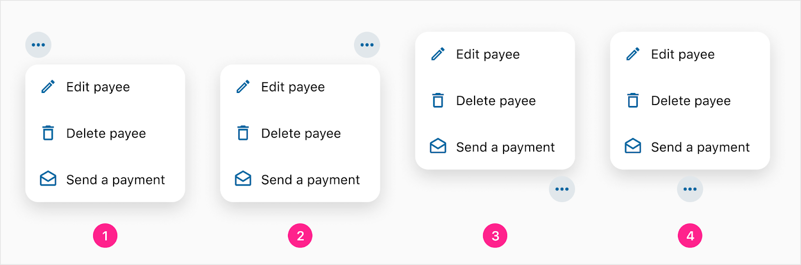
Menu Dropdown
The menu dropdown variant is triggered by tapping or clicking on either a static trigger or dynamic trigger (more on triggers at the bottom of this menu dropdown section). The trigger can be one of two options: quick action button or label and caret — each trigger option has unique features and behaviors.
Quick Action Button
The quick action button trigger allows the dropdown to be triggered by interacting with the quick action button. Any icon can be used within the quick action button. What’s unique about this trigger option is a badge can be utilized to show how many selections have been made.

- Quick action component — Embedded QAB (any variant)
- Badge (optional)
Badges represent how many list items have been selected by the user. Usability when selecting multiple list items starts to take a hit when more than just a handful of selections are made. If a user may want to select more than 5 selection, consider using a different solution. A bottom sheet or side sheet could be a great place to list out a large group of chips that a user could add/remove one by one instead of tediously selecting from a dropdown (that could easily be cancelled inadvertently.
Label and Caret
This combo trigger is unique because the caret will spin around to provide affordance for the user both when the dropdown is open or closed.

- Trigger label — Body 1
- Trigger icon
Static triggers
The static trigger maintains a consistent label and/or icon before and after a selection is made. Both the icon only trigger and quick action trigger are considered to be static since the icon will not change as a result of the user's selection. Both the label and icon combo trigger and the label and caret trigger can be static if the label does not change as a result of the user's selection.

- Label and caret trigger (before selection)
- Label and caret trigger (after selection)

- Quick action button trigger (before selection)
- Quick action button trigger (after selection)
Note: Although the quick action button cannot change as a result of a user's selection, a badge can be shown as a way to let the user know how many list items have been selected. A badge cannot be used with any other trigger types.
Dynamic triggers
The dynamic trigger updates the trigger label based on the user uselection, and requires a default selection. Only the label and icon combo trigger and the label and caret trigger can utilize the dynamic updating of the text label (since these are the only triggers with a text label that can be updated).
- Label and caret trigger (before selection)
- Label and caret trigger (after selection)
Selection Dropdown
The selection dropdown variant for choosing a value from a list item options. It is triggered by clicking the caret or anywhere on the text field area. Note: Only the values shown in the dropdown can be selected. A custom value cannot be entered.
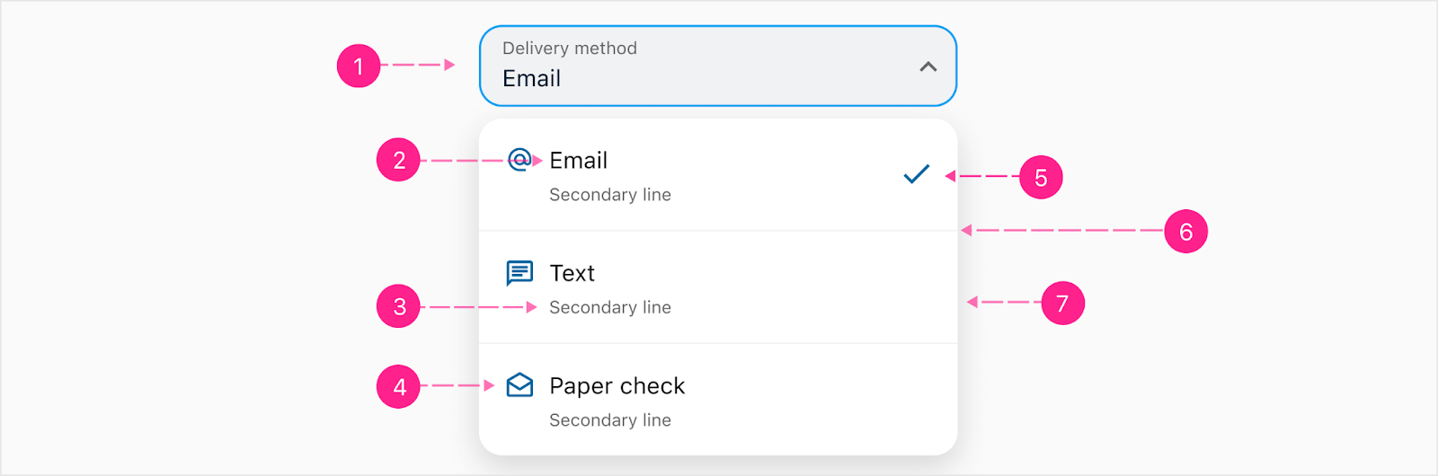
- Select trigger (Focus state)
- Item Label - Body 1
- Second Line- Caption (Optional)
- List Item Icon (Optional) - 24px
- Selected item indicator
- Divider (Optional)
- Raised Surface
Text Field Dropdown
The dropdown uses an input text field as the trigger. In the focus state, it will show a dropdown of suggested values but the user has the option to type out a new value. A value does not have to be selected from the dropdown list and cannot use the account component. Note: On mobile views, instead of a bottom sheet this variant will still use a dropdown.

- Input field trigger (Focus state & before typing)
- Suggestions

- Input field trigger (Focused state & after typing)
- Input field typed (New value)
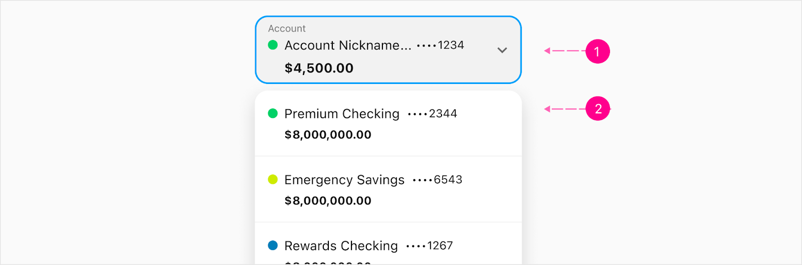
Account
The account trigger can house either single line or stacked body 1 with subtitle 2 variant. The dropdown list will show a list of accounts using any account variant defined by design. Within the account select, the only properties being shown will be the name of the account, account number and amount to allow more room. Note: The single line account variant is the default variant.
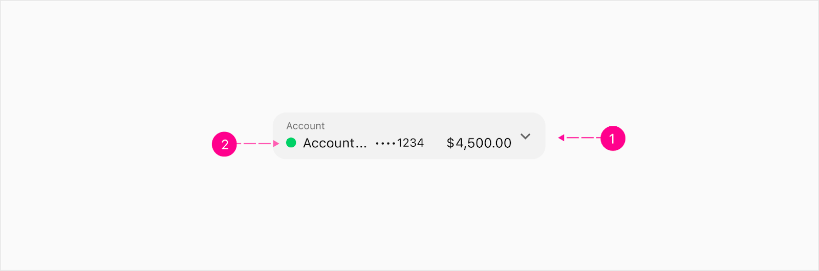
- Selection trigger (Static)
- Account component - Single line variant
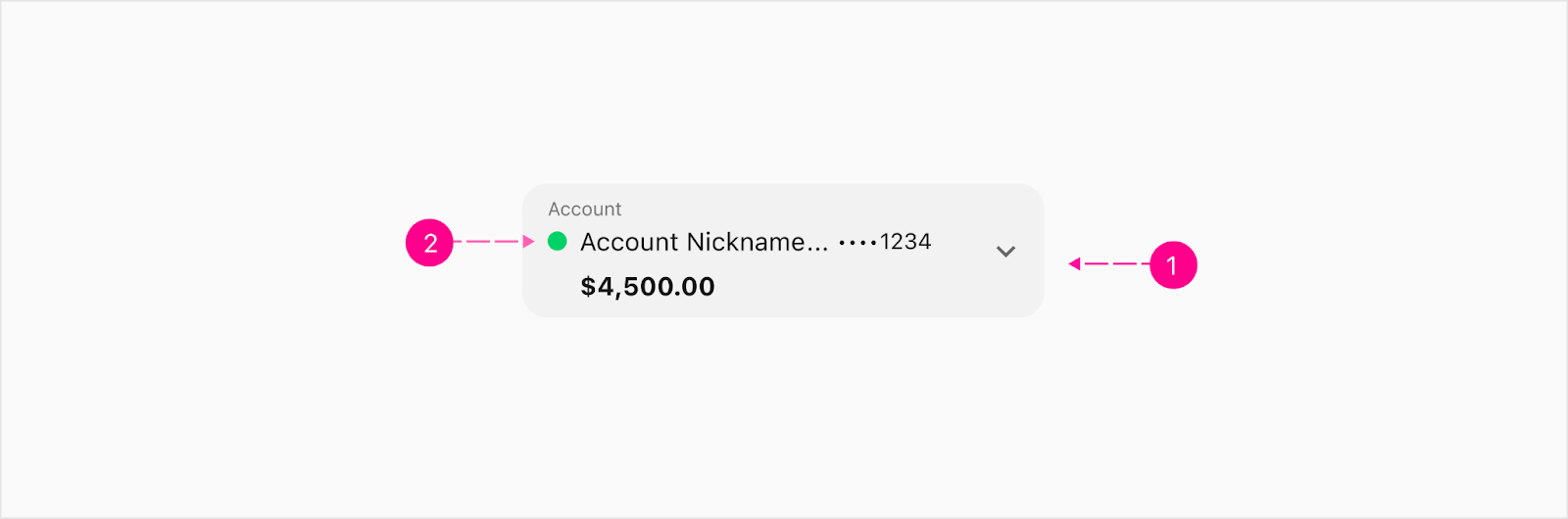
- Selection trigger (Static
- Account component - Stacked with Subtitle 2 variant
- Selection trigger (Focus state)
- Account variant
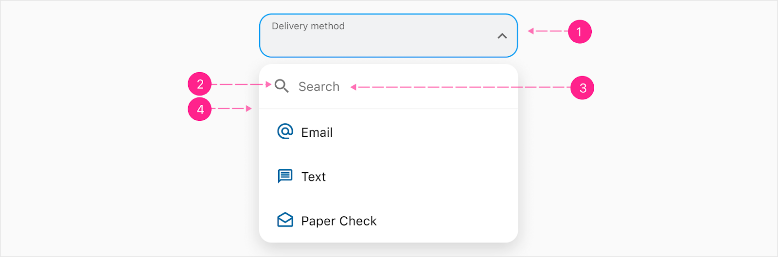
Search
The search provides a way for the user to type out their value in the search field within the dropdown. The list items in the dropdown will filter out depending on what the user types. The search filter will be pinned to the top of the list and will stay if the user needs to scroll within the dropdown. Note: A value has to be selected from the dropdown list. If the user were to search for a value that is not in the list, a “No results found.” text will be displayed.
- Selection trigger (focus state)
- Search Icon - 24px
- Search Placeholder - Body 1
- Divider
Filtering

- Select trigger (Focused state)
- Search filtering
Empty state

- Select trigger (focus state)
- Empty state of dropdown list - Caption
Selected state
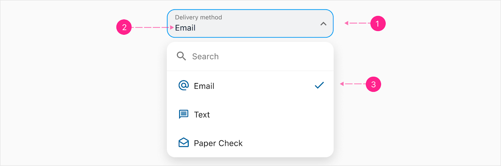
- Input field trigger (focused state & while typing)
- Selected value
- Selected list item
Account
The search extension can be added to the account dropdown. The user has the option to choose from a list of accounts or search the accounts to filter the list.

- Selection trigger (Focus state & while typing)
- Search (Optional)
- Account component - Stacked with Subtitle 2 variant
International Phone Number Dropdown
The search extension can be added to the international phone number dropdown variant.

- International phone dropdown trigger
- Search (Optional)
Menu Dropdown

- Quick Action Button Trigger
- Search (Optional)

- Label and Caret
- Search (Optional)
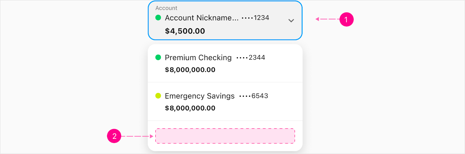
Slot
Slot is an optional section at the bottom of a dropdown where design will determine the content inside when there is a need for a call to action.
Menu Dropdown

- Quick Action Trigger
- Slot (Optional)

- Label and Caret
- Slot (Optional)
Selection Dropdown

- Select trigger (Focus state)
- Slot (Optional)
Text Field Dropdown

- Input field trigger (Focus state & before typing)
- Slot (Optional)
Account
- Selection trigger (Focus state)
- Slot (Optional)
Mobile dropdown
On mobile views, the dropdown will change from a traditional dropdown to a bottom sheet. The only variant that will not follow this pattern will be the text field dropdown due to the user needing to type within the text field. Note: The title will pull in the label as default but it can also be custom text defined by design.
Limited Feature Bottom Sheet
The dropdown will change from a traditional dropdown to a limited feature bottom sheet once it hits the breaking point of 560px. This will trigger a partial bottom sheet that will auto-grow with the content inside it. The title of the bottom sheet will be pulled from the name of the select as well as a counter at the end of the number of items in the dropdown. Note: It will never trigger a full screen bottom sheet.
In code, this bottom sheet will not technically be the usual Bottom Sheet component, but simply a re-styled version of the dropdown. Therefore this bottom sheet’s use is restricted from a normal Sheet’s elements such as Quick Action Buttons, headings, menu buttons, close or backstack buttons. Think of it as a glorified dropdown, stuck to the bottom of the screen.

- Scrim
- Partial Bottom Sheet
- Title Heading with number of items in dropdown - Small heading (Optional)
- Second line -
- Dropdown item
- Selected item
Search within Bottom Sheet
A bottom sheet with a search will be triggered if using the select with a filter property. It will open to a full partial bottom sheet with a search pinned to the top. When filtering, the size of the bottom sheet will stay the same but the content will filter down.

- Title Heading with number of items in dropdown - Small heading (Optional)
- Search text field extension
Scrollable
In most cases, the height of the dropdown is based on the amount of content contained within the dropdown. The exception to this rule is when the height of a dropdown would otherwise be taller than the visible space within the viewport. In this case, a scrollable dropdown should be utilized.

- Divider

- Divider


States
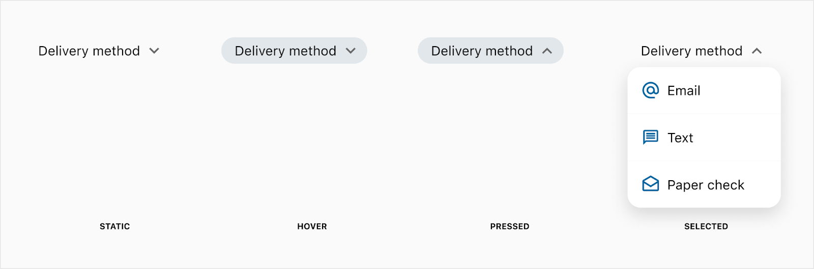
Labels and icons trigger
The following graphic show the states for both the icon only trigger, label and icon combo trigger, and the label and caret combo trigger.
Quick action trigger

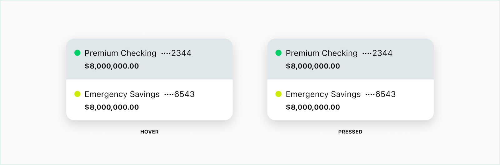
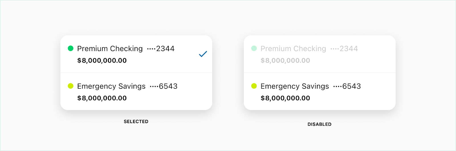
Account list items
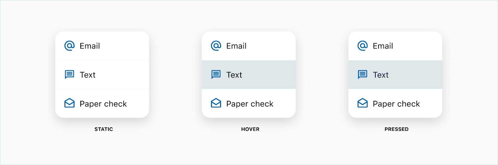
Standard list items

Bottom sheet list items


Placement
The default placement of dropdowns should be immediately below the trigger (referred to as the flow down placement) and aligned along the left edge; but due to information density or scroll position, the dropdown can also appear above the trigger (referred to as the flow up placement), aligned along the right edge, or centered vertically or horizontally with the trigger.
- Flow down placement aligned along the left edge
- Flow down placement aligned along the right edge
- Flow up placement aligned along the right edge (but could also be left aligned)
- Flow up placement center aligned (could also follow the flow down placement)
Scrollable
In most cases, the height of the dropdown is based on the amount of content contained within the dropdown. The exception to this rule is when the height of a dropdown would otherwise be taller than the visible space within the viewport. In this case, a scrollable dropdown should be utilized.
Truncation
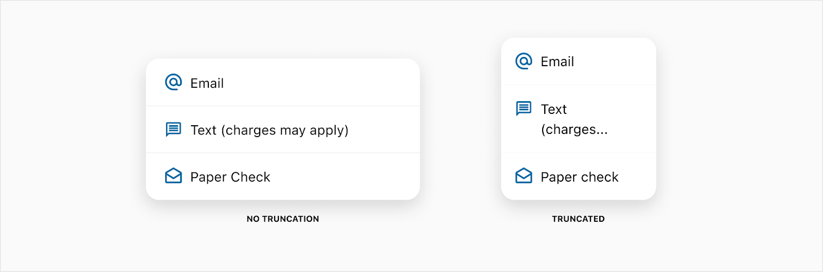
List items that contain account information can become truncated if there’s not enough horizontal space to display the full account nickname. See the account component for more details about truncation and priorities. Standard list items should never truncate, but wrap to another line. The title in the bottom sheet will wrap to two lines but truncate after that with enough room to have the counter at the end.


Developer Docs
Vue Developer DocsComponent documentation coming soon!