.png)
Mobile Webviews
Mobile Webviews describe the patterns for implementing web experiences within the Flutter mobile apps. Within the Alkami Platform there are two types of experiences that may be displayed: Native experiences & Web experiences.
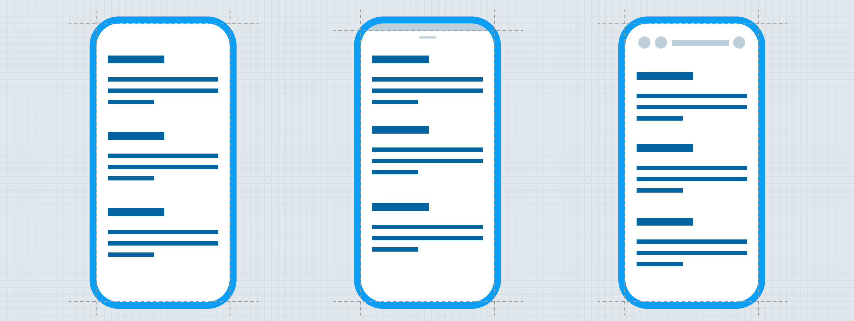
Anatomy
Native experiences
Native experiences take advantage of the full set of native technologies, enabling highly responsive and engaging experiences through careful use of haptic feedback, gestures, and animated transitions.
Web experiences
Web experiences utilize traditional front-end technologies to mimic native experiences to varying degrees. Depending on the degree to which they attempt to mimic native experiences, these webviews are broken into three levels:
- Embedded webview
- Overlay webview
- External webview
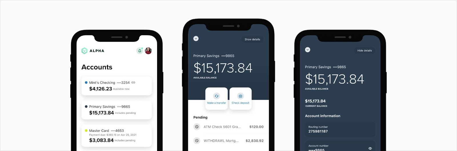
Embedded webview
Embedded webviews provide the most native-like experience. These experiences utilize haptic feedback, gestures, and simplified animated transitions. These experiences should utilize and interact with the native top bar and shortcut bars. Embedded webviews are placed beneath ( Z-axis) the Flutter top bar and shortcut bars but may dismiss, modify, or move them as users scroll (see behavior for Mobile Top Bar).
Due to the increased cost of implementing native-like experiences with web technologies, these experiences are reserved for products and features with high usage.
Common use cases for embedded webviews:
- Transfers
- Bill pay
- Financial wellness
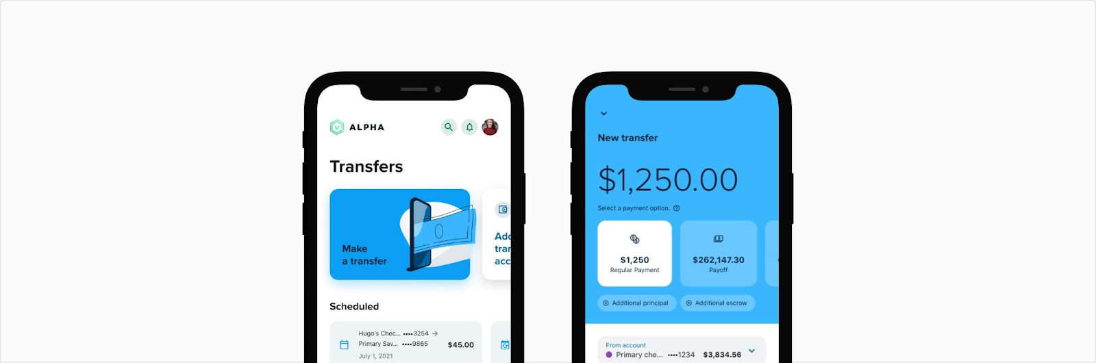
Overlay webviews
Overlay webviews display web experiences in a modal similar to the Cupertino modal with navigation (Android and iOS experiences should look the same). See “Modal Bottom Sheet” Flutter plugin. This sheet overlays both the native top bar and shortcut bar.
These contexts allow drill-in and drill-out context stacking as well the triggering of raised- and overlay-level components (bottom sheets, toast notifications, etc.).
Experiences designed for these webviews should be crafted to simplify development efforts while optimizing for usability.
Common use cases for overlay webviews:
- Authentication
- Custom widgets for FI’s (such as User services)
- Edocs
modal_bottom_sheet | Flutter Package
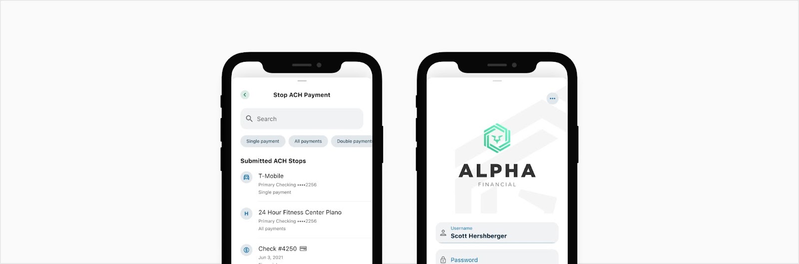
External webview

External webviews are reserved experiences injected into the Alkami Platform. These views are displayed on a full-screen or partial bottom sheet with classic browser controls for back and forward. These views display the URL or a simple title near the top of the view.
The controls for the external webview can either be at the top or bottom depending on the experience. The top controls are more for a seamless experience for the user to think they are still within the application. The bottom controls act more as a web browser to make the user feel as if they are outside of the application.
Common use cases for external webviews:
- SSO experiences
- External links
Anatomy
Embedded webview
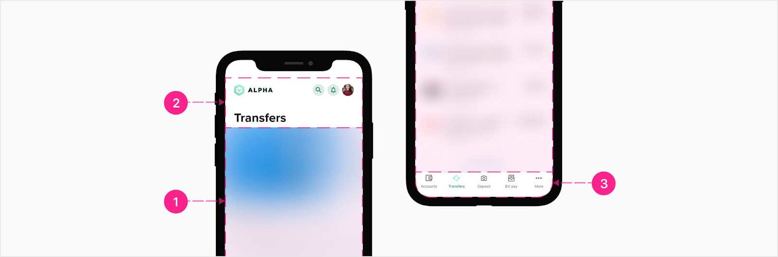
Embedded webviews are composed of the following organisms:
- Content area (Web)
- Mobile top bar (Flutter — High Emphasis District)
- Mobile shortcut bar (Flutter)
Overlay webview

Overlay webview displays content on a Flutter modal, utilizing the following elements:
- Content area (Web)
- Modal bottom sheet (Flutter)
- Neighborhood top bar (Flutter)
External webview
Bottom controls
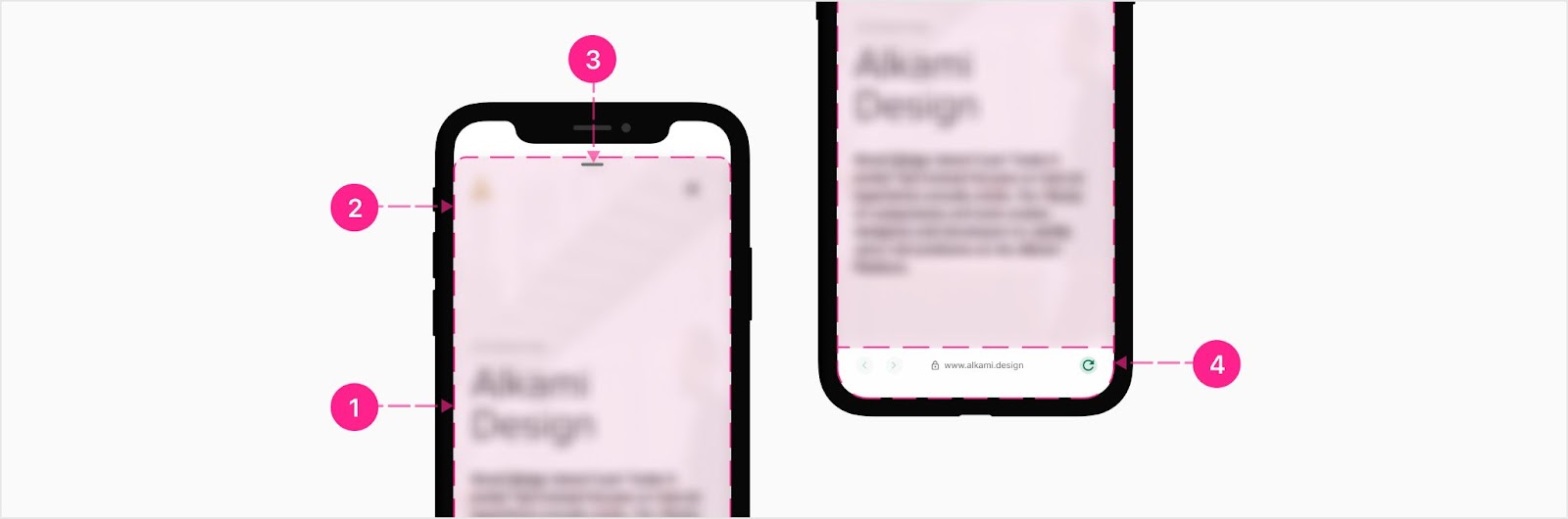
External webviews can have a bottom control bar within a bottom sheet
- Bottom sheet (Flutter)
- Handlebar (Custom for this pattern)
- Content area (Web)
- Control bar (Flutter)
Top controls

External webviews can have a top control bar within a full bottom sheet
- Bottom sheet (Flutter)
- Content area (Web)
- Control bar (Flutter)
Top control bar
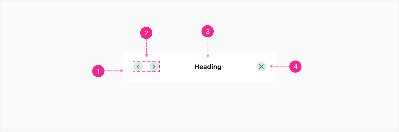
- Container
- Navigational actions — Xsmall embedded quick action buttons (Flutter)
- Heading label - Subtitle 1
- Close action - Xsmall embedded quick action button (Flutter)
Bottom control bar
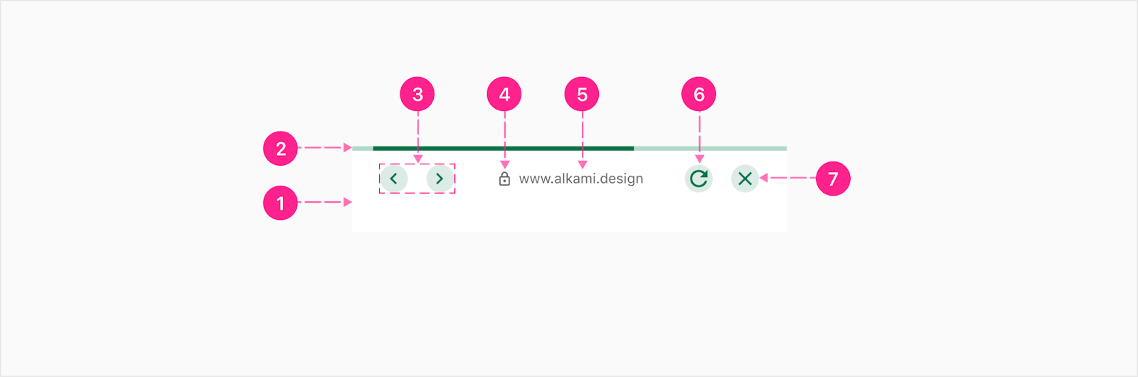
- Container
- Indeterminate viewport progress bar
- Navigational actions — Xsmall embedded quick action buttons (Flutter)
- URL display icon (Optional) (Flutter)
- URL label (Flutter) — Caption
- Refresh action — Xsmall embedded quick action button (Flutter)
- Close action — Xsmall embedded quick action button (Flutter)


States
The control bar quick action buttons may be disabled when they are not functional.
Placement
All of the above webviews are anchored to the bottom of the view and take up most of the screen (minus the safe zone and the prescribed spacing).


Developer Docs
Vue Developer DocsComponent documentation coming soon!