.png)
Responsive Sheet
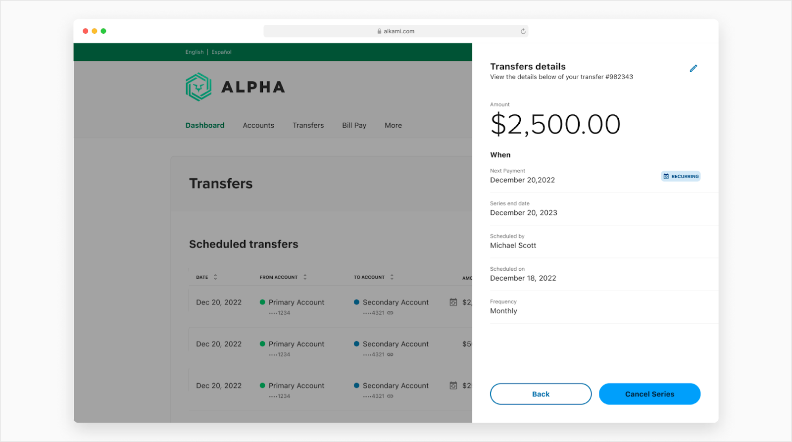
Responsive sheet is used to overlay content on top of the user interface for the purpose of focusing the user’s attention on specific information or to accomplish a specific task. As a general rule, responsive sheets should provide contextually-relevant content to the parent view underneath. This component is designed only for the responsive web medium to large experiences. See this doc for the breakpoints. Anything that is considered “Mobile” will display a bottom sheet while “Tablet” and “Desktop” display the responsive sheet.
Anatomy
The responsive sheet component is made up of a raised surface that contains content and affordances to close the responsive sheet. All other elements are optional. Side sheets come in three different sizes; small, medium and large. All three sizes have the same content but are just different sizes. Side sheets come in three variants; simple, step tracker and tabs.
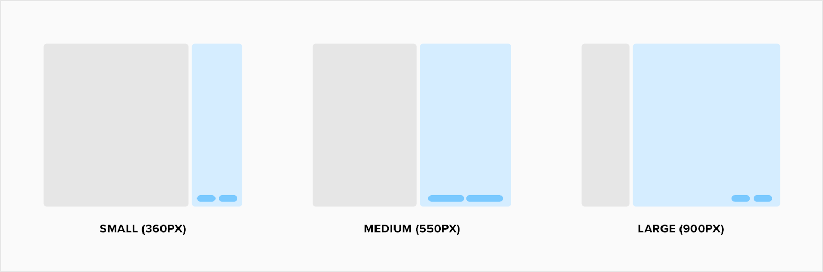
Side sheet sizes
Side sheets come in three different sizes; small, medium and large. The amount of content in the responsive sheet depends on which one design will choose to use. Buttons will fit the width of the container except for the large variant. The large variant buttons will be right aligned and auto width to the button title.
Simple
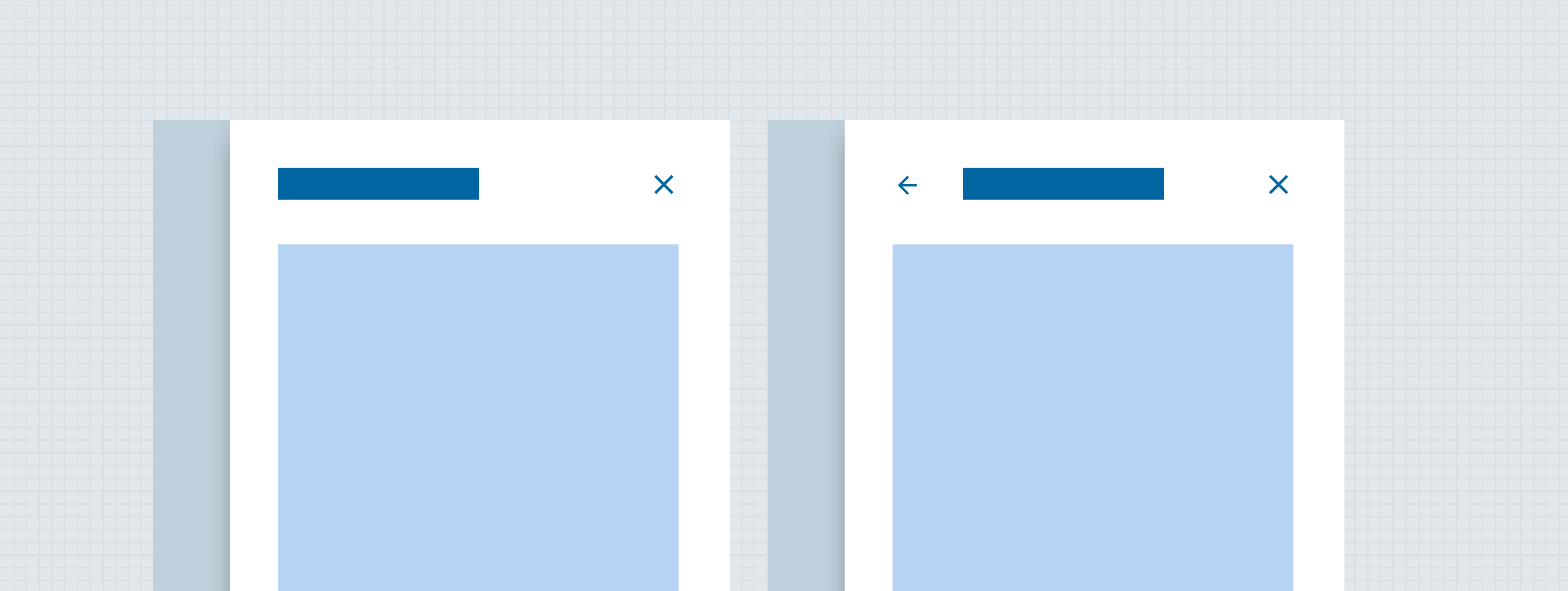
Simple responsive sheets are raised above the surface and completely cover the context underneath. Side sheet header can provide several controls depending on how the user might need to interact with responsive sheet content. The slots within the header should be flexible in width and height but always fill the container. For example if there is only a header, the text will fill the entire width of the container but if a button is added then the header title will shorten to accommodate the width of that button to the right. Depending on the content in the header, the surface container may grow. Note: It is possible to have no header and/or footer showing within a responsive sheet with only body content. Also, both of the slots are top aligned.
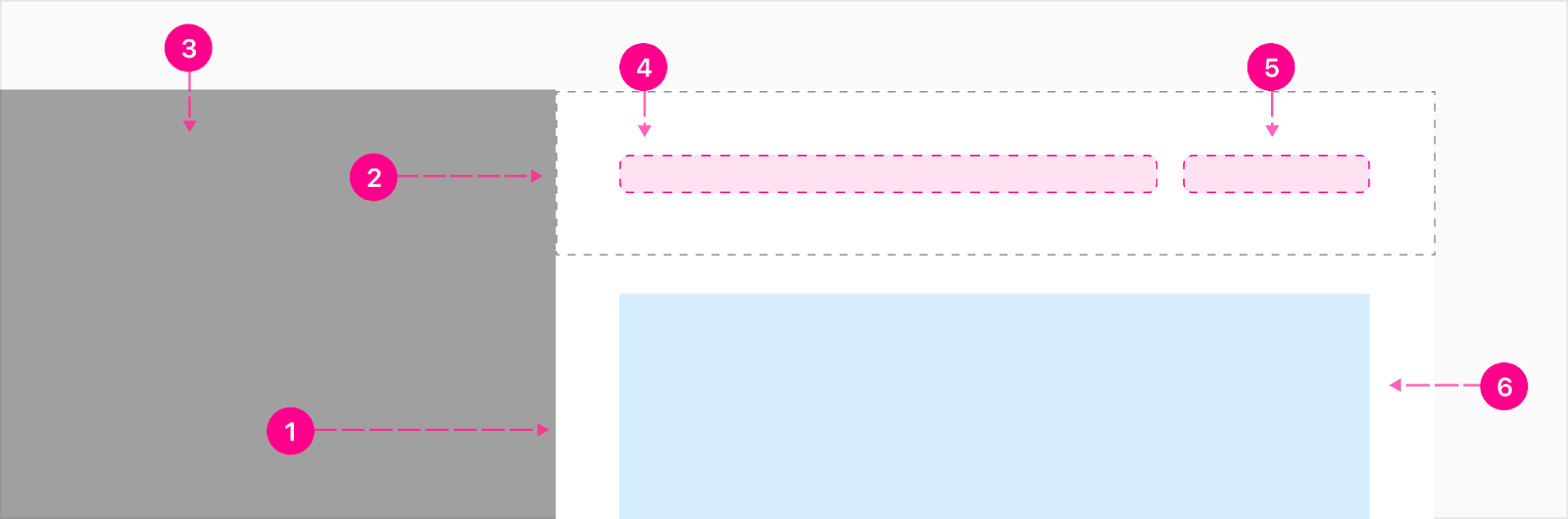
- Surface
- Header container (optional)
- Scrim
- Primary slot (optional)
- Secondary slot (optional)
- Content (just for reference)
Nested Side Sheet
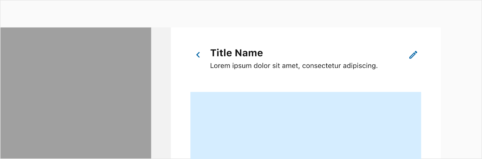
When needing to go another layer deep within a responsive sheet, another sheet will slide over the first and allow the user to click back to the previous layer via the 40px of the previous sheet to the left. Nested responsive sheets can drill up to three levels if needed. The only defined item in the header is the backstack and it serves as an additional way to go back to the previous responsive sheet. Note: Both of the slots are top aligned.
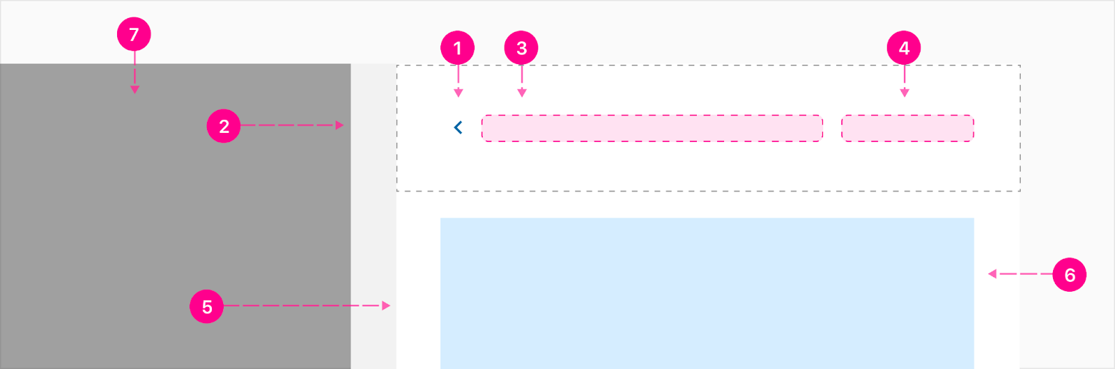
- Backstack - Small no emphasis quick action button
- Nested Side Sheet - 40px selectable surface
- Primary slot (optional)
- Secondary slot (optional)
- Surface
- Content (just for reference)
Footer
The footer is sticky at the bottom of the responsive sheet and can house up to 3 buttons and the primary action should always be high emphasis to the right. More actions can be housed in the top right section of the header if you need more than three actions. The buttons are equally spaced and stretched to fill the width of the container except for the large size variant; those will be aligned to the right and the auto width button size.
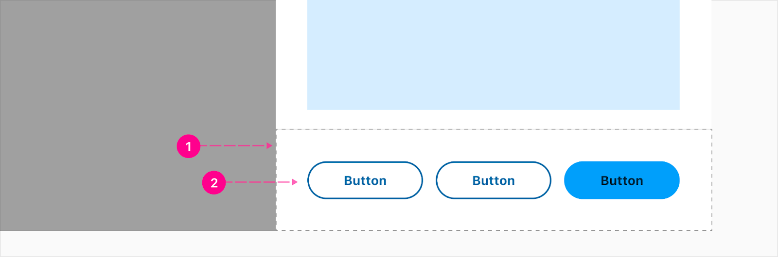
- Container (optional)
- Buttons (Up to 3 & optional)
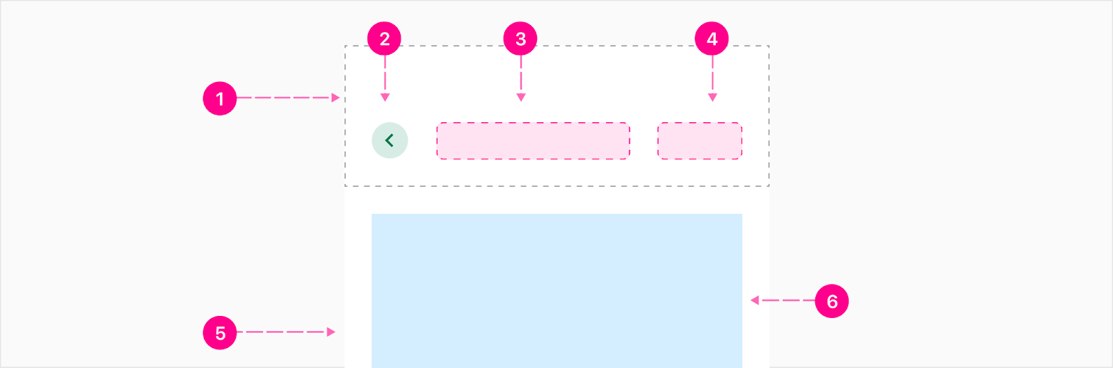
Step tracker
A progress step tracker can include all the same elements of a simple responsive sheet, but also include a stacked progress indicator to aid in multi-step flows contained within the responsive sheet Note: The step tracker is part of the entire header container and will be sticky with it to the top so it is always visible when the user scrolls.

- Stacked progress indicator (see documentation)
Tabs
Tabs can be added if the responsive sheet needs multiple pages of content to compare between. The tabs will be flush at the bottom of the header container. Note: The tabs are part of the entire header container and will be sticky with it to the top so it is always visible when the user scrolls.
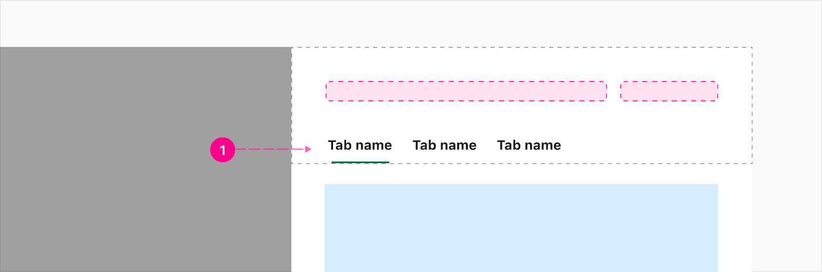
- Auto width desktop tabs (see documentation)
Mobile responsive web
The responsive sheet is responsive and shrinks down to a single page sheet without a scrim once hitting the width equal to or smaller than the responsive sheet's size.
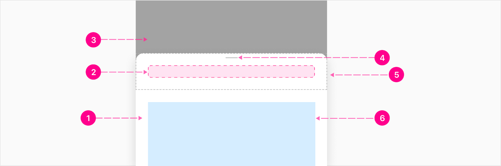
Full Responsive Sheet
When going into a nested responsive sheet, the backstack will be stacked with the content to allow more space on mobile (480px and under). The backstack will be updated to a medium guidance emphasis quick action. Note: If there is no secondary slot, the heading slot will be center aligned within the header container.
- Header Container (Optional)
- Backstack - Small Medium Quick Action Button (Guidance)
- Heading Slot
- Secondary Slot (Optional)
- Surface
- Content (just for reference)
Partial Bottom Sheet
Partial bottom sheet has auto height which means it will only get as high as the content inside. The bottom sheet can fill all the way up to 95% of the screen if needed.
- Raised surface
- Heading Slot (Optional)
- Scrim
- Close affordance
- Header container (Optional)
- Content (just for reference)
Footer
Footer buttons are responsive by responsive to fill the width of the container but if the container becomes too small depending on the size of the screen or length of the button CTA, the buttons will stack. The high emphasis button will usually be at the top.

- Container (Optional)
- Buttons (Up to 3 & optional)
When to use
Responsive sheets are useful for a wide variety of use-cases and can contain one or more atoms on their surface, and can be triggered as a result of user interaction or by system request. Some examples of responsive sheet usage:
- Providing quick access to detailed information
- Tasks for the user to perform
- Step tracker flows
- Filters


States
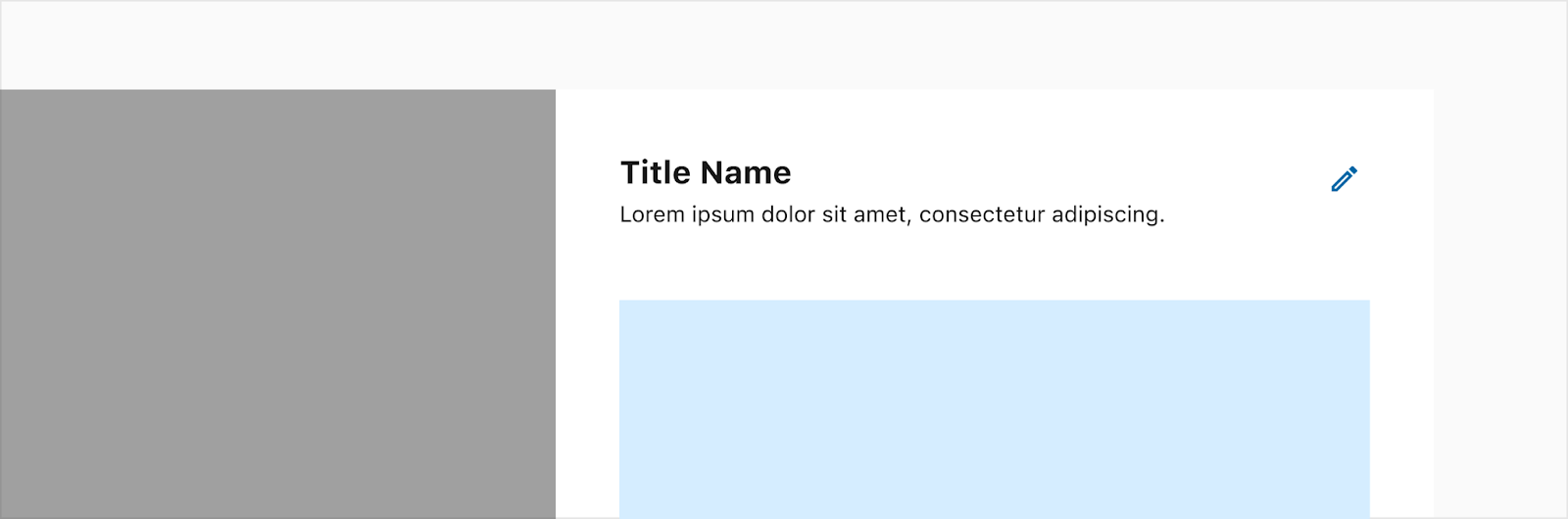
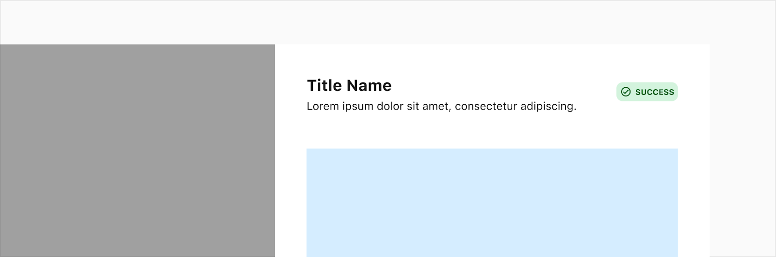
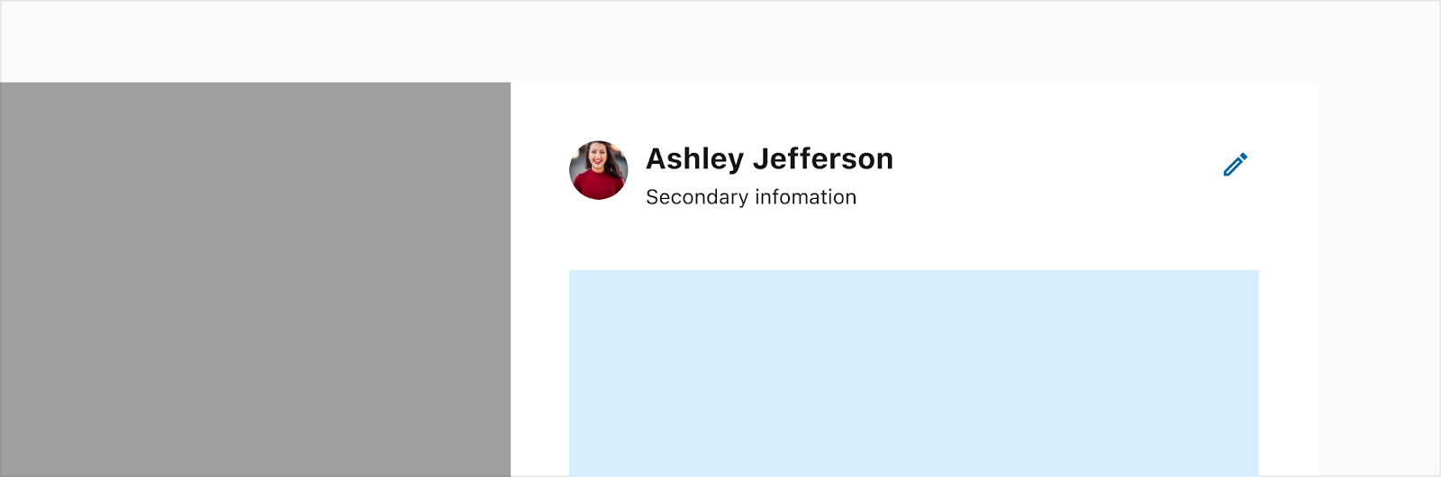
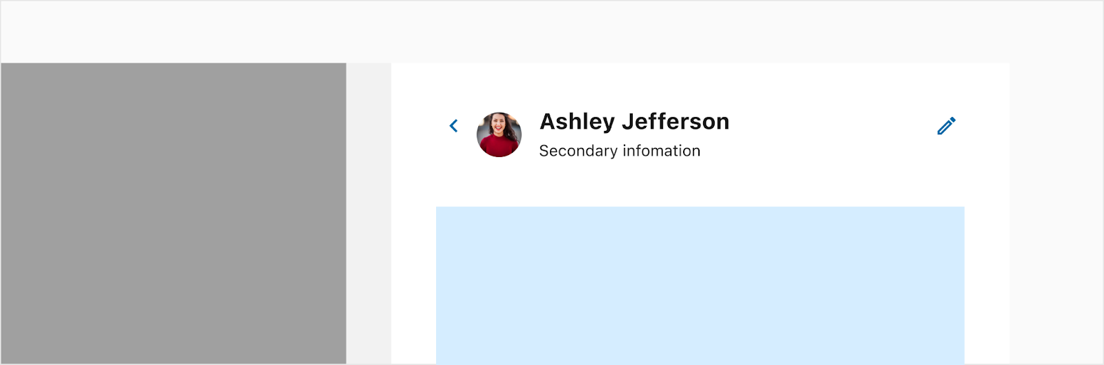
Header content examples
Just a few common header examples below to show how the slots may be utilized.
Description
Status

Profile
Placement
Desktop
Mobile


Developer Docs
Vue Developer DocsComponent documentation coming soon!