.png)
Table
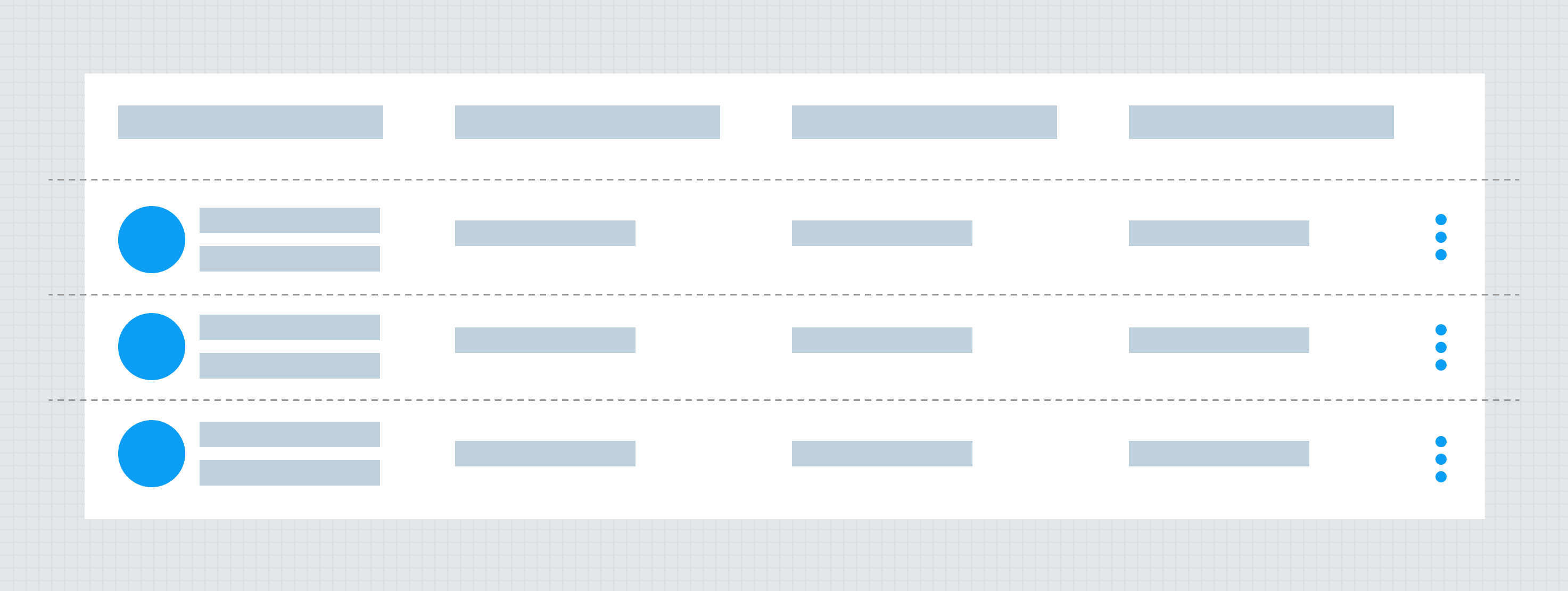
Tables will allow the user to view rows and columns of data presented to them. The table may allow the user to take actions for specific rows, edit or delete and download data.
Anatomy
Use of AG Grid
Alkami will utilize the AG Grid JavaScrip framework for displaying complex tables. Iris will provide the visual style, but all functionality will be driven by AG Grid. The documentation below should be used for design conventions and for styling. HTML <table> styling will still be available via Iris Vue, even with simple tables where the use of AG Grid would be overkill.
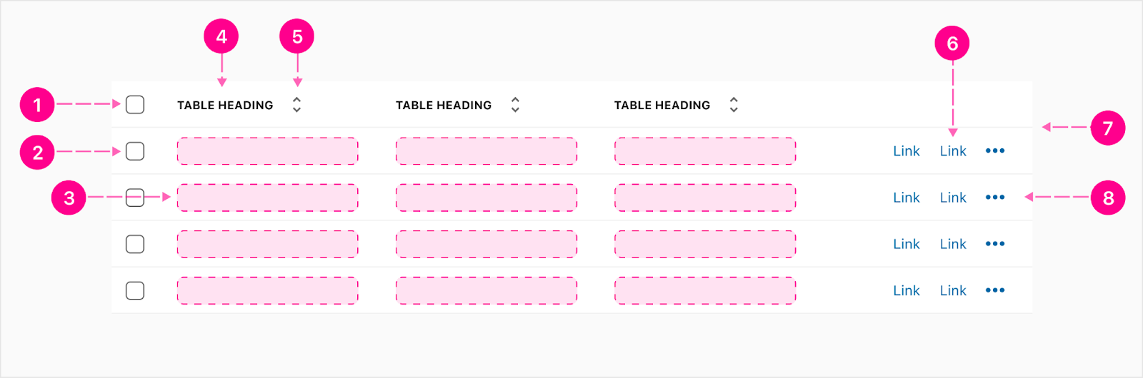
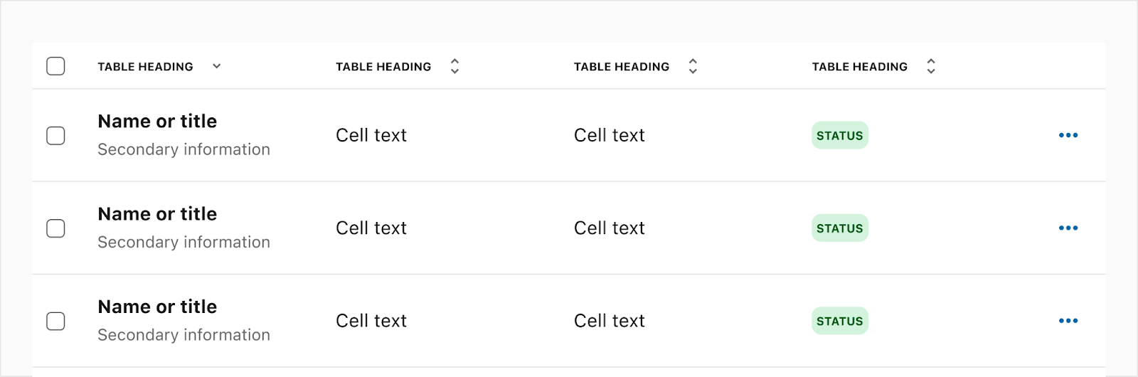
- Select all selector - Checkbox (Optional)
- Single row selector - Checkbox (Optional)
- Slot
- Heading - Overline (Optional)
- Sort - 24px Icon(Optional)
- Links - Compact button (Optional)
- Divider
- Overflow - Small No Emphasis QAB (Optional)
Alignment
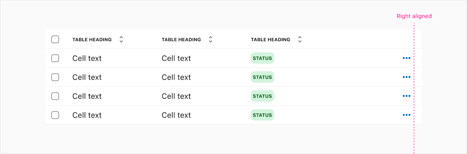
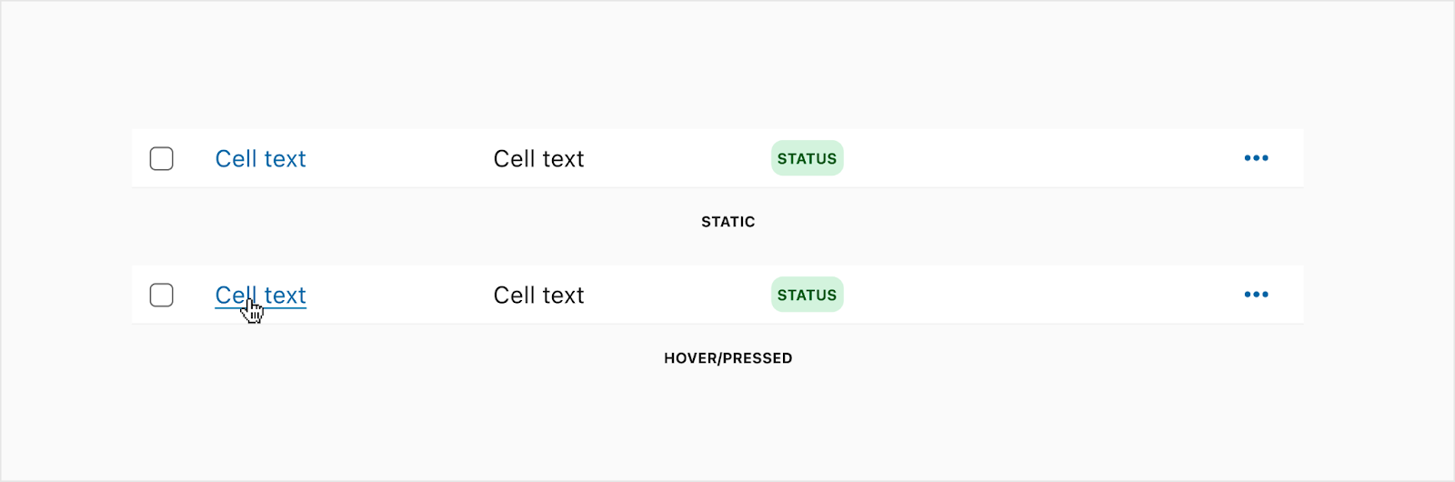
Content within the columns can either be left or right aligned. Most of the time, the content will be left aligned but there are times where it may need to be right aligned depending on the design. For example, the far right column with QAB actions are right aligned. Note: The table heading will follow the alignment of the column data.
Left aligned

Right aligned
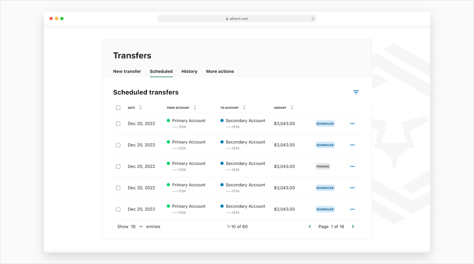
Pagination
Table pagination
The table pagination is used below tables and stretches the width of the table.
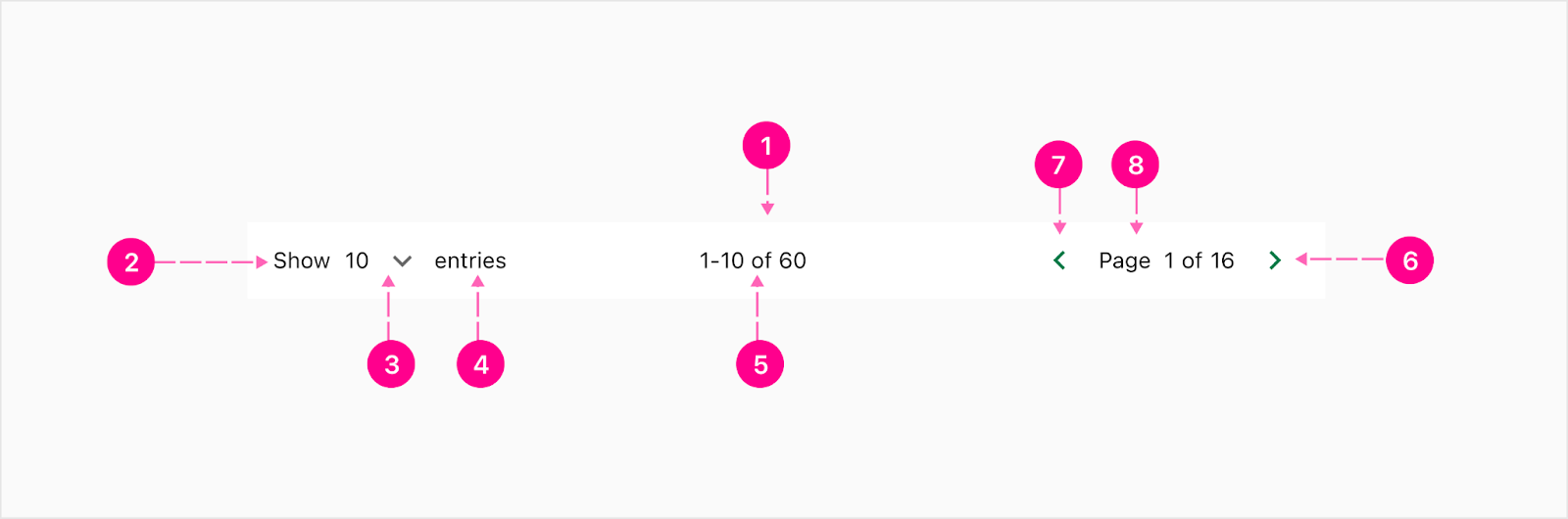
- Container
- Show label - Body 2
- Menu dropdown - Label (Body 2) and caret
- Entries - Body 2
- Total entries
- Backward - No emphasis quick action button
- Page numbers
- Forward - No emphasis quick action button
Load more button
This type of pagination is using a no emphasis button below a table to allow users to load more rows of the table. The user will continue to load more as they see fit.
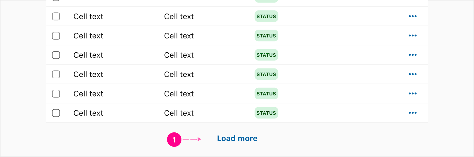
- Button - No Emphasis
Infinite scrolling
Infinite scrolling allows users to scroll the page and more rows will automatically appear below the previous rows. This will continue on till users scroll to the end of the table list.

- Loader - circle-Indeterminate-24
- Loading text - Body 1
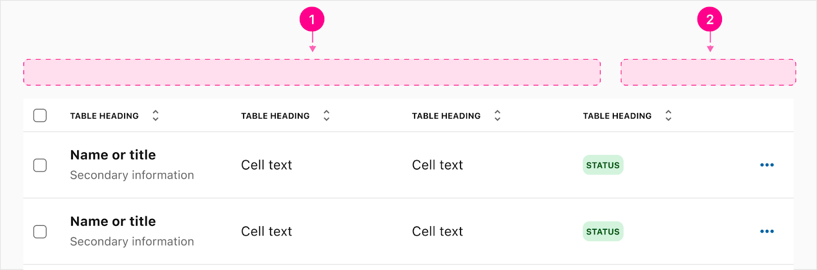
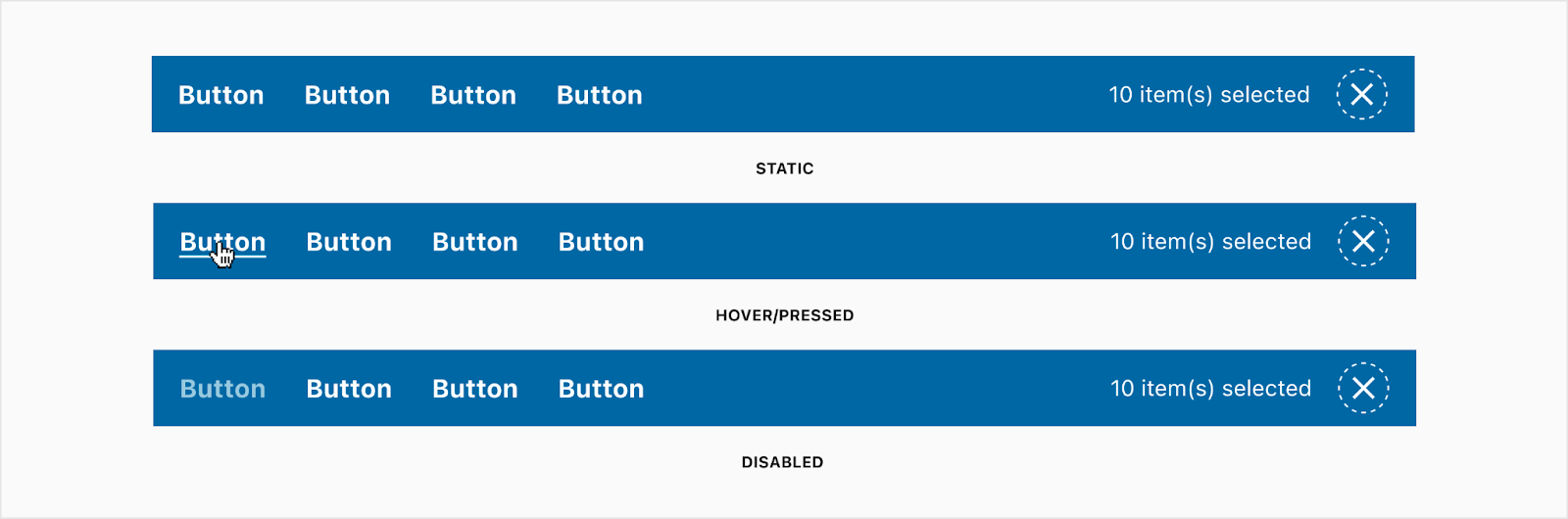
Bulk Action Bar
The bulk action bar will show when a row has been selected and a user can take actions against that row. The buttons inside of the bulk action bar will take on the same padding and spacing as the normal buttons but have a different color palette.
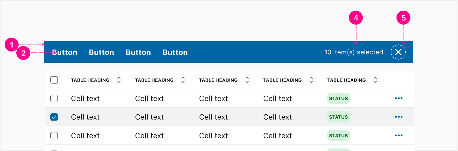
- Container
- Bulk action - Button text
- Items selected - Body 1
- Close - Small high emphasis quick action button
Action menu
An action menu is needed when there is an overflow of actions on the far right of the actions column. This will take on the style of our Iris 2 dropdown.
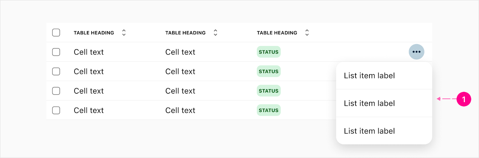
- Menu dropdown
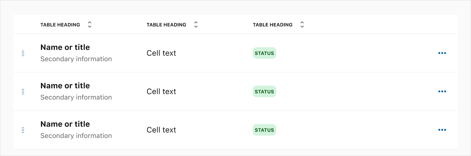
Row Reordering (Drag & Sort)
When row reordering is needed, this can be done by either moving the table into an edit view or it may be the main objective for the table and have the reordering surfaced. View how it works on AG Grid.

Row Sorting
Sorting from ascending or descending order is possible by clicking the headers of columns that have sorting enabled. View how it works on AG Grid.

Row Reordering
When row reordering is needed, this can be done by either moving the table into an edit view or it may be the main objective for the table and have the reordering surfaced. View how it works on AG Grid.
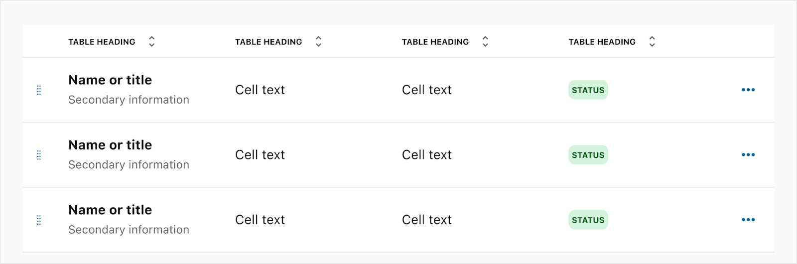
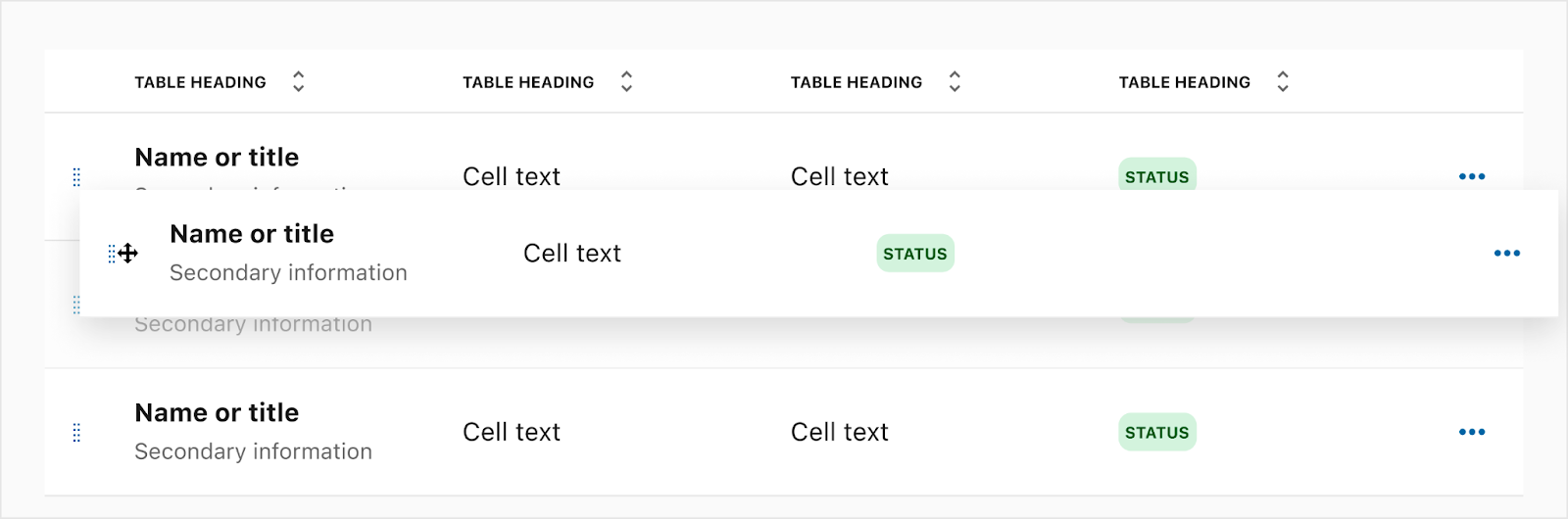
Table Header
The header for the table may be a title or use another component; for example switchboard. Actions for the entire table may be surfaced when needing to do an overall action. This can be done with either quick action buttons or regular buttons. For example, adding a new row of information, downloading table data, etc.
- Header - (Optional)
- Global Actions - (Optional)
Default Table Header
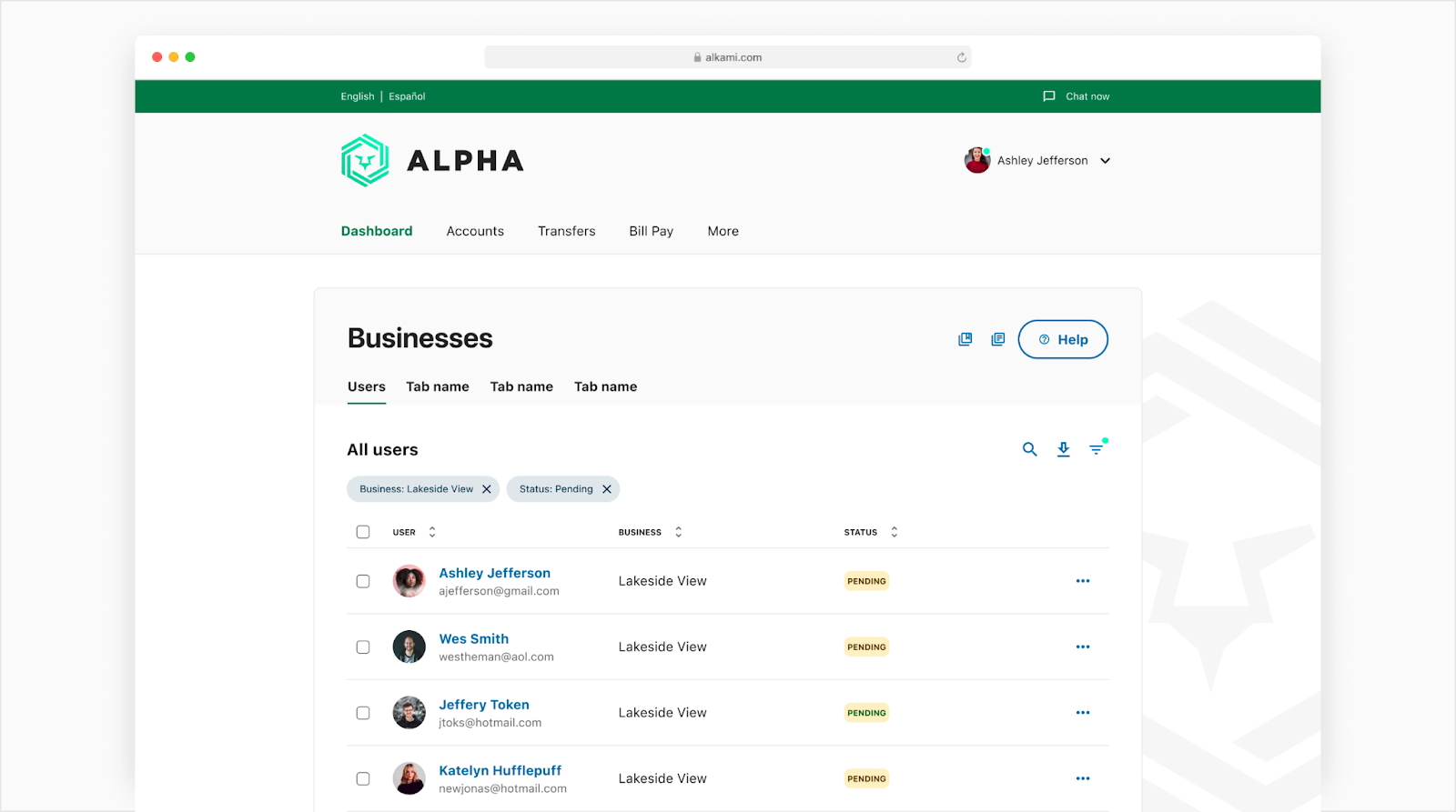
Below is an example of the default table header. This is a way to make sure there is a defined example for all widget teams to follow since this is the most commonly used table header.

- Heading - Small Heading (Optional)
- Expanding Search - Small No Emphasis QAB Expandable Search (Optional)
- Download - Small No Emphasis QAB (Optional)
- Filter - Small No Emphasis QAB (Optional)
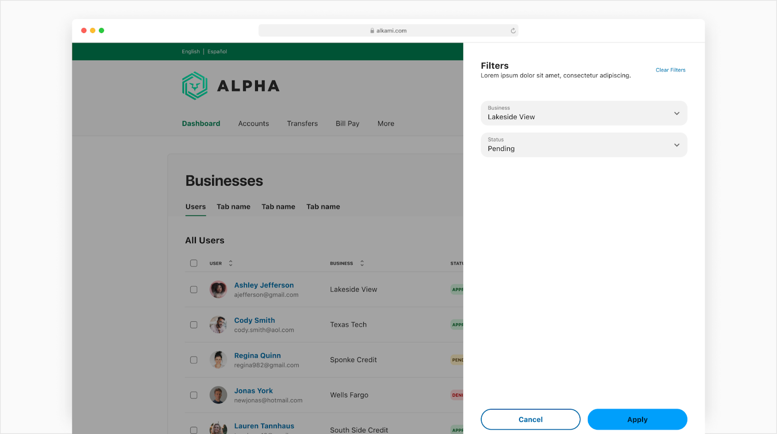
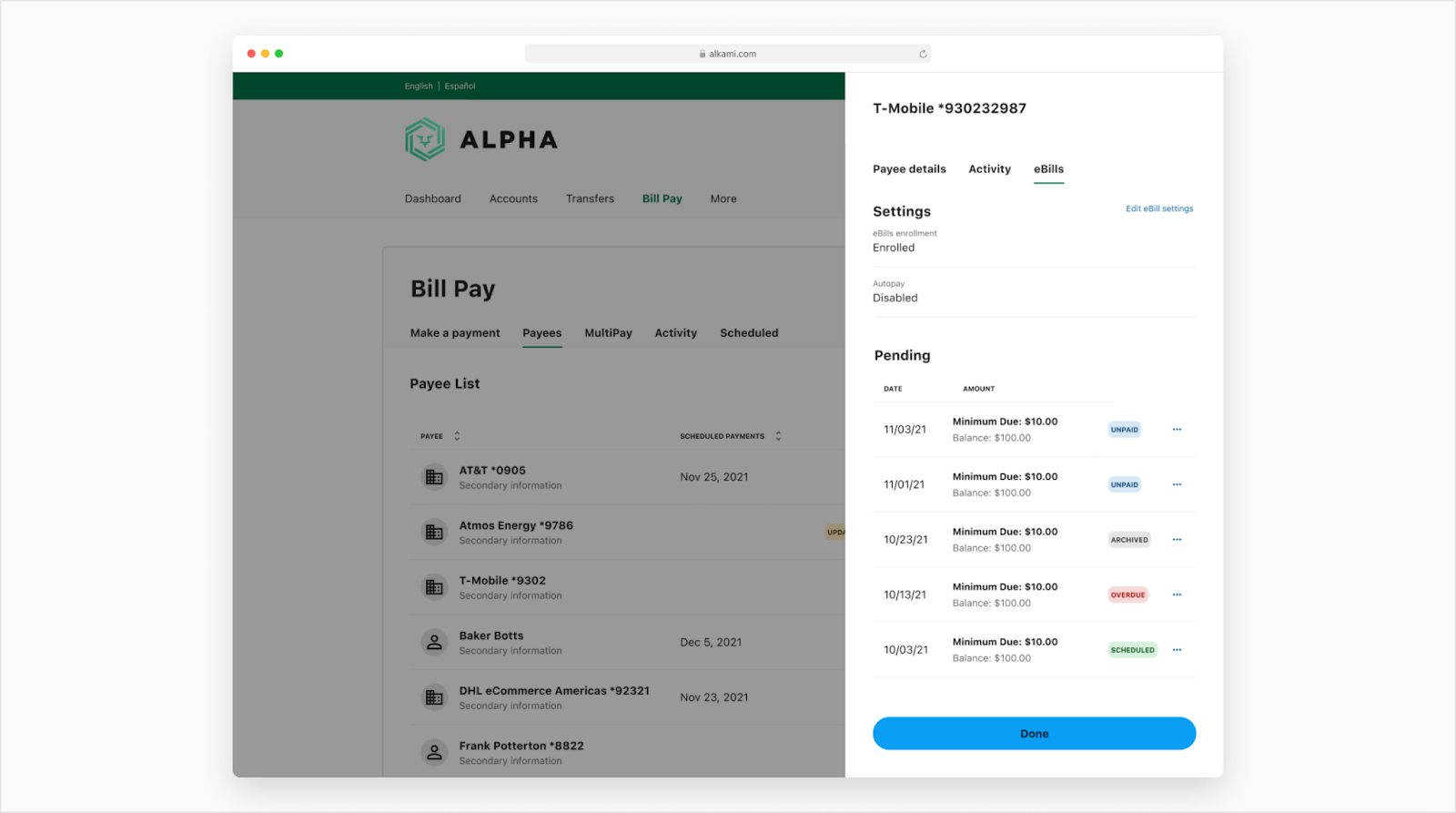
Applied filters
If a filter QAB is in the table header, the user can press the QAB and it would trigger a side sheet to show all the filters the user can apply. Once applied, chips would surface to the page with those filters and the QAB will surface a minimal badge to indicate filters have been applied.
Empty State
If a table has no data or has been filtered down to no results, it will need to show an empty state for the user. Note: The empty state is centered in the middle of the table container.
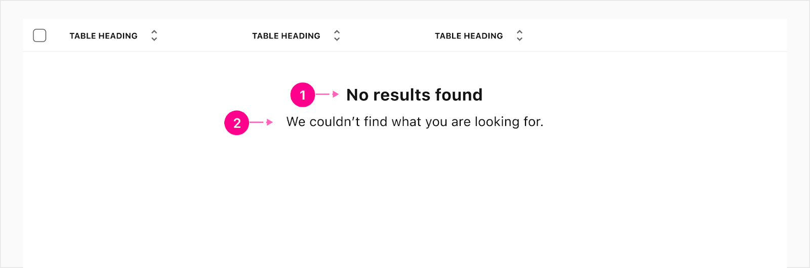
- Heading - Small Heading
- Subline - Body 1 (Optional)
Loader Overlay
The content within the table may need to load when the page has been launched or when rows have been updated/added by either changing the page or loading more from the pagination. The loader will be in the middle of the widget container height and a slight white scrim will be added over the content while loading new rows.
No Row Overlay
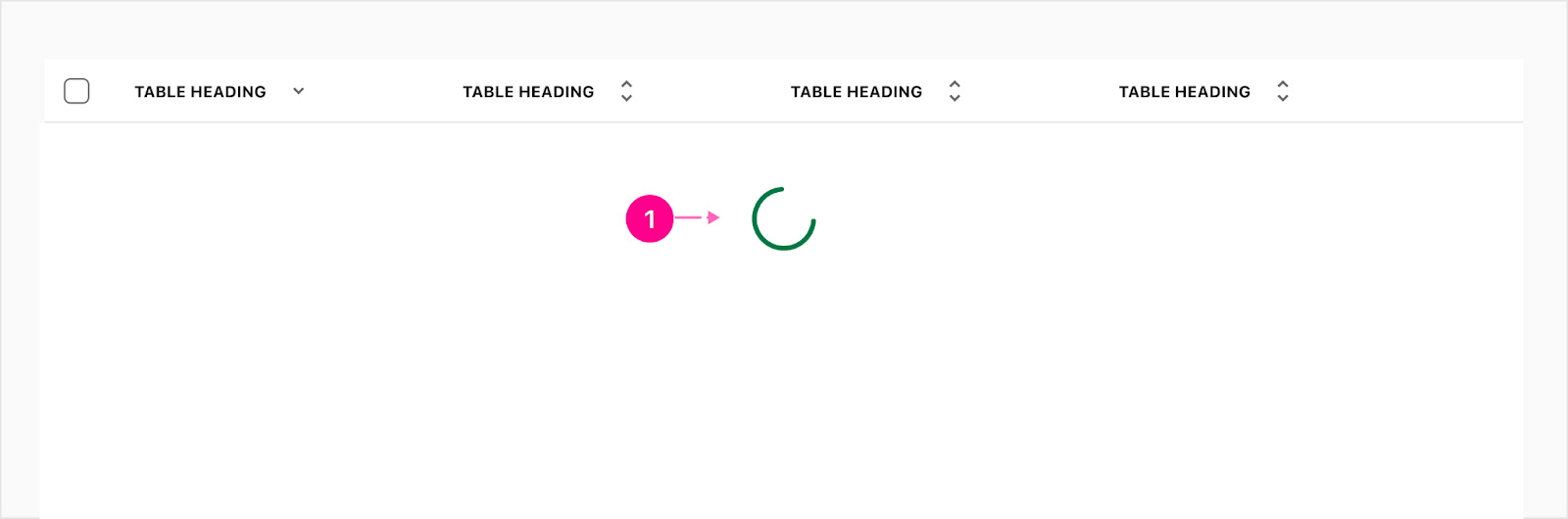
- Large intermediate progress circle indicator
Row Overlay
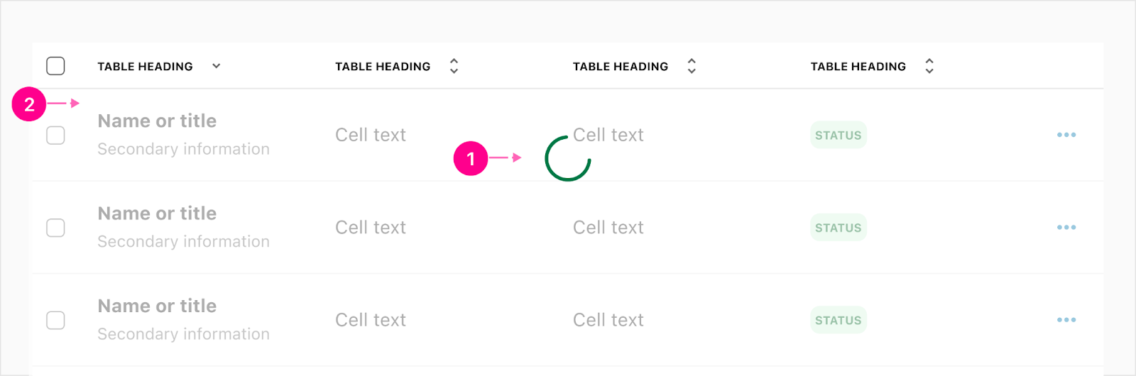
- Large intermediate progress circle indicator
- Scrim


States
Links
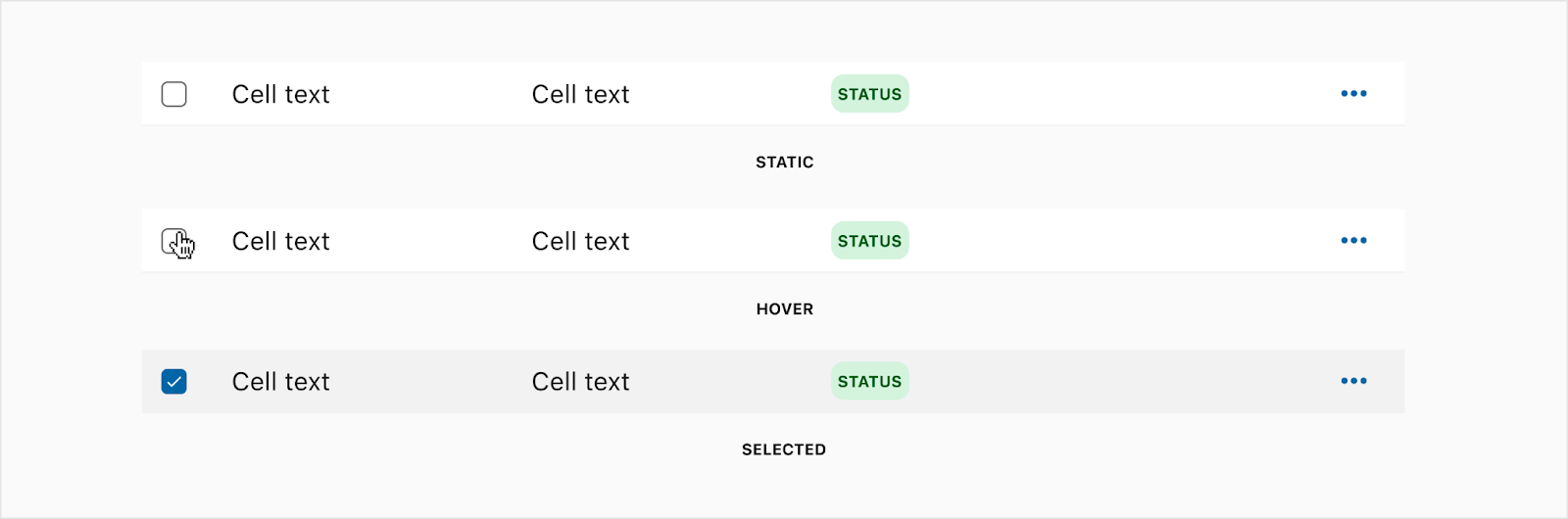
Selecting rows
Row Rearranging

Bulk action bar
Sorting

Placement
Bulk bar
The bulk bar will take over any filter chips within the table so the user cannot filter while in this mode. If there is a table header like a title or global actions then those will stay.

Auto Width
The table should take up the width of the container it is housed in and each cell, except the checkboxes, will stretch to fill that container width.
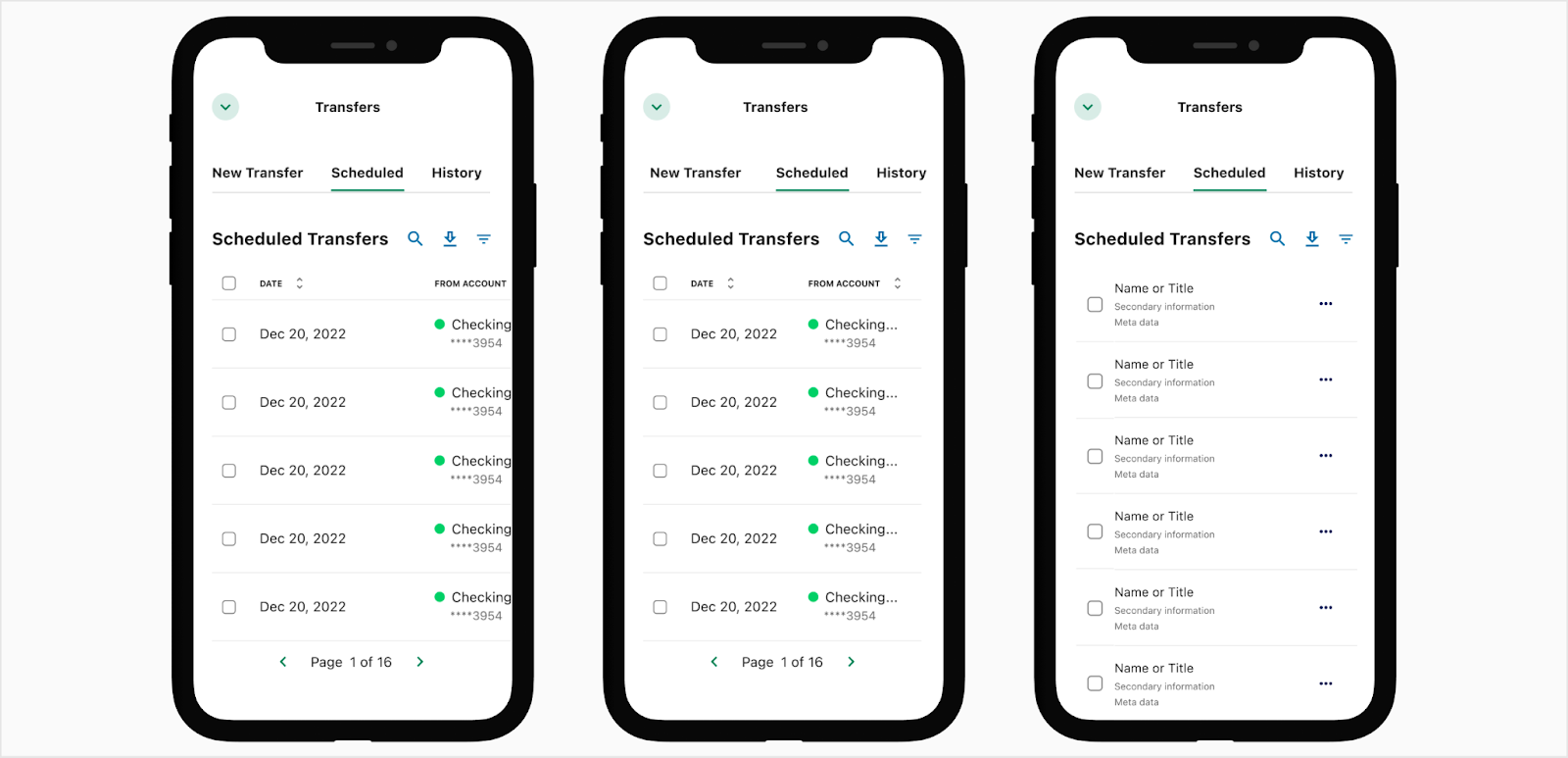
Responsive Web
There are three options for responsiveness; horizontal scrolling, resizing without a scroll, or list view which will just fit a few items within the table. The table header will shrink to fit the width of the container and the pagination will switch to just the page options. View how it works on AG Grid.
Developer Docs
Vue Developer DocsComponent documentation coming soon!