.png)
Progress Indicators
Progress indicators display the status of load times, processes, and user behaviors (such as savings goals or spending habits).
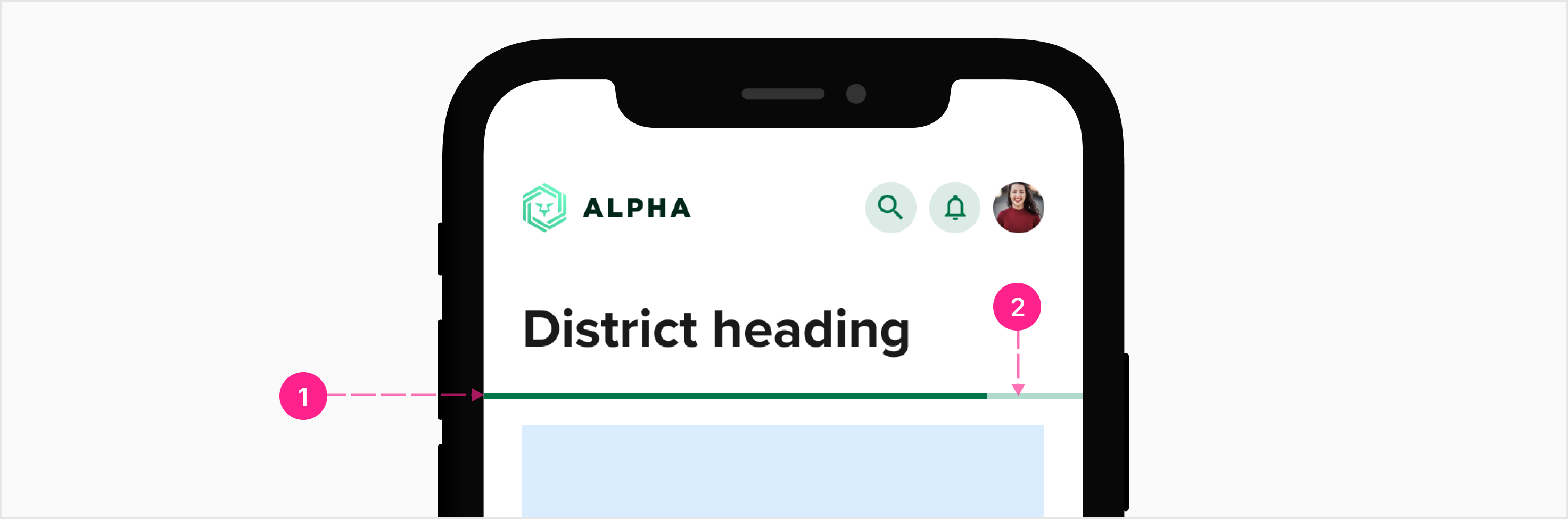
Anatomy

Progress indicators should be used wherever possible to inform the user of system status. Use the default animations when a loading experience is expected to be less than 10–15 seconds. When a loading experience is expected to take longer than 15 seconds, a custom indicator should be designed to make the experience as delightful and informative as possible. The progress indicator component is not considered to be a custom indicator.
Progress indicators appear in a wide variety of ways throughout the platform. In general, their uses can be split into two types of progress: Determinate and Indeterminate.
Determinate vs Indeterminate
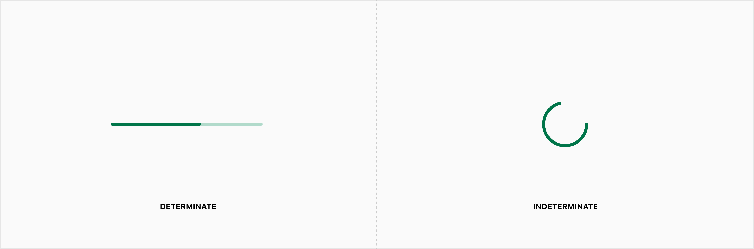
A process can be defined as determinate only if the end value (such as the length of time, size of download, etc.) is a known and fixed amount. A process is inherently indeterminate when the end value is unknown or varied. While indeterminate progression experiences generally describe that of a loading process, determinate progress indicators may be used to describe the time of a loading process, workflow, or user behavior (such as savings goals or spending habits).
Please note: Not all loading experiences use progress indicator component. Use the table below to determine the best loading experience for a variety of use cases.
Determinate
Determinate progress indicators may be used to display system status for loading, workflows, or user progress. When a determinate loading experience is expected to take longer than 10–15 seconds, include a time estimate. Determinate loaders come in three varieties: Bar, Circular, and Viewport.
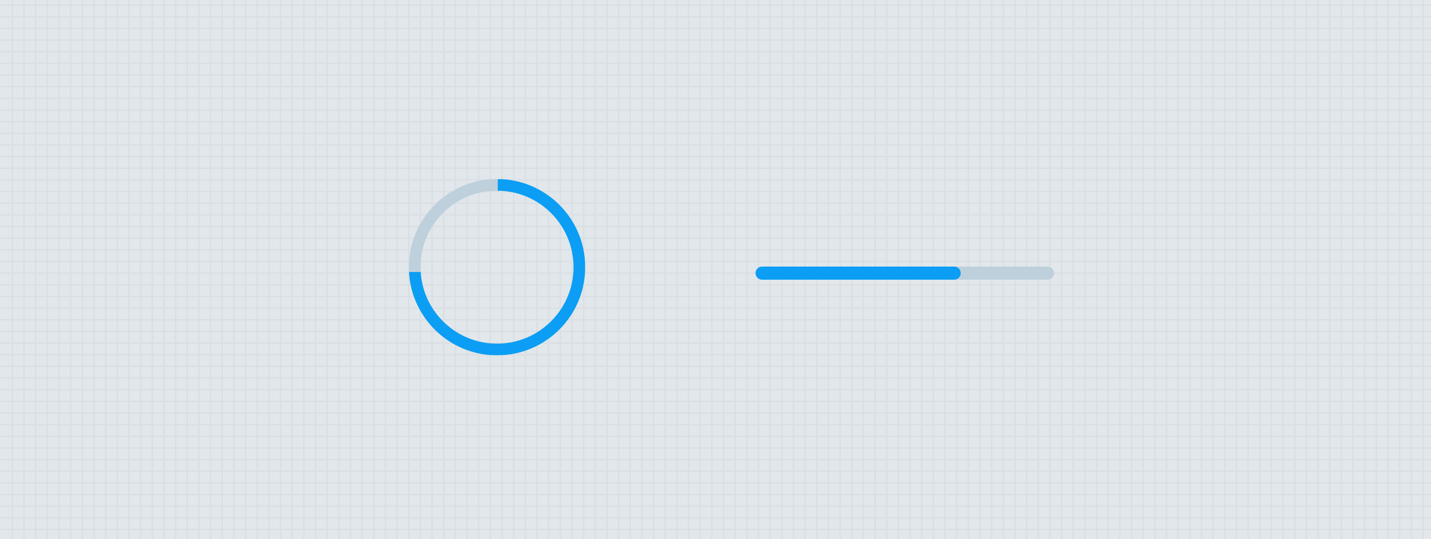
Bar
Determinate bar comes in two layouts, each utilizing a track/indicator. Both layouts should support multi-tracking within the bar. Multitracking allows one bar to visualize the progress of multiple items, generally shown as percentages of a whole. When multitracking is enabled, each indicator should utilize a distinct color token. When multitracking is enabled, the percentage label should not be used. Use a legend to help users understand the meaning of each indicator if the context does not adequately describe the colors.

- Indicator(s)
- Track
Stacked
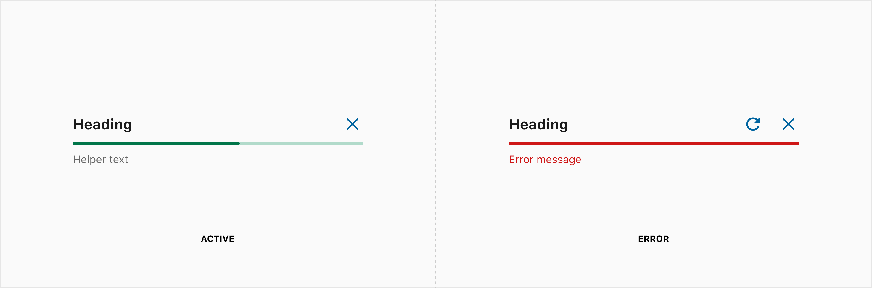
The stacked bar loader includes additional items to support previewing the loading process of a single item within a list. This loader may encounter an error state and swap the helper text to error messaging. Note: The quick action button extension should only show the retry quick action button until an error occurs. For more information, see states below.
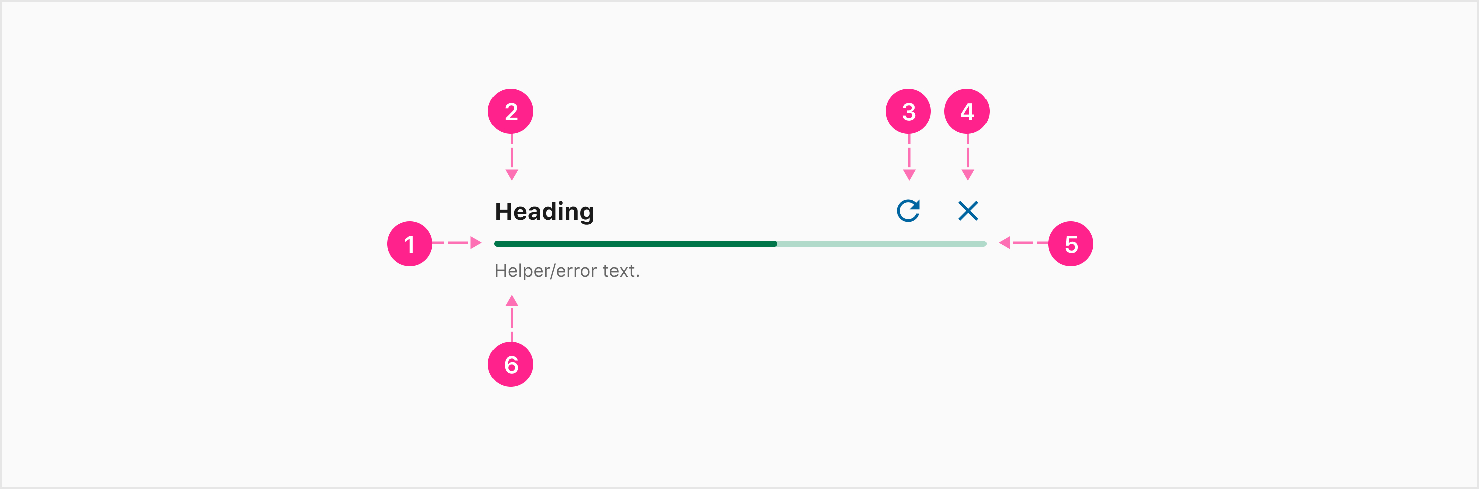
- Indicator(s)
- Heading — Subtitle 1 (Optional)
- Retry action — small no emphasis quick action button (Optional)
- Cancel action — small no emphasis quick action button (Optional)
- Track
- Helper/error text (Optional)
Inline
The inline determinate bar may commonly be used without any labels.
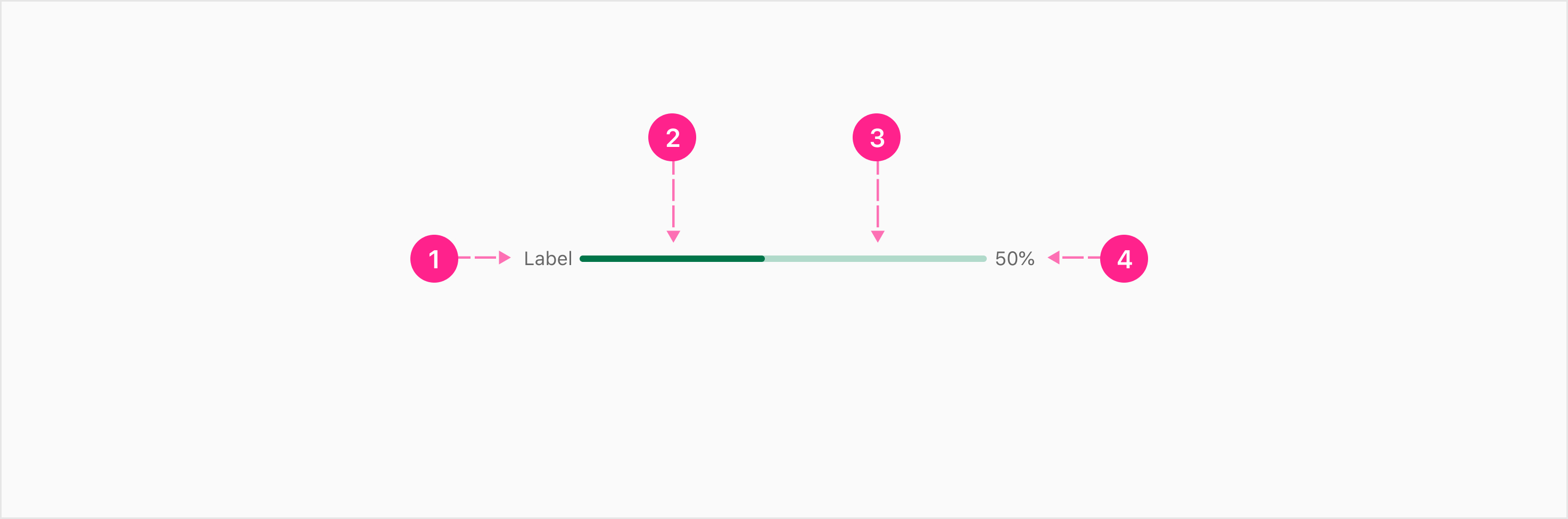
- Label — Caption (Optional)
- Indicator(s)
- Track
- Percentage — Caption (Optional)
Circular
The circular determinate progress indicator fills clockwise starting at the top-center point of the circle.

- Indicator
- Track
Viewport
The viewport determinate loader may be used to signify the loading process of a user interaction that does not occur within an affordance. This progress indicator moves linearly from left to right signifying the processing from 0–100%. Viewport loaders span the width of a context. The progress indicator is pinned to the bottom of the top bar (if a top bar is present). This progress indicator is not affected by shape theming. Note: Viewpoint is for flutter only.
- Indicator
- Track
Indeterminate
Indeterminate progress indicators are primarily used to indicate system loading as the result of a user interaction. Indeterminate loaders are best used within affordances (such as a button, text field, or quick action button) to provide feedback for user interaction. Do not ever display more than one indeterminate “spinners” at a single time within a view. Indeterminate progress indicators come in two varieties: Circular and Viewport.
Circular
The circular indeterminate progress indicator often appears within an avatar as part of another interactive organism (e.g. button, chip, cloaked checkmark, etc.). Avoid displaying two of these at a time. This loader should never be used to display the loading of a new page. Instead, it is better to use skeleton states to load content as it becomes available, allowing users to engage with the page content quicker. When the load process will likely take more than 7 seconds, consider using the confirmation activity loaders with an estimate or process description description.

- Indicator
Viewport
The viewport determinate loader may be used to signify the loading process of a user interaction that does not occur within an affordance. This loader may be implemented using the Lottie files documented below. The animation features a cycling, non-linear movement of the indicator to signify indeterminate processing. Viewport loaders span the width of a context. The progress indicator is pinned to the bottom of the top bar (if a top bar is present). This progress indicator is not affected by shape theming. Note: Viewpoint is for flutter only.

- Indicator
- Track


States
While most progress indicators do not require consideration for states, determinate bar loaders will commonly be used in scenarios where errors may occur. For that reason, an error state has been defined, replacing the helper text with error messaging.


Placement
With the exception of the viewport variants, all progress indicators should be placed adjacent to the content they describe. When an affordance triggers an indeterminate loader, the loader should be positioned as or replace the trailing icon. When any progress indicator is used as the only content on a screen, it should be placed in the center of the context.
Never use an indeterminate loader to show a page is loading. Instead, use skeleton states on the atoms to reduce cognitive load as items load in.


Developer Docs
Vue Developer DocsComponent documentation coming soon!