.png)
Chip
Chips allow users to perform a variety of actions throughout the platform while utilizing a low-emphasis, compact design. Chips represent actions, inputs, and selections.
Anatomy
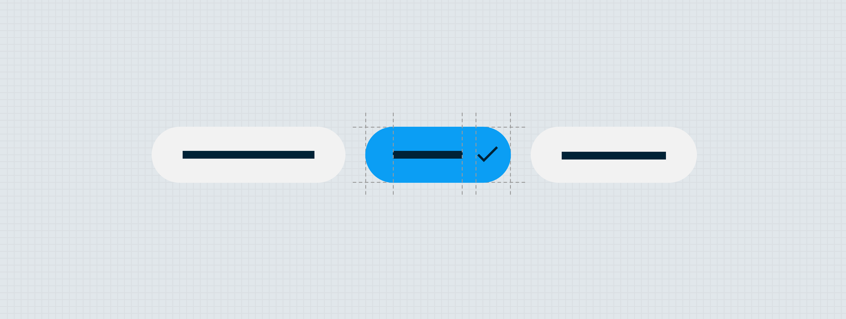
The chip component is made up of a surface, a label, an optional leading icon (Avatar), and an optional trailing icon (Avatar or Quick Action Button). Chips come in four variants: selection chip, action chip, add chip, and the input chip.
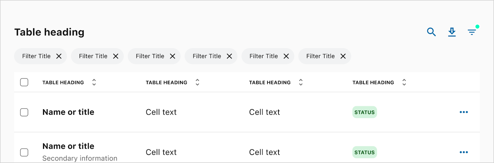
Selection chip
The selection chip behaves in many ways identically to the traditional radio button or checkbox; allowing an either-or selection, or a multi-select from a list of chips. Once a selection is made, the trailing icon appears to provide an additional layer of system feedback.

- Surface/container
- Leading icon — Avatar (optional)
- Label — Caption
- Trailing icon — Avatar
Action chip
The action chip behaves in many ways identically to the traditional button, allowing a way for the user to initiate an action or flow. Once a selection is made, the action is immediately initiated. The action chip is meant to be a “no emphasis” level CTA.

- Surface/container
- Leading icon — X-small Avatar (optional)
- Label — Caption
- Trailing Icon - X-small Avatar (optional)
Trailing icon — X-small Avatar (optional)
Add chip
The add chip behaves similarly to the action chip but has distinct on/off states similar to the selection chip. These states allow a user to add and remove items from the UI, including other chips or input fields.

- Surface/container
- Leading icon — Avatar (optional)
- Label — Caption
- Quick action button
Input chip
The input chip behaves similarly to text fields, allowing a user to generate a unique input within a group of selection chips. For these chips, the trailing quick action button can be used to edit, confirm/submit the input, or delete chip. The trailing quick action button may change depending on the state to provide various interactions in one compact design.

- Surface/container
- Leading icon — Avatar (optional)
- Text input / Label — Caption
- Quick action button (optional)
Chip groups
Chips often appear in groups. Depending on the context, chip groups may horizontally scroll/swipe or wrap. Chip groups can be either single-select or multi-select depending on the use case.
Scrollable/swipeable
Chip groups should be set to scroll/swipe in most cases. Specifically, scrollable/swipeable chip groups are best when it is not necessary to see all of the available chips at one time. Swipeable chip groups should always align to the left edge of the parent container, and overflow off the right side of the screen.
To ensure that the first chip in the chip group aligns to the rest of the content within the context, scrollable chip groups include an optional leading alignment spacer. This spacer may be sized according to the context using any of our systems spacing tokens, with a default spacing of Base. The leading alignment spacer should always be set to match the invisible keyline of the content above or below.
The optional leading quick action button may be set to Scroll or Anchored. When set to anchored, the quick action button will not move when a user swipes—instead the chips will scale and fade to indicate that they are being scrolled beneath the quick action button (see Behavior) below.
Unique anchored behaviors
When a new chip is created using the anchored quick action button, the new chip will appear immediately next to the quick action button as either the first or last chip in the group. If the user has swiped the chip group, and the beginning or end is no longer visible, the group will automatically scroll to the beginning or end to reveal the newly added chip.
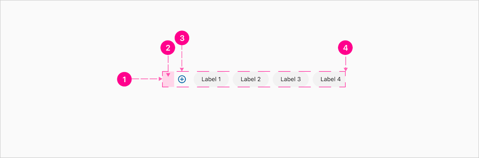
- Scrollable/swipeable chip group container
- Leading alignment spacer (Optional)
- Leading or trailing quick action button (Optional)
- Trailing alignment spacer (Optional) (not shown above)
Wrapping
Chip groups should be set to wrap when it is necessary to see all, or most, of the available chips at one time. Whenever a wrapping chip group is likely to exceed three full lines, the group may be appended with a“View more” action chip. The purpose of this extension is to give the user an option to expand a chip group to reveal more available actions. After the group has been expanded, the appended chip should change to a “View less” action chip.
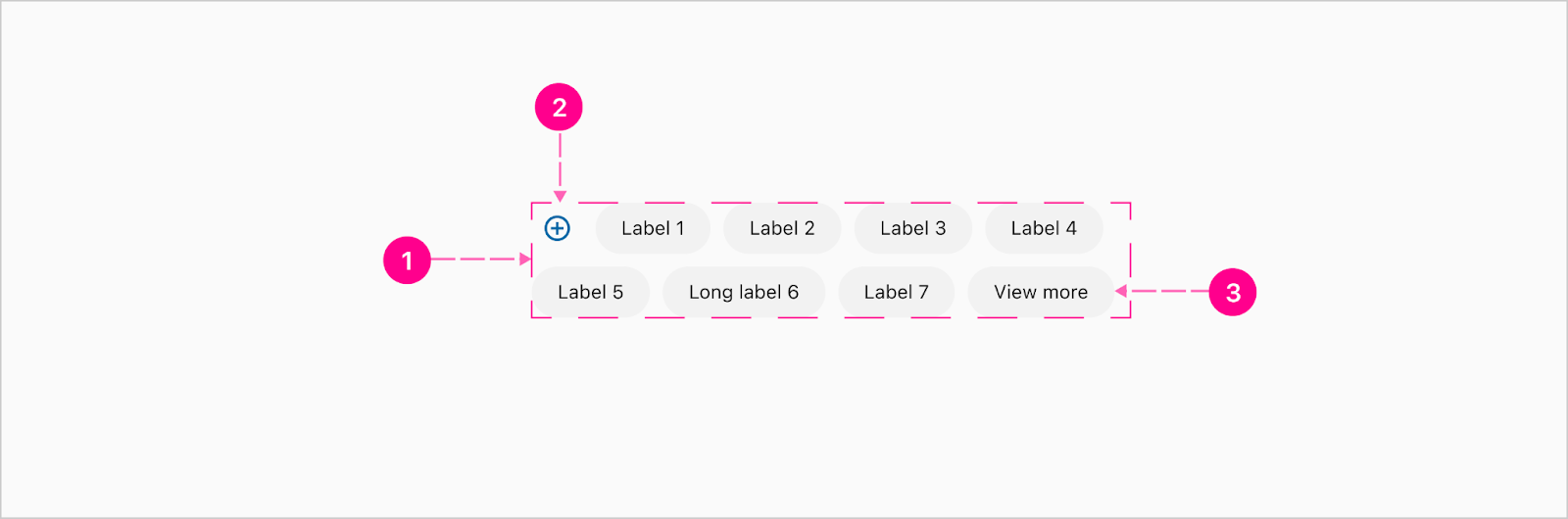
- Wrapping chip group container
- Leading or trailing quick action button (Optional)
- Appended “View more” or “View less” chip (Optional)


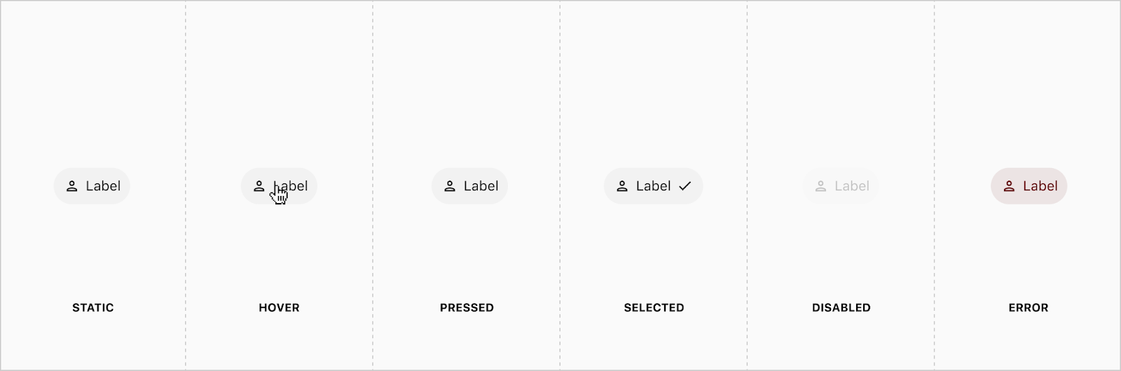
States
Placement
Chips and chip groups should always be aligned according to the rest of the content in the area, reinforcing the overall alignment framework of the context. In most cases, this will mean that chips and chip groups should be left-aligned so as to reinforce the primary keyline.


Developer Docs
Vue Developer DocsComponent documentation coming soon!