.png)
Display Text Field
The Display Text Field is a high emphasis text field used to capture short inputs. Common uses for the Display Text Field include inputting custom amounts and validating with short alphanumeric codes (in MFA experiences for example). The Display Text Field should only ever be used when the content is the most important element on the screen. As opposed to the Text Field, the Display Text Field is designed primarily for immersive experiences, and should adapt to the background surface it sits on. As such, there are less theming options, assuming that the context will already be themed.
Anatomy
A Display Text Field comes in two variants: Currency and Alpha-numeric. Alpha-numeric Display Text Fields may either be Specified or Unspecified (see below). Both variants allow for left-alignment or centered-alignment depending on the context.
Currency
As an expansion on the Currency Text Field, this Display Text Field is used for inputting and editing currency values.

- Currency prefix - Display
- Input value - Display
- Active indicator (optional)
- Error Quick Action Button (optional)
- Error text - Caption (optional)
- Helper Quick Action Button (optional)
- Helper text - Caption (optional)
Note: When the underline is set to off, the static Display Text Field must display a value so that the component provides adequate affordance.
Currencies in Iris

The Display Text Field shares all of the standard currency elements as other currency fields within Iris.
- Currency prefix
- Comma delimiter
- Value (all nth places, not just ones)
- Cent amount (optionally automatically placed)
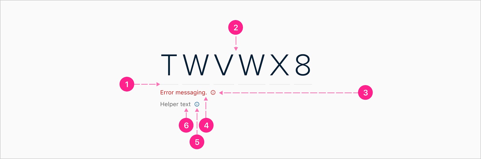
Alpha-numeric
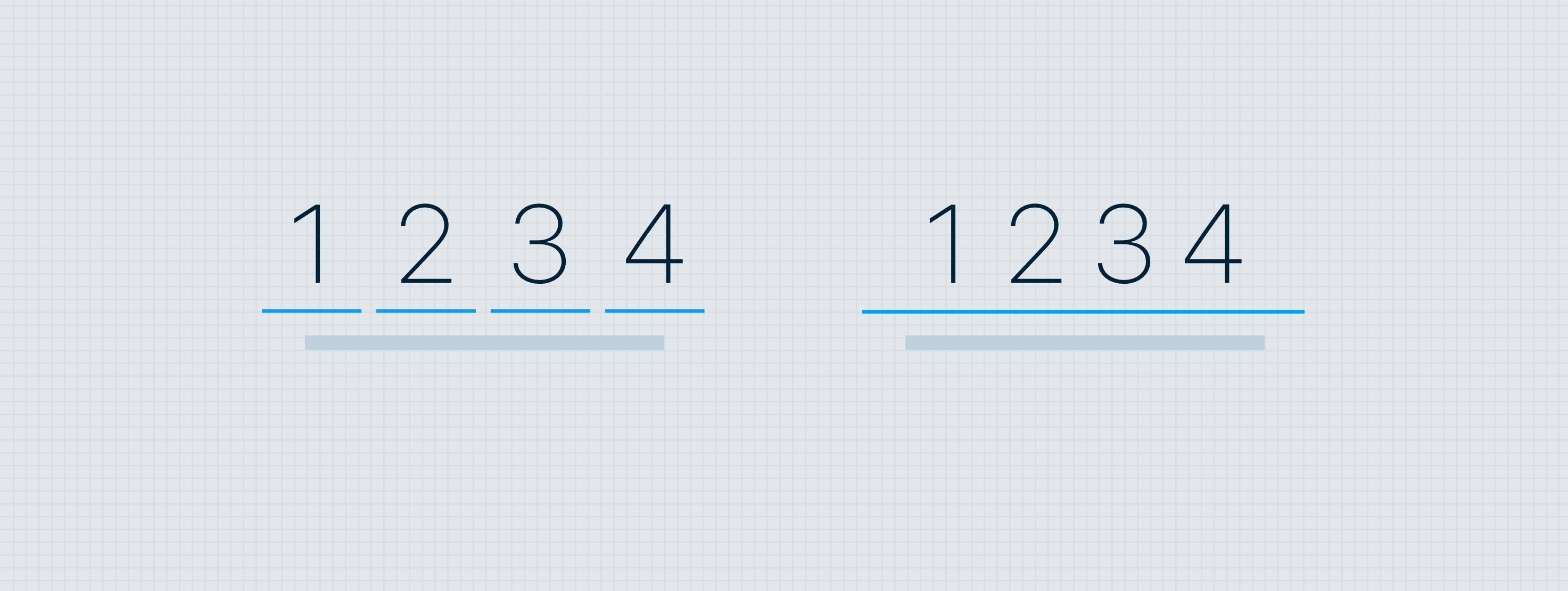
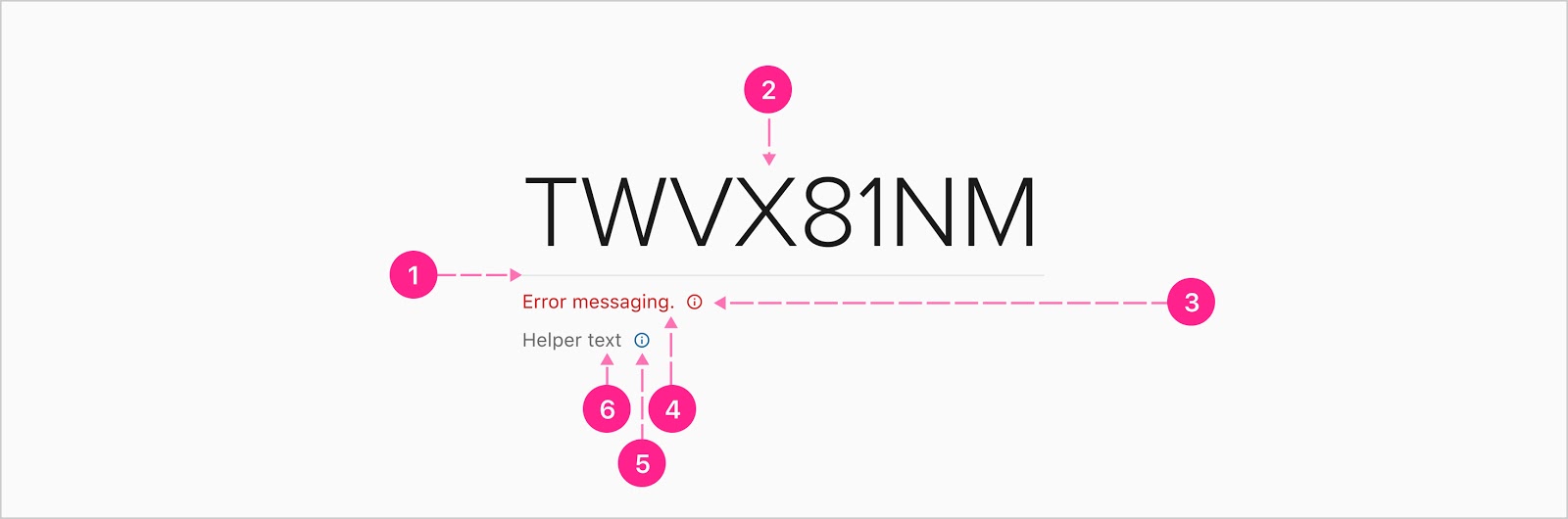
The alpha-numeric Display Text Field can be used for entering short strings. If an alpha-numeric input will be more than 8 characters long, do not use a display text field. Instead, you should use a standard text field. There are two distinct styles for the alpha-numeric display text field: specified and unspecified. When the exact character count of an input is known, it is best to use the specified variant. This will give users a better sense for what the system requires. When the exact character count is unknown or variable, use the unspecified variant.
Specified
- Active indicators
- Input value - Display
- Error Quick Action Button (optional)
- Error text - Caption (optional)
- Helper Quick Action Button (optional)
- Helper text - Caption (optional)
Unspecified
- Active indicator
- Input value - Display
- Error Quick Action Button (optional)
- Error text - Caption (optional)
- Helper Quick Action Button (optional)
- Helper text - Caption (optional)


States
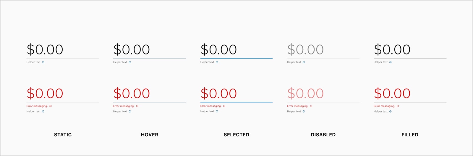
- Static
- Hover
- Selected
- Disabled
- Filled
- Success (alpha-numeric only)

Placement
Left aligned

Generally speaking, the Display Text Field should be left aligned to the rest of the content within its context.
Centered

In some cases, the page may feel more balanced and cohesive if the centered version of the Display Text Field is used. Take care not to enforce center alignment when it conflicts alignment patterns for the rest of the elements on a page.


Developer Docs
Vue Developer DocsComponent documentation coming soon!