.png)
Card
Cards are interactive containers that can be static, dismissed off screen, or even used as a full screen surface to create new context. Cards are used to display information within the entire surface. It may have different styling depending on the emphasis needed. The card can be styled to have either a raised surface. flat or stroke outline. Cards may also need an image along with content in a secondary region. The position of the image may be on the top or on the left side of the card.
Anatomy
Cards are used to display information within the entire surface. It may have different styling depending on the emphasis needed. The card can be styled to have either a raised surface. flat or stroke outline. Cards may also need an image along with content in a secondary region. The position of the image may be on the top or on the left side of the card.
High Emphasis Surface
High emphasis cards take on any background color that is different from white. The default color is the Branded Affordance color. Content on top of the card needs to be able to pass accessibility and uses an On color to make sure black or white content passes on the surface. The card can be on a raised surface or flat surface.

Low Emphasis Surface
The card can be on a raised surface or flat surface. If using the flat surface, it should be on another background color other than white.
.jpg)
Outlined Surface
The card can be on a raised surface or flat surface.
.jpg)
Image Surface
Image cards can be on a raised surface, flat or outlined surface.
.jpg)
Content Slot
The content slot contains 1 slot for everything within the card. The width of the card fills the screen size and height depends on the content inside.
.jpg)
- Surface - High Emphasis, Low Emphasis, Outlined or Image
- Content Slot (Optional)
Standard Slots
The standards slot contains 3 slots for a title, actions and body content. The width of the card fills the screen size and height depends on the content inside.
.jpg)
- Title Slot (Optional)
- Action Slot (Optional)
- Content Slot (Optional)
- Surface - High Emphasis, Low Emphasis, Outlined or Image
Regions
Cards can be split into two regions; horizontally or vertically. The split can happen anywhere within the card. No set width or height and the content inside will be defined by design.
Horizontally Split Region
Each region can have all the standard slots or just the content slot. If there is an image or background color, it will bleed to the edges of its region.
.jpg)
- Horizontal Region - Content Slot or Standard Slots
- Surface - High Emphasis, Low Emphasis, Outlined or Image
- Horizontal Region- Content Slot or Standard Slots
- Surface - High Emphasis, Low Emphasis, Outlined or Image
Vertically Split Region
Each region can have all the standard slots or just the content slot. If there is an image or background color, it will bleed to the edges of its region.
.jpg)
- Vertical Region - Content Slot or Standard Slots
- Surface - High Emphasis, Low Emphasis, Outlined or Image
- Vertical Region - Content Slot or Standard Slots
- Surface - High Emphasis, Low Emphasis, Outlined or Image
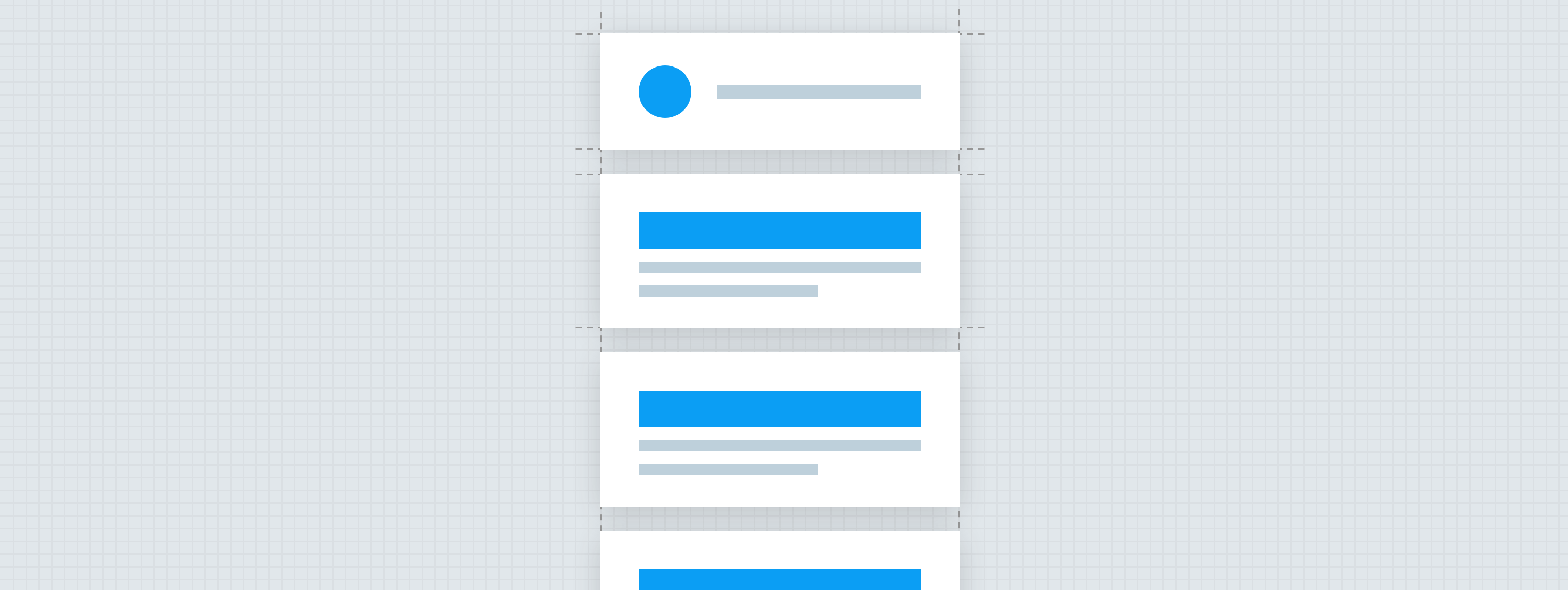
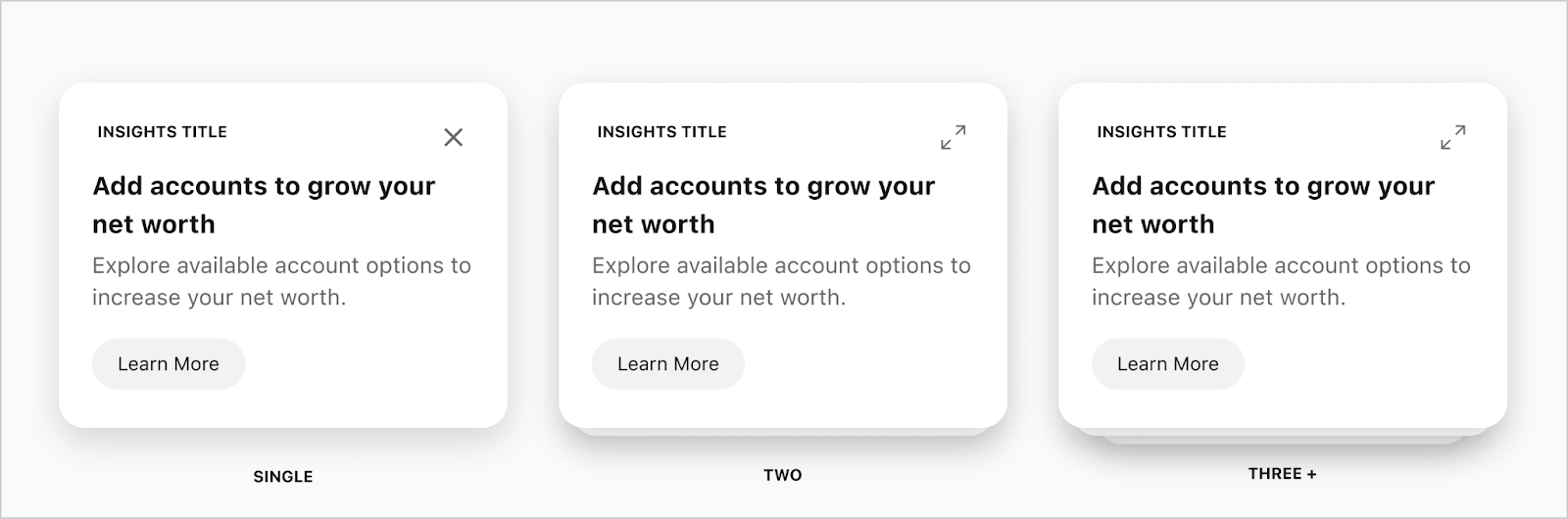
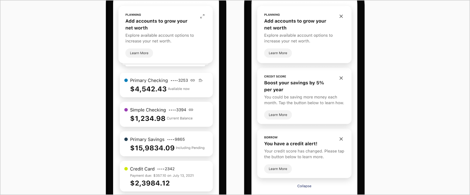
Card Stacks
Standard Slots
The width of the card fills the screen size, and height depends on the content inside. The height of the stacked group will be based on the first card in the group. Note: All cards in the stack should have identical styles. Do NOT show edge to edge images in the cards when they are under the main stack.
- Surface
- Slot - Content or Standard Slots
- Stack for 2 Cards
- Stack for 3+ Cards
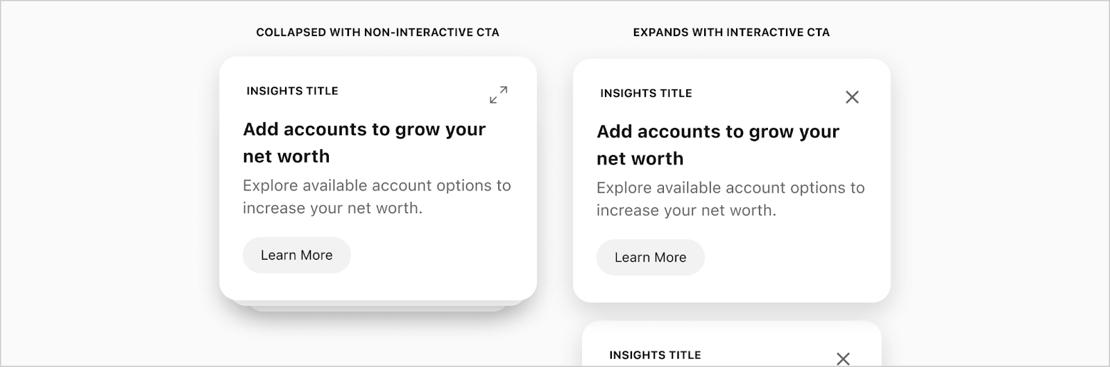
Expanded Stacked Card
When the cards expand, there will be a collapse button at the bottom for the user to close the grouping again. If the cards in the stack have a region set to hide in a collapsed stack, they will then be shown at this point.
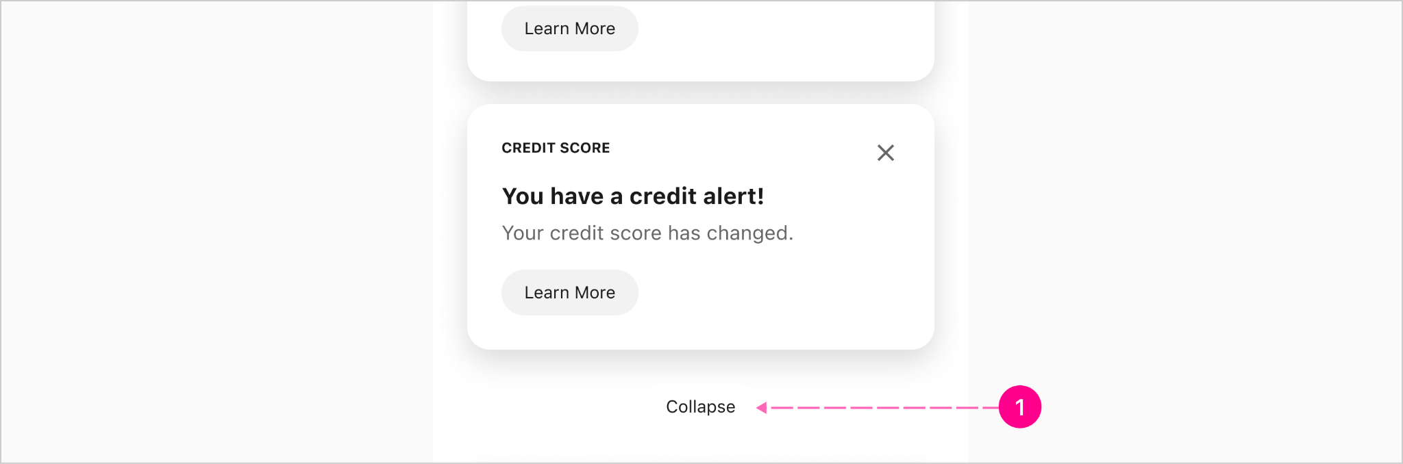
- Custom Button (See specs and spacing)
Tile Template
Tile (High Emphasis)
The width of the card depends on the design and has a fixed height of 152px. The icon and text colors will automatically go black or white depending on the background color.

- Surface - Raised High Emphasis
- Icon —Small Avatar
- Title — Subtitle 1
- Subline — Caption
Tile (Background Image)
The width of the card depends on the design and has a fixed height of 152px. The icon and text colors will depend on the person creating the tile with an image to make sure the text will pass accessibility depending on the image used.

- Surface - Raised Image
- Icon —Small Avatar
- Title — Subtitle 1
- Subline — Caption
Tile (Medium Emphasis)
The width of the card depends on the design and has a fixed height of 152px.

- Surface - Raised Medium Emphasis
- Icon — Small Avatar
- Title — Subtitle 1
- Subline — Caption
Tile (Low Emphasis)
The width of the card depends on the design and has a fixed height of 152px.

- Surface - Flat Outlined
- Icon — Small Avatar
- Title — Subtitle 1
- Subline — Caption
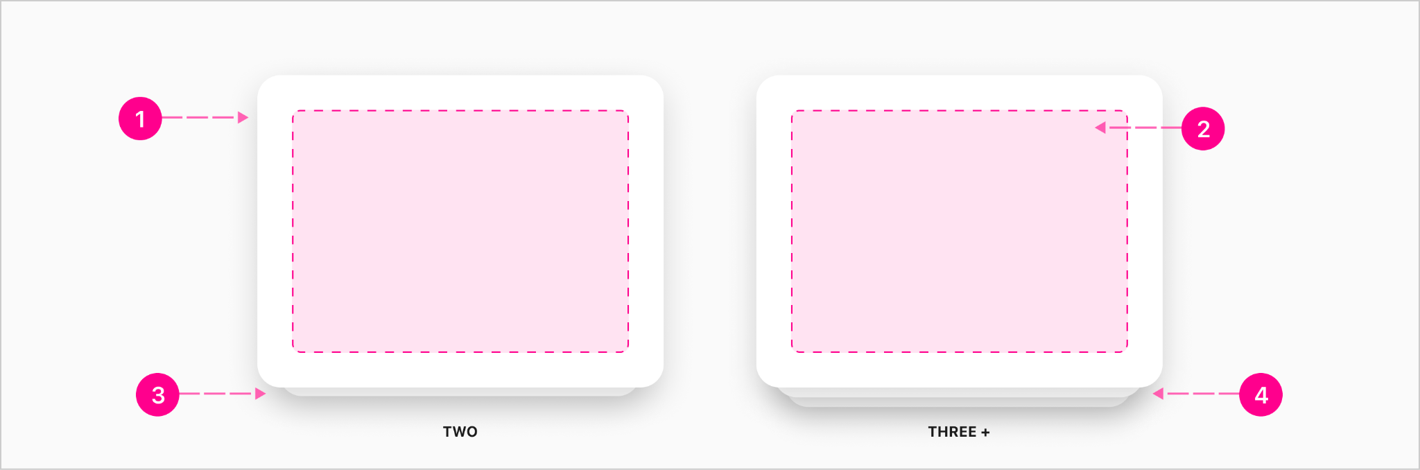
Footer CTAs
If there is one button, the button can be either auto width based on the content in the button or fill the width of the card 100%. If there are two buttons, they will split the width of the card 50/50.
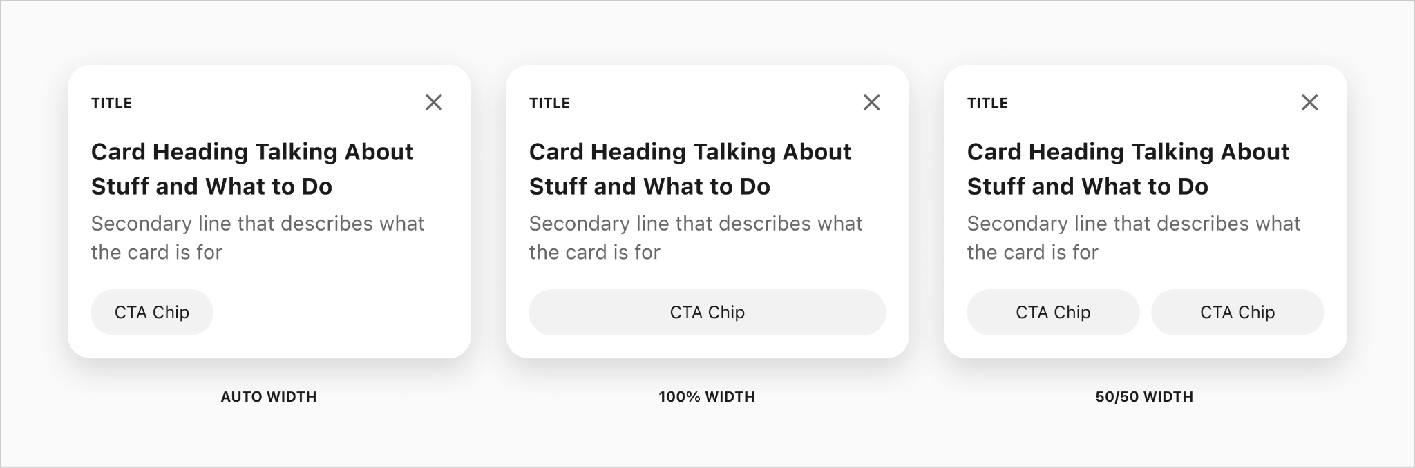
Preformatted Text CTA Card
The width of the card fills the screen size and height depends on the content inside.

- Title - Overline
- Icon - 32px (Optional)
- Heading - Subtitle 1
- Subline - Body 2 (Optional)
- CTA Footer Region - Chips (Optional up to 2)
- Action - Caption Link or 20px Icon (Optional)
- Card Surface
Content Wrapping
Tile
The content within this card will wrap to two lines then truncate afterwards. When the title wraps, it will move into the empty space above to make sure the card does not get any taller since it will be next to other cards the same height. The width of the card depends on the design and has a fixed height of 152px.

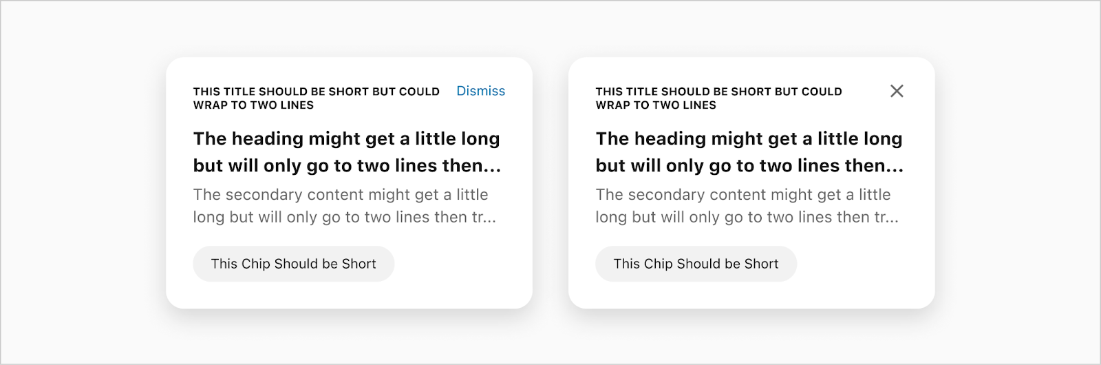
Preformatted Text CTA Card
The title should always be short but can go up to two lines then truncate, if it starts moving into the slot next to it. The heading and secondary content within this card will wrap to two lines then truncate afterwards. The CTA should be short and max will fill the width of the card.
.jpg)

.jpg)

.jpg)
.jpg)
.jpg)
.jpg)
.jpg)
.jpg)

States
Note: High emphasis card does not have a selected state.
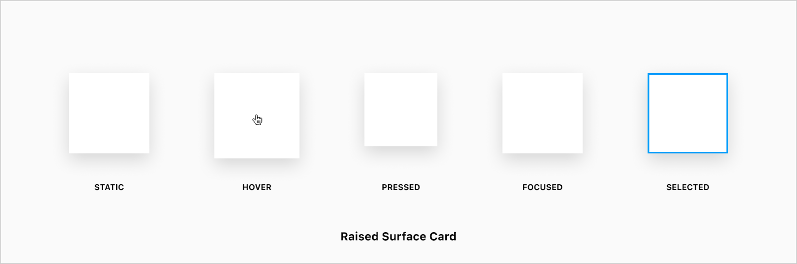

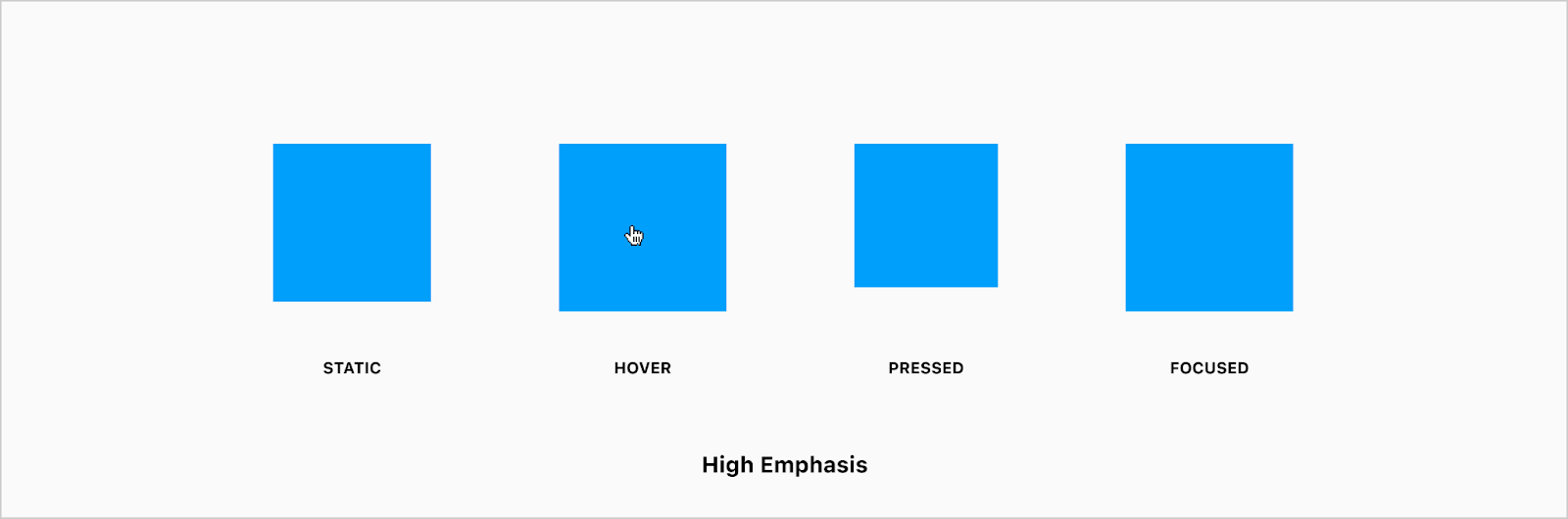
Static
Cards can appear as collapsed or expanded, and both of these “states” without any additional interaction with the user would be considered to be in a static state. Some might refer to this as an enabled state.
Hover
Hover states only apply to users utilizing a mouse to interact with UI elements, and with the card specifically, the hover state creates a unique interaction in which the card rises slightly in response to the hovered pointer. The paradigm leans on the concept of a magnetic field in which the user's pointer pulls the magnetic card surface toward it when hovering.
Pressed/Active
When a card is either pressed (touch event) or clicked (mouse event) a pressed/active state is displayed to the user while the press/touch is occurring. Once the press is released and the click event is completed, the elevation returns to static state.
Focused
The visual treatment of cards when focused via navigating through the document using the keyboard or mobile OS-level accessibility gestures, is handled by either the OS or the browser, and is not styled in any special way. When interacting with cards using either a touch or mouse event, the focused state is not applied.
Selected
The visual treatment for when a card is selected is for it to get a 2px border all around the card. This state is used to select the card as a decision for the user to pick from.

Placement
Cards can be placed almost anywhere within the main content area of a view or activity. Cards can live on their own in the flow of content, or contained together within either a card list or stack.
Horizontal Card List
Cards appearing within a group of other cards should all have the same height to appear uniform and indicate their relationship to one another. The width of each individual card should be flexible to work within many different design solutions.

Vertical Card List
Cards can appear in vertical lists — the height of which is determined by the content within the cards. There is no need to ensure uniform height for each card.

Stackable Cards
Cards can stack on top of each other to make a grouping. This grouping can expand to open all the cards and will have CTA for a compact button at the bottom to collapse the cards.
Card Groupings
CTA with Groupings
The only action that can take place on a card in a stacked state, is to expand the stack. Once expanded, the user can interact with each card individually.


Developer Docs
Vue Developer DocsComponent documentation coming soon!