Coach Tip

Done

The coach tip component is a high emphasis experience, guiding and teaching users about new features and UI updates.

Coach Tip

Anatomy

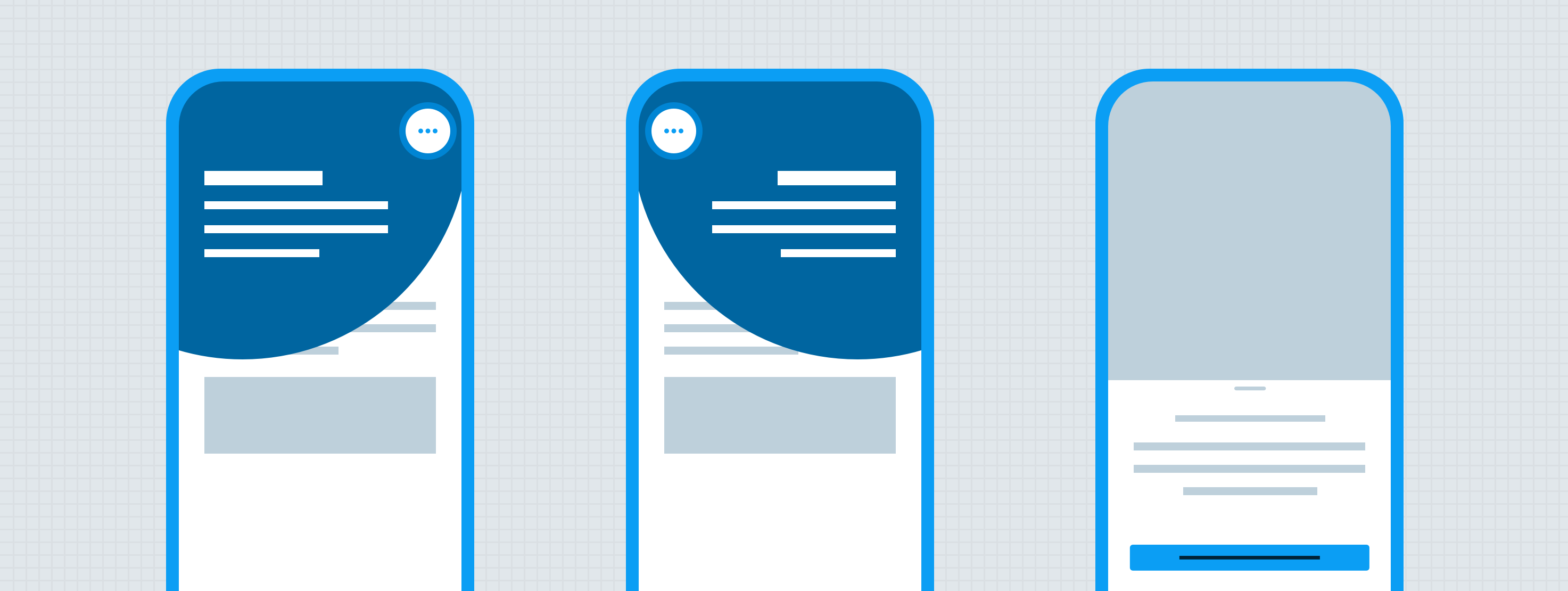
The coach tip is an overlay made up of a number of other atoms and molecules. The coach tip is always centered around the UI element it highlights. Coach tips are highly disruptive and should be used sparingly to alert users to one new feature at a time. Avoid displaying multiple coach tips back-to-back in a short time period. Only one coach tip can display within the platform at a time.

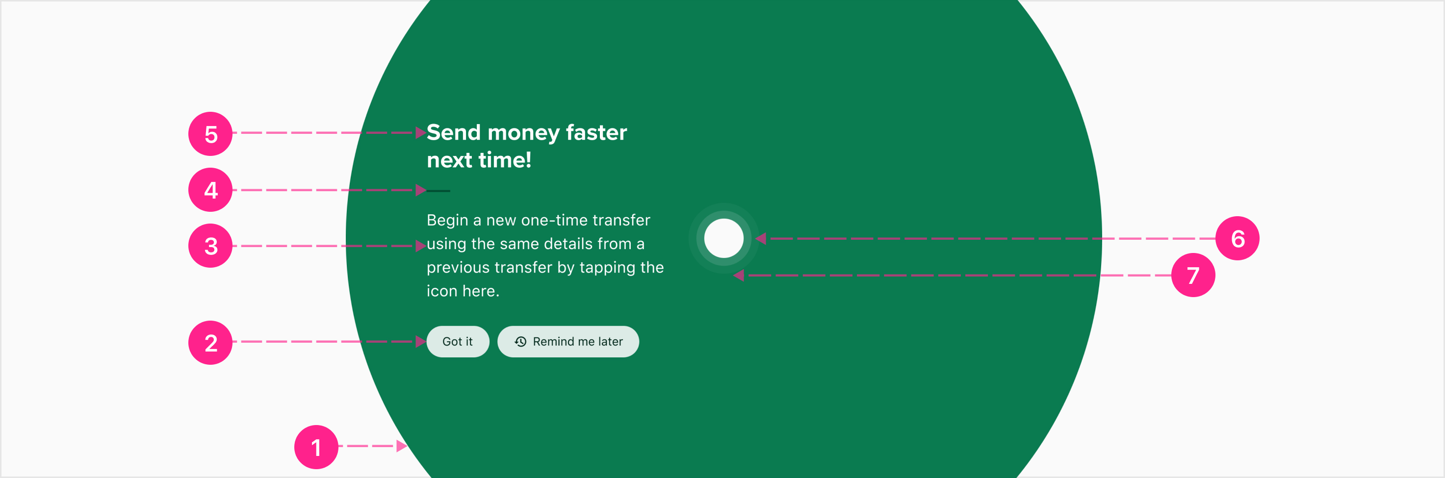
  1. Surface — High emphasis
  2. Content actions - Chips
  3. Content — Body 1
  4. Content divider (not a component or atom found in the system)
  5. Content heading — Medium Heading
  6. Highlight
  7. Highlight pulse
Surface

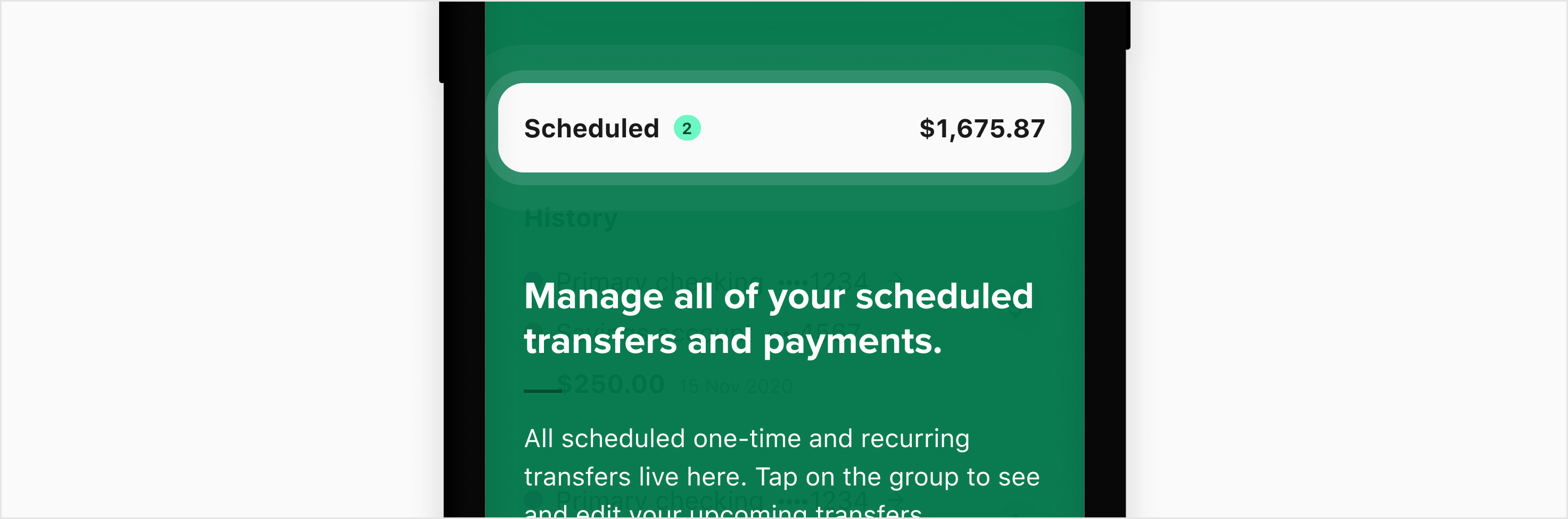
The coach tip surface is a nearly opaque branded surface, always shaped as a perfect circle. While the coach tip surface color defaults to ∆colorBrandedGuidance700, the surface may utilize any of the branded color prefixes or platform gray (see Specs below). The size of the surface varies slightly by device so that the rounded edges appear as consistently as possible. The surface size is 2.4x the viewport width with a max size of 1440 by 1440. The surface is always centered around the highlighted object.

Content

Coach tip content is composed of a heading and body section, separated by a branded divider. Coach tips always include the same actions, “Got it” and “Remind me later”, but the “Remind me later” action is optional. These actions are displayed as chips utilizing the same color prefix as the surface and always display beneath the copy. 

Copy character limits

Coach tip copy should be limited as much as possible, and ideally use less than 100 characters for the heading, and 300 characters for the body. Heading copy should be kept to a single line but can wrap if necessary. Body copy should be limited to 300 characters. The entire content group is vertically or horizontally centered to the highlight, depending on the placement. 

Highlight

The highlight is a knockout/cutout of the coach tip surface, fitted to the UI element the coach tip is calling out. The highlight may be a rectangle of any size and roundness, always designed to match the highlighted UI element. To help draw the user’s attention to the highlighted object, a subtle pulse animation radiates outward from the knockout in the shape of the highlight (see Behavior below).

Specs

Color

The coach tip component defaults to Guidance colors, but may use Affordance or messaging color prefixes or platform gray. For all of the following labels, “--” is a stand-in for the branded prefix. For example, a default, or Guidance, coach tip would use a surface background color of ∆colorBrandedGuidance700.

The chip should inherit the branded prefix to ensure that the colors do not clash or create unforeseen visibility issues.

Element Property Value
Surface Background color with alpha ∆colorBranded--700
∆colorPlatformAlpha900
Copy Text color ∆colorPlatformWhite
Branded divider Color ∆colorBranded--800
Highlight pulse Color with alpha ∆colorPlatformWhite
∆colorPlatformAlpha400 to ∆colorPlatformAlpha0 (see Behavior)
Chip All properties Branded prefix informed by parent

Elevation

The coach tip should always appear on top of every other element in the UI, but it utilizes no styling for elevation.

Spacing

Internal padding

Maintain an internal padding of ∆spacingPlatformGigantic on all four edges of the surface to keep the content area from extending past the coach tip surface.

Additionally, for Small or Medium viewports the highlight has a horizontal spacing of spacingPlatformBase and vertical spacing of spacingPlatformHuge. For all other viewport sizes, both horizontal and vertical spacing is spacingPlatformHuge.

Content area

Within the content area, all items are spaced vertically using the above guidelines. The divider is a 24x2 rectangle. The content area has a minimum width of 240px and should be repositioned whenever it would shrink beneath this size (see Placement below). 

The content area should be vertically or horizontally centered to the highlight point.

The content area has a max width of 560px to optimize character per line, maximizing readability.

Screen margins

Most of the coach tip’s surface will appear off-screen. However, the content and highlight should never appear offscreen. (It’s fine for the highlight pulse to extend off screen) To ensure that the content and highlight are always visible, align content to the screen margins in the event that the content space would appear offscreen. For example, the content area above honors the screen margins instead of coach tips’ left internal padding.

Highlight pulse

The highlight pulse radiates outwards, fading out at a max distance of ∆platformSpacingBase from each edge of the highlight knockout (see Behavior below).

States

There are no state considerations for this component.

Theming

There are no additional theming considerations for this component.

Placement

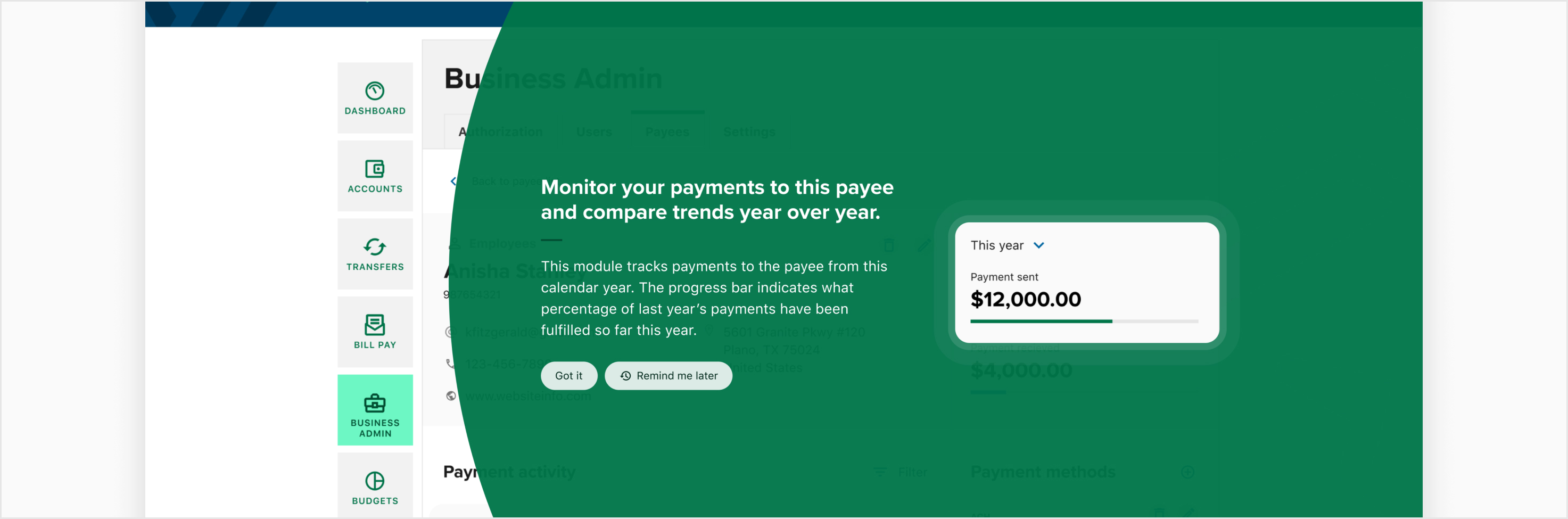
The coach tip is always centered on the highlighted UI element.

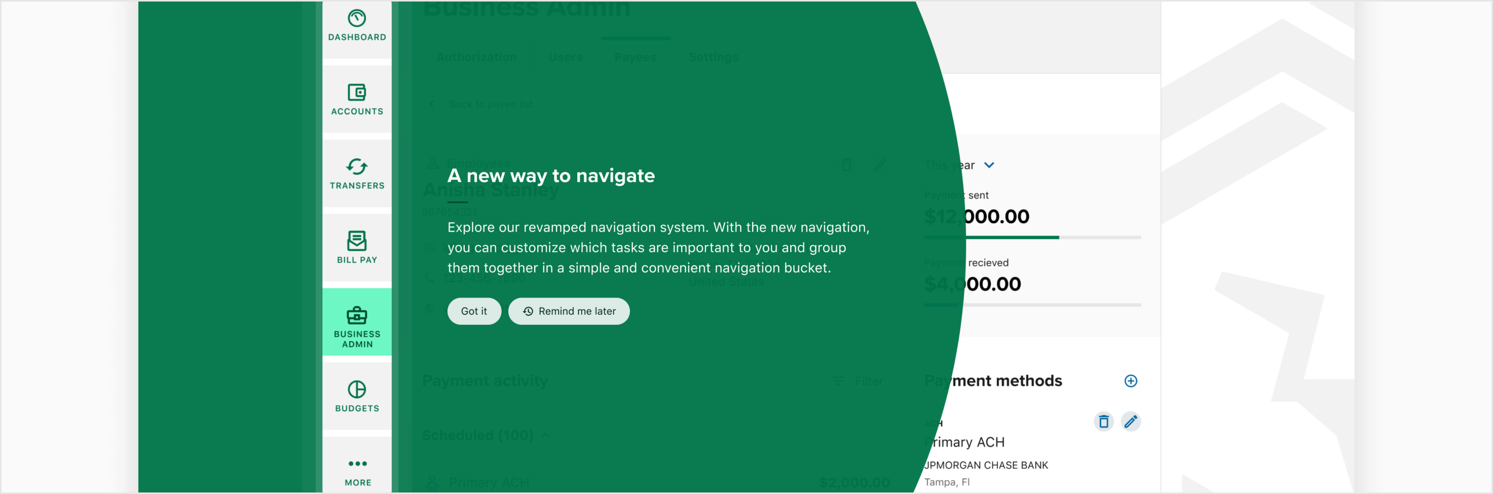
While the content area defaults to be positioned to the left of the highlight, it may also be placed above, below, or to the right of the highlight. Left and right placement are preferred because they reinforce users’ left-to-right reading patterns.

The content should be placed above or below the highlight whenever its width would shrink below 240px.

Behavior

Entrance

Coach tips enter the screen over a relatively long amount of time. The choreography of scaling and fading in gives the user a moment to recognize their experience is being augmented without feeling like they are being bombarded with a popup.

Interaction Steps Duration Easing Notes Haptics
Entrance 1a. Surface scales and fades in ∆motionTimeFast ∆motionTimingFunctionStandard The surface scales from 96-100% and fades from 0-100% opacity.  
  1b. Highlight scales in ∆motionTimeFast ∆motionTimingFunctionStandard The highlight knockout scales from 0-100%.  
  2. Content moves and fades in ∆motionTimeModerateSlow ∆motionTimingFunctionStandard The content moves up from ∆spacingPlatformTiny below its resting place while fading from 0-100% opacity.  
  3. Highlight pulse     Begin the highlight pulse animation loop.  

Highlight Pulse

The highlight pulse animation is a 3.5 second loop of three consecutive ripples. Each ripple should maintain the shape of the highlight, extending outward ∆spacingPlatformBase on all sides while fading out.

Interaction Steps Duration Easing Notes Haptics
Highlight pulse 1a. Ripple 1 1.5s ∆motionTimingFunctionStandard The highlight shape grows ∆spacingPlatformBase in all directions while fading from ∆colorPlatformAlpha75 to ∆colorPlatformAlpha0 (24–0%).  
  1b. Ripple 2 1.5s ∆motionTimingFunctionStandard Delayed ∆motionTimeExtraSlow from ripple 1 (0.5s into loop).  
  1c. Ripple 3 1.5s ∆motionTimingFunctionStandard Delayed ∆motionTimeSlow from ripple 2 (0.8s into loop).  

Exit

The coach tip exits considerably faster than the entrance, allowing users to return to the experience as quickly as possible.

Tapping anywhere outside of the surface should dismiss the coach tip, preferring the least destructive action available. In the example above, the send again quick action button is actionable and tapping it would dismiss the coach tip with a Remind me later event.

Interaction Steps Duration Easing Notes Haptics
Exit 1. Coach tip scales and fades out ∆motionTimeExtraFast ∆motionTimingFunctionStandard The coach tip scales from 100–96% whie fading from 100–0% opacity.  

Developer Docs

Vue Developer Docs

Component documentation coming soon!