.png)
Bottom Sheet
A bottom sheet is used to overlay content on top of the user interface for the purpose of focusing the user’s attention on specific information or to accomplish a specific task. As a general rule, bottom sheets should provide contextually-relevant content to the parent view underneath. This component is designed only for the mobile experience. The wide-screen equivalent is the side sheet component. Anything that is considered “Mobile” will display a bottom sheet while “Tablet” and “Desktop” display the side sheet.
Anatomy
The bottom sheet component is made up of a raised surface that contains content and affordances to close the bottom sheet. All other elements are optional. Bottom sheets come in two variants: full screen and partial.
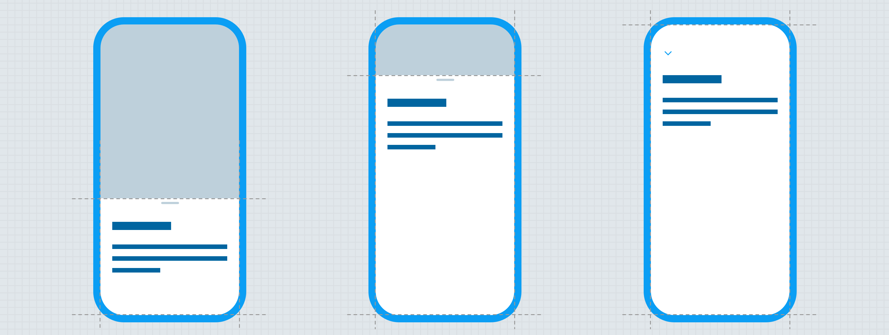
Full screen bottom sheet
Full screen bottom sheets are raised above the surface and completely cover the context underneath.
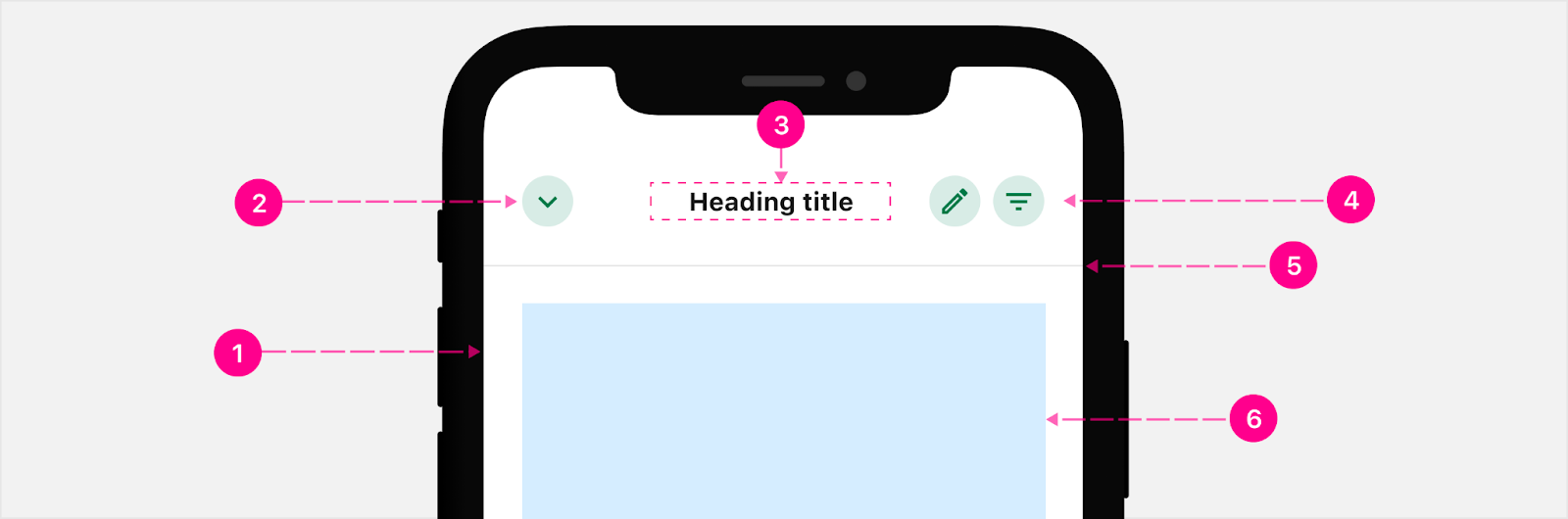
- Surface
- Backstack - Small Medium Emphasis Quick Action Button (Guidance)
- Heading - Subtitle 2
- Up to 2 Actions - Small Medium Emphasis Quick Action Button (Guidance)
- Divider (When Scrolled)
- Content (For reference)
Partial bottom sheet
Partial bottom sheets only come up as much as needed to display the content within the sheet (more on this in the behavior section).
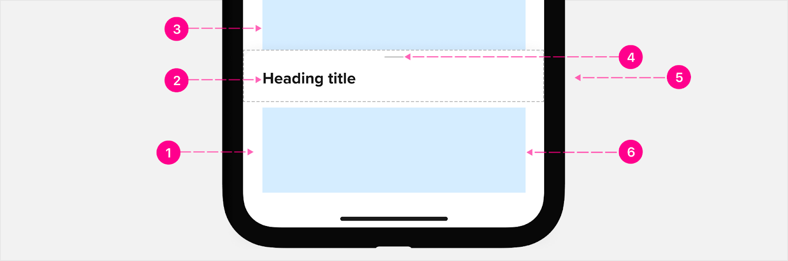
- Raised surface
- Content heading (optional) (See content headings)
- Scrim (optional)
- Close affordance
- Header container (if needed)
- Content (just for reference)
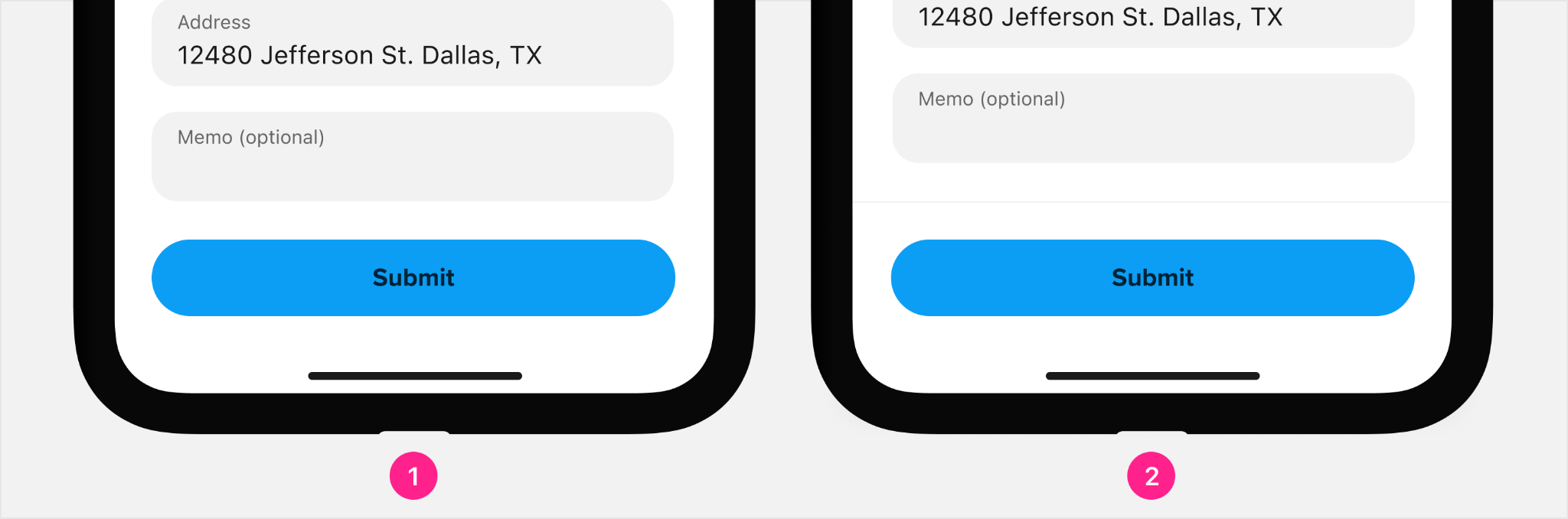
Footer
Bottom sheets can contain optional footers to provide space for calls to action where the CTA can remain sticky and not scroll with the content.

- Footer container
- Content scrolled below footer (just for reference)
- Divider (when scrolled)
- Content within the footer (just for reference)
Heading alignment & truncation
Headings for full height bottom sheets should be center aligned and fixed in the center of the screen.. Content headings for partial bottom sheets can either be left-aligned or centered, depending on what makes the most sense for the solution. Note: Heading text should truncate when space is not available, and should never wrap to two lines.

- Full screen bottom sheet (centered heading only)
- Scrolled full screen bottom sheet (centered heading only)
- Partial bottom sheet (left-aligned heading)
- Scrolled partial bottom sheet (centered heading)


States
Header
Content, at its default state does not impact the header divider or treatment until scrolled. Once scrolled, the header then takes on the divider with the content scrolling underneath while the header remains fixed at the top of the screen.
- Full screen — default
- Full screen — scrolled
- Partial — default
- Partial — scrolled
Footer
Content, at its default state may or may not impact the footer divider. If there’s enough room for the content to appear within the bottom sheet without scrolling, the footer does not take on a divider; however, if there’s too much content to display, then the content can overflow off the screen. In this case, the footer in the default state would take on the divider.

- Footer — content in a default state (dotted line represents unscrolled content)
- Footer — content scrolled (notice dotted line representing scrolled content underneath the footer and beyond the visible bounds of the device), or content that is not visible due to limited screen size.
Buttons
Call to action buttons can be either inline with the content on the page or they can be inside of a footer. Sticky footers with buttons are great for when you need the user to still see the button when doing something within the page but if the user is filling out a form, then use an inline button with the content.
- Inline button
- Sticky footer button
Placement
Bottom sheets should always be anchored to the bottom of the screen, and can be placed into one of two states: contextual or persistent.
Contextual placement
Bottom sheets are contextual by nature, and should only appear when the user needs some contextual UI, and be dismissed fully when no longer needed.
Persistent placement
Sometimes the content in a bottom sheet will be continually referenced throughout a user’s journey, and should be persistently pinned at the bottom of the screen until a flow is completed or the user navigates away from the context.

Usage do’s
Bottom sheets are useful for a wide variety of use-cases and can contain one or more atoms on their surface, and can appear as a result of user interaction or by system request. Some examples of bottom sheet usage:
- Providing quick access to contextual features.
- Surfacing contextual interaction options.
- Surfacing interstitial content with medium emphasis
Usage don'ts
Avoid using a bottom sheet when:
- The content makes more sense existing within the parent context
- The interaction is initiated by a card component (in which case the card should grow to fill the view instead of triggering a bottom sheet)
- There is no contextually useful information or possibilities for interaction on the bottom sheet
Native versus responsive web
Use bottom sheets on viewports smaller than 560px. On 561px and over, the physicality of gestures is lost, and interaction is typically performed with a mouse. Because of this, bottom sheets should be replaced with Side Sheets or otherwise persistent content.
Anything that is considered “Mobile” will display a bottom sheet while “Tablet” and “Desktop” display the side sheet.


Developer Docs
Vue Developer DocsComponent documentation coming soon!