Cloaked Checkmark

Approved — Ready for dev

The cloaked checkmark is a selection control component for single- or multi-select lists. Due to the large tap targets and design flexibility of each list item, it is the preferred choice for selection experiences throughout the platform.

Cloaked Checkmark

Anatomy

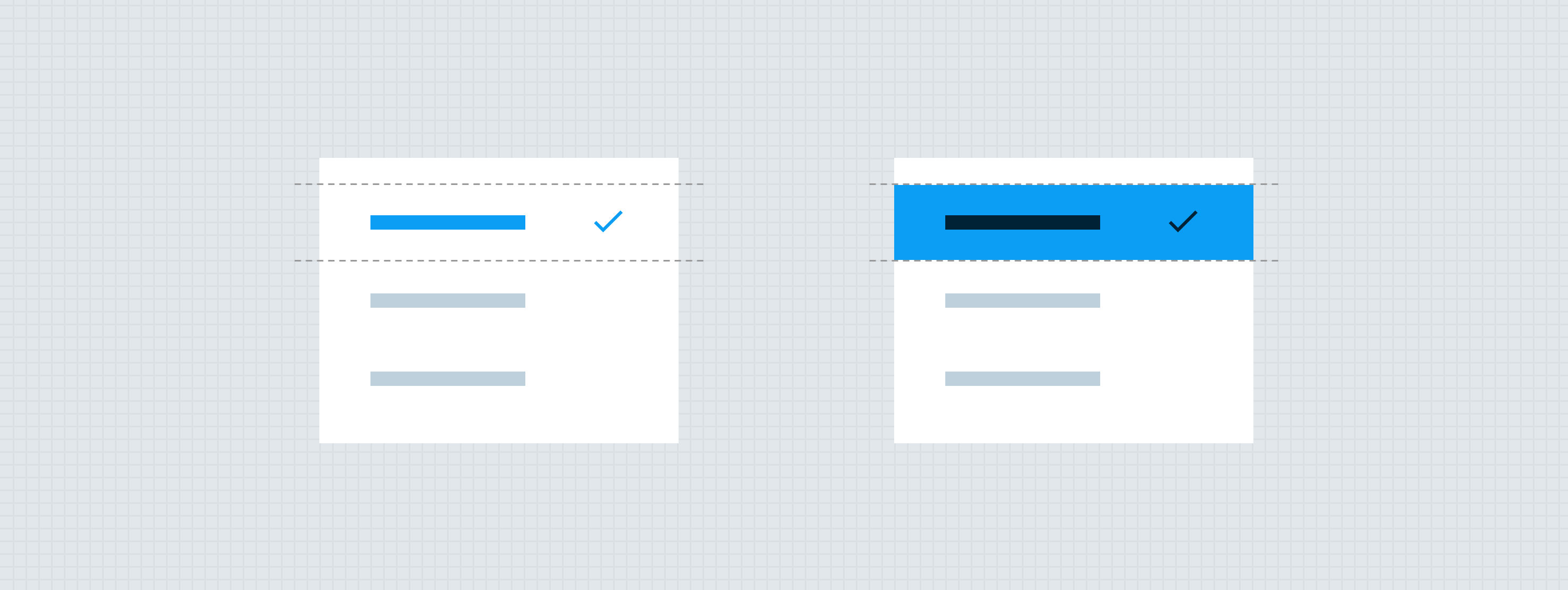
Each cloaked checkmark list item is made of a branded container and a selection icon. The cloaked checkmark also has a content area that may be customized per design. This content area may contain various atoms from the design system such as labels, quick action buttons, or account components. While the content area is flexible, each item of a cloaked checkmark list must utilize the same design components in the same layout, so that the list is easy to scan.

  1. Content - not defined by the component
  2. 24px selection icon — Avatar
  3. Branded container

Specs

Color

Element Property Value
Selection icon (Static: On) Icon color ∆colorBrandedAffordanceAccessible
Selection icon (Hover: On) Icon color ∆colorBrandedAffordanceOn
Selection icon (Pressed: On) Icon color ∆colorBrandedAffordanceOn
Container (Static: Off) Background color None
Container (Static: On) Background color None
Container (Hover) Background color ∆colorBrandedHover
Container (Pressed) Background color ∆colorBrandedHover
Content Various Defined by each design
Container, content, and selection icon (Disabled) Alpha ∆colorPlatformAlpha400

Elevation

No elevation considerations needed for this component.

Spacing

Selection icon placement

The selection icon is always right-aligned to the edge of the branded container. This alignment makes it very easy for a user to scan the list and find the selected item.


Size

The cloaked checkmark has a fluid width, meaning its width should be relative to the width of the parent container. The max-width of the cloaked checkmark container is 576px. In the event that a parent container is larger than the max-width, the cloaked checkmark group should be centered within the parent container.

States

The content inside of the container will stay the same between the different state.


Theming

No additional theming considerations are needed for this component.

Placement

Cloaked checkmark groups should generally be left-aligned within their parent containers, but may be centered if the content immediately above or below is also centered.

Behavior

When a user interacts with a cloaked checkmark, it will change its status from Off to On, or vice versa. Use the animation patterns below to create a responsive experience. When a cloaked checkmark group is used for single-select, previously selected items should automatically switch off. When a cloaked checkmark group is used for multi-select, the Off animation can only be triggered by user interaction.

On

Interaction Steps Duration Easing Notes Haptics
On 1. Selection icon draws on ∆motionTimeExtraFast ∆motionTimingFunctionStandard The icon draws on following the animation above. Light on trigger (Flutter: Selection Click)

Off

Interaction Steps Duration Easing Notes Haptics
Off 1b. Selection icon draws on ∆motionTimeExtraFast ∆motionTimingFunctionStandard The icon draws off following the animation above. Light on trigger (Flutter: Selection Click)

Loading

If a list item selection requires the system to load, the selected item should display the standard icon loading animation in place of the checkmark until loading is complete. In single-select groups, the other list items in the group should switch to a disabled state while the selection is loading. In multi-select groups, multiple items may load at one time.

Developer Docs

Vue Developer Docs

Component documentation coming soon!