.png)
Surfaces
Surfaces make up the containers for many large blocks of content, and can also serve as visual separation between groups of content.
Anatomy
A surface comes in four variants: Background, Base, Raised, and Overlay. Based on how much emphasis or separation is needed, each surface variant can be visually treated through increasing levels of emphasis or theming.
Background Surface
The background surface is visually the lowest container in the z-axis and acts as the container/wrapper for an entire experience. All other surfaces and content will appear in front of the background surface.
- Default background treatment
- White background treatment
- Branded image background treatment
- Branded color background treatment
Base Surface
The base surface is a container for main sections of content, and can be visually treated using a No Emphasis, Low Emphasis, Medium Emphasis, High Emphasis, Contextual Emphasis, or Draggable Zone approach.
No Emphasis
When using a no emphasis base surface, no visual indicators are present that the surface exists. The container has no background color or border visible, and would never transition to another surface variant.
Engineering note: This component variant isn’t necessarily a component, but could potentially just be a framework-specific way of creating a container (e.g., <div> in web, Container() in Flutter).
Low Emphasis
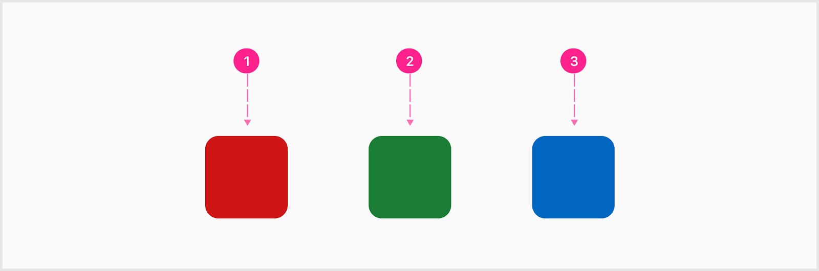
When using a low emphasis base surface, the background color is white with an optional subtle border.
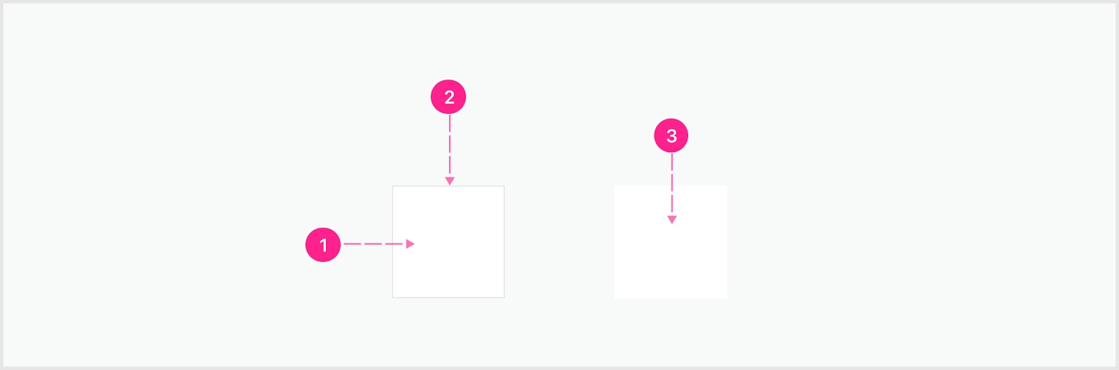
- Base surface
- Border treatment (optional)
- Base surface
Medium Emphasis
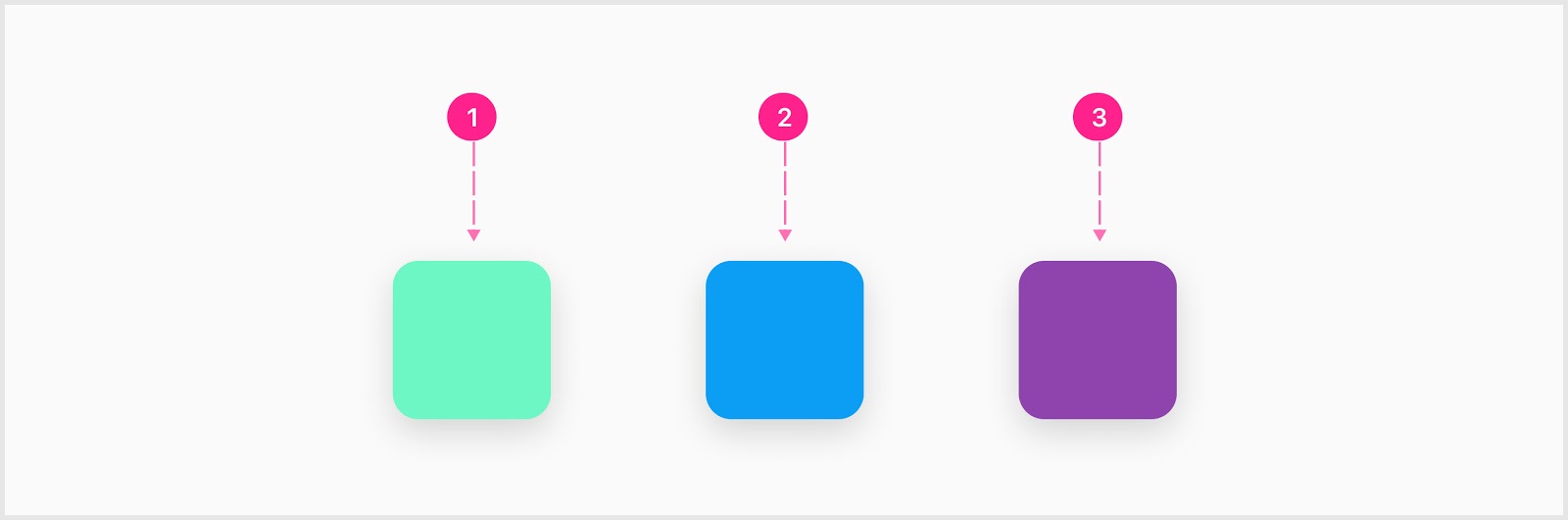
When using a medium emphasis base surface, the background color is a subtle platform gray with an optional border.
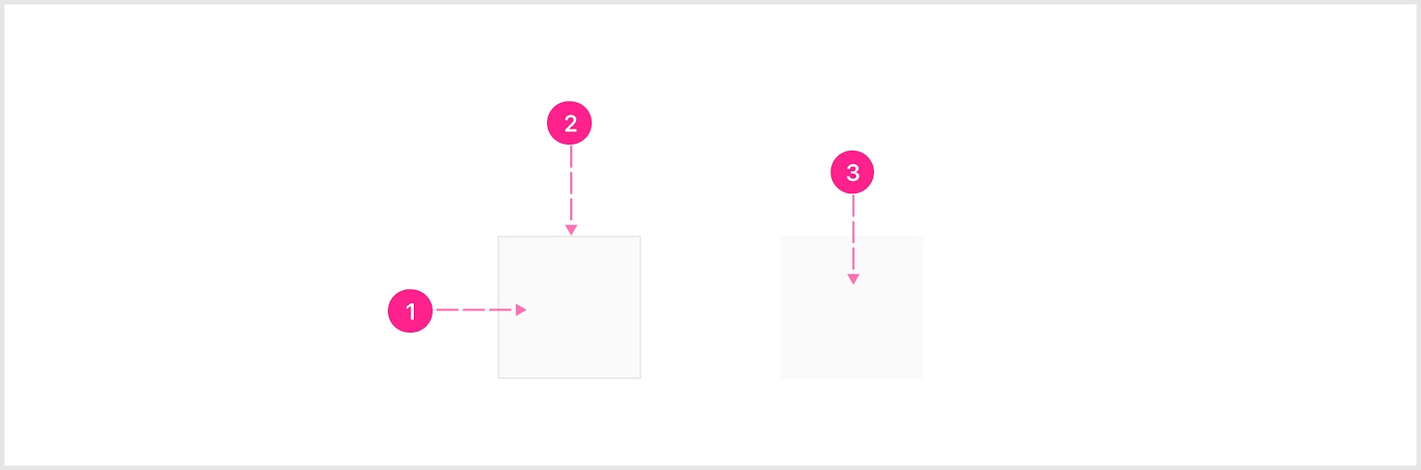
- Base surface
- Border treatment (optional)
- Base surface
High Emphasis
High emphasis base surfaces are containers used to call attention to the primary section of the screen where the highest value actions and information are contained, and should be used with extreme discretion. Only the most pivotal of moments justify the use of such bold color.
High emphasis base surfaces can be treated with either the base affordance, guidance, account, messaging (error, success, warning, etc.) color, or any level of color from these color ramps.
- Error base surface
- Success base surface
- Info base surface
Draggable Zone
Draggable surfaces can either be a base surface or raised surface that are capable of becoming a drag target. The destination of the drag target can be a draggable zone or reordering in a series. The draggable zone is a base surface that indicates to the user a draggable surface can be dropped within the draggable zone.
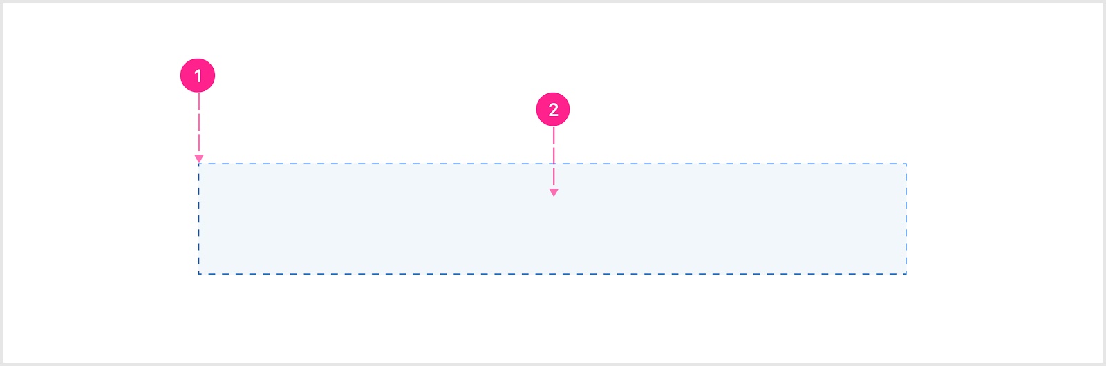
- Broken line border
- Solid fill background
Raised Surface
A raised surface is a container for content that is raised on the z-axis in front of the content behind. Elevation indicates interactivity, and can be visually treated with a Low Emphasis, High Emphasis, or Contextual Emphasis approach in the same pattern as Base Surfaces.
Low Emphasis
When using a low emphasis raised surface, only a drop shadow and white background exists to indicate interactivity and elevation.

- Raised surface
High Emphasis
High emphasis raised surfaces are containers used to call attention to the primary section of the screen where the highest value actions and information are contained, and should be used with extreme discretion. Only the most pivotal of moments justify the use of such bold color.
High Emphasis surfaces can be treated with either the Affordance base, Guidance base, or an account color.
- Guidance treatment
- Affordance treatment
- Account color treatment
Contextual Emphasis
Contextual emphasis base surfaces are containers used to convey information and system feedback. When using a contextual emphasis raised surface, only utilize the messaging colors as the background and icon colors.

- Error raised surface
- Success raised surface
- Info raised surface
Overlay Surface
An overlay surface is a raised surface that will always appear in front of everything else on screen and should primarily be used as the surface for bottom sheets and side sheets.
States
Generally speaking surfaces are not state-dependent; however, in some instances high emphasis surfaces can change color to aid in the communication of system status.
Placement
Surfaces should always be placed with a responsive experience in mind. Always have a plan where a surface will live at each screen breakpoint. It may make sense to label each surface in the design with a unique number which would indicate to the engineers the stacking order as things get rearranged from small screens to larger screens.
Surfaces can be nested within other surfaces, and can be completely empty (used as a spacer).
Developer Docs
Vue Developer DocsComponent documentation coming soon!