.png)
Floating Action Button (FAB)
The floating action button (FAB) is a district-wide call to action, and should be the most commonly used highest-level action a user might want to take within a widget. The unique functionality of the FAB is that it can either trigger the start of a task in a new context, or become a new surface for actions and content to live within.
Anatomy
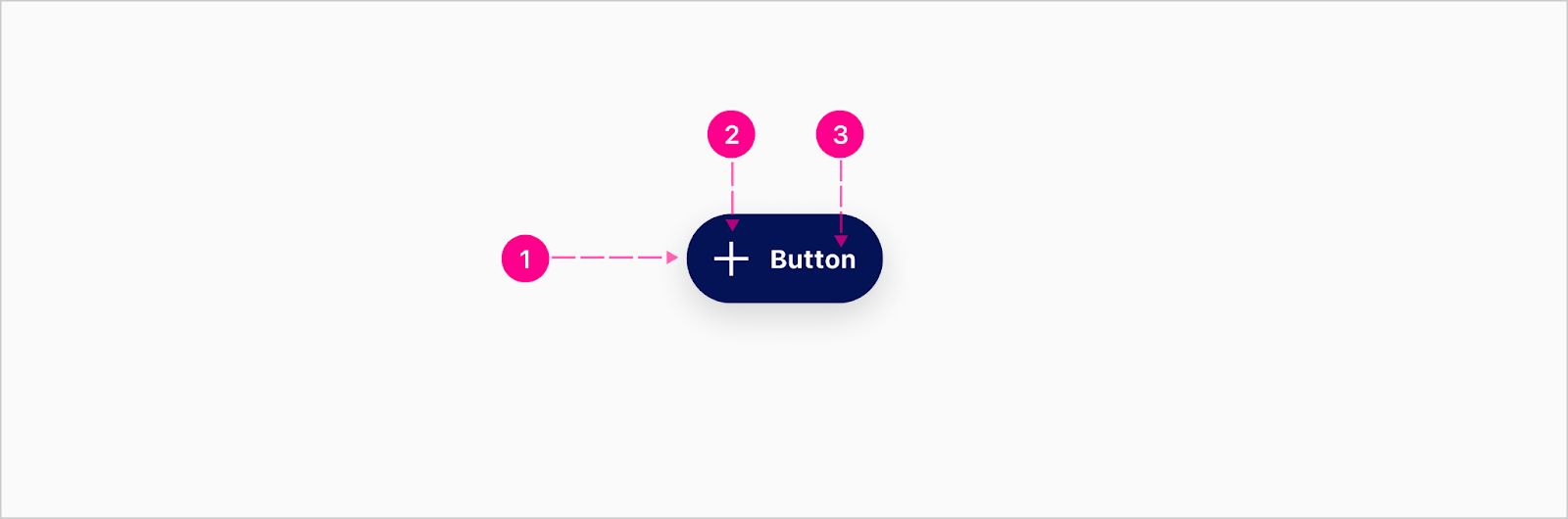
The essential part of the FAB is the trigger, which can trigger a new flow/task or become one of two types of surfaces: floating action menu, or a full context. The FAB has high emphasis and medium emphasis variants.
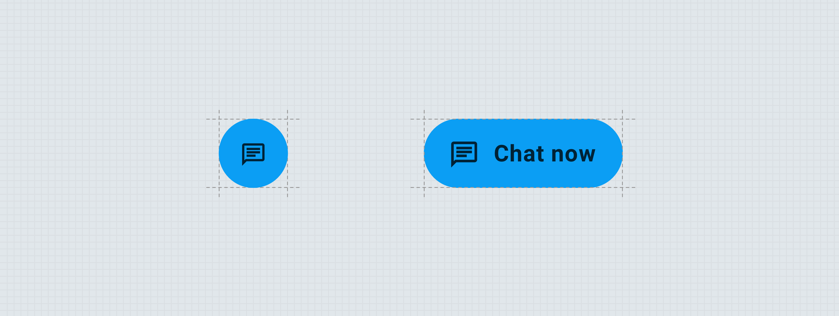
Trigger (Condensed)
High Emphasis

- Raised container
- Avatar - Medium
Medium Emphasis

- Raised Container
- Avatar - Medium
Trigger (Extended)
High Emphasis
- Raised container
- Avatar - Medium (Optional)
- Label - Button
Medium Emphasis

- Raised container
- Avatar - Medium (Optional)
- Label - Button
Menu
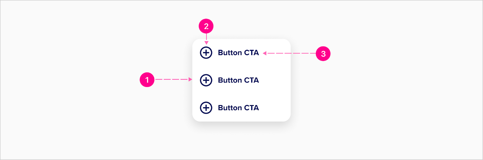
- Raised container
- Avatar - Medium (Optional)
- Label - Button
Do’s and don’ts
To help understand more clearly the difference between the FAB and quick action buttons, please follow these do’s and don’ts.
Do
- Use FABs for the primary widget/district-level actions
Don’t
- Use FABs for overflow actions
- Use FABs for minor actions
- Don’t display multiple actions within a task flow (they should float above the content and outside the flow of specific tasks)
- Cover up FABs with other contexts or layers
- Display FABs in both the standard placement and marquee placement at the same time (see Placement section)


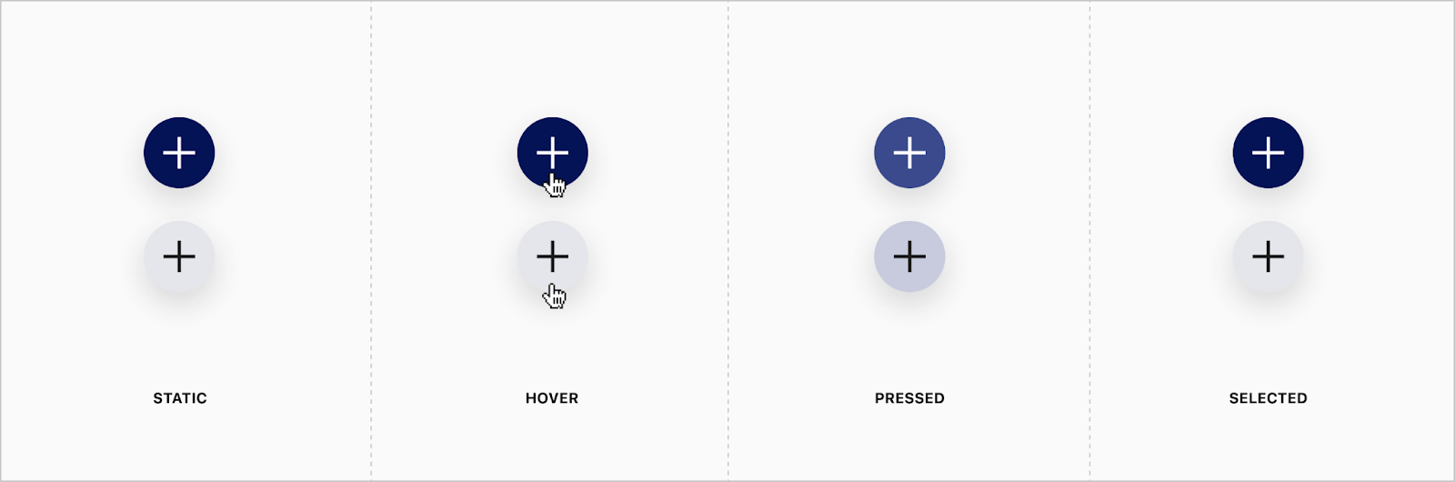
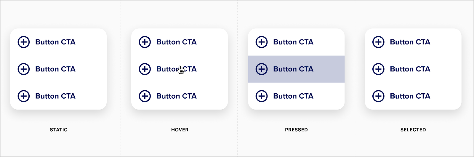
States


Placement
FABs can be placed and positioned inside of mobile and desktop experiences.
Mobile Placement
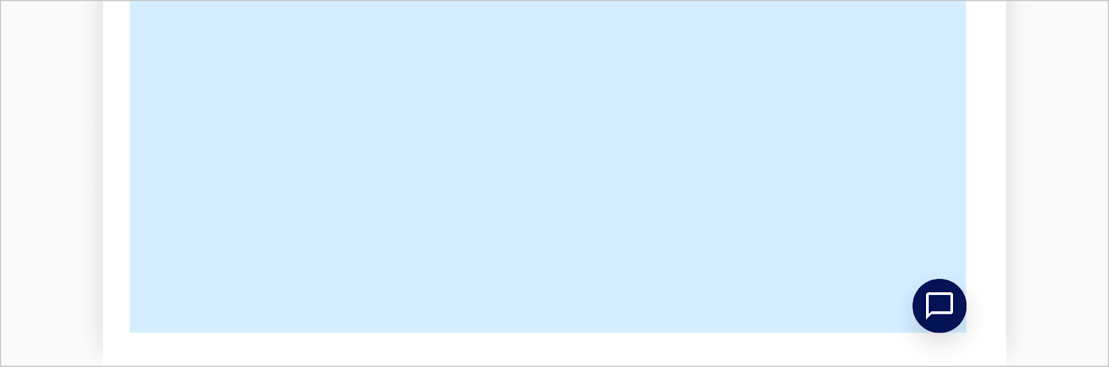
The standard placement for FABs is the lower right corner of the screen while also respecting ancestral padding of the top-level container. The FAB should not be positioned on the edge of the viewport/screen, but remain 24px off the right edge for mobile.

Desktop Placement
The standard placement for FABs is the lower right corner of the screen while also respecting ancestral padding of the top-level container. The FAB should not be positioned on the edge of the viewport/screen, but remain 40px off the right edge for desktop.
Developer Docs
Vue Developer DocsComponent documentation coming soon!