.png)
Slider
A slider indicates to a user that a value is adjustable. The user moves the slider handle along a rail to increase or decrease this value. When interacting with the sliders, the value is reflected back to the user immediately. There are two types of sliders: continuous, range and discrete. There are three sizes: small, medium and large.
Anatomy
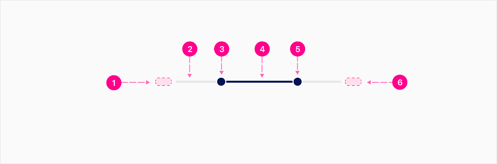
Continuous
Continuous sliders allow users to select a value along a subjective range.

- First Value Slot (Optional)
- Indicator
- Handle
- Track
- Second Value Slot (Optional)
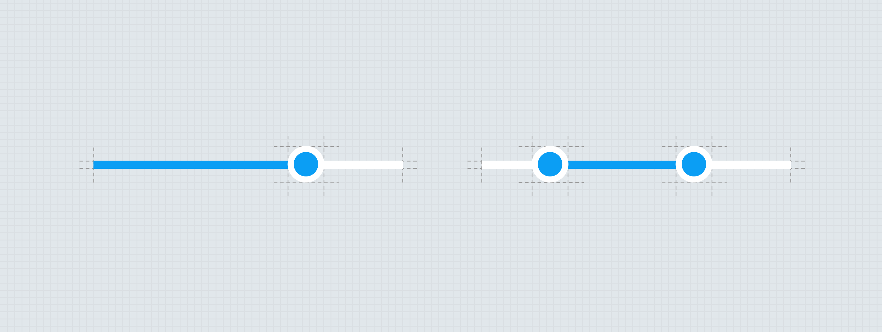
Range
Range slider allows users to set a minimum and maximum value.
- First Value Slot (Optional)
- Track
- Handle (Min)
- Indicator
- Handle (Max)
- Second Value Slot (Optional)
Discrete
Discrete sliders allow users to choose from a set of predetermined values. This is shown by using tick marks that the user can easily move the handle across the slider to choose their value.
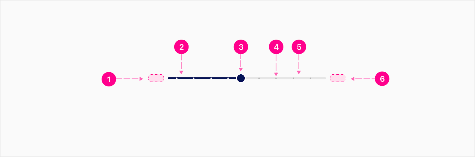
- First Value Slot (Optional)
- Indicator
- Handle
- Tick Mark
- Track
- Second Value Slot (Optional)


States
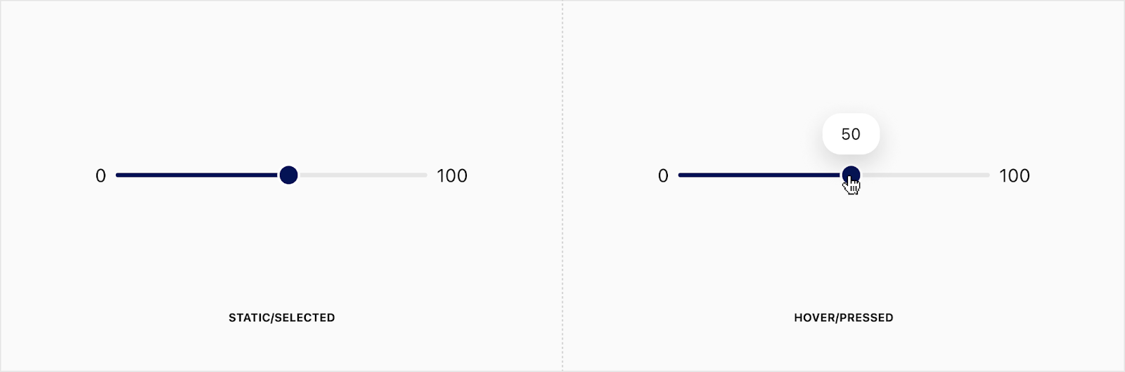
A tooltip will show up as the user hovers over the handle and then also as they drag it around the track to indicate the value. The tooltip will go away once the user has let go of the handle and moved their cursor outside of the handle bounds.
Placement
All sliders should be placed adjacent to the content they describe.
Developer Docs
Vue Developer DocsComponent documentation coming soon!