Notification

Approved — Ready for dev

Notifications are medium-emphasis messages used to communicate contextual information from the system to the user.

Notification

Anatomy

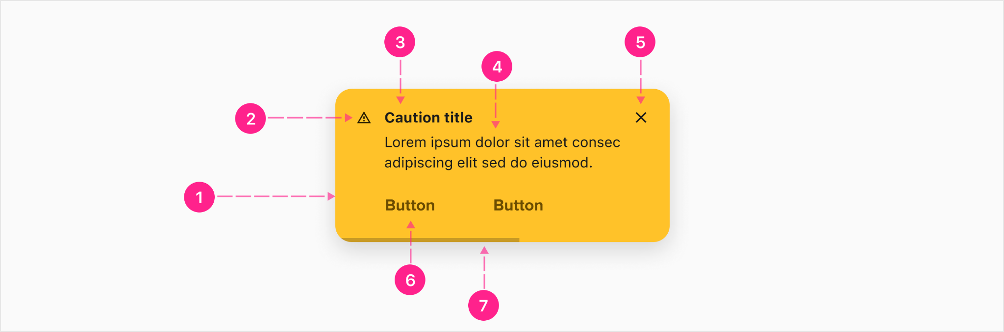
The essential parts of any notification are the surface that contains the content, the message itself, iconography used to aid the user in determining message severity, and color — also used to help the user quickly assess severity. All other elements are optional. Notifications come in three variants: toast, inline and banner.
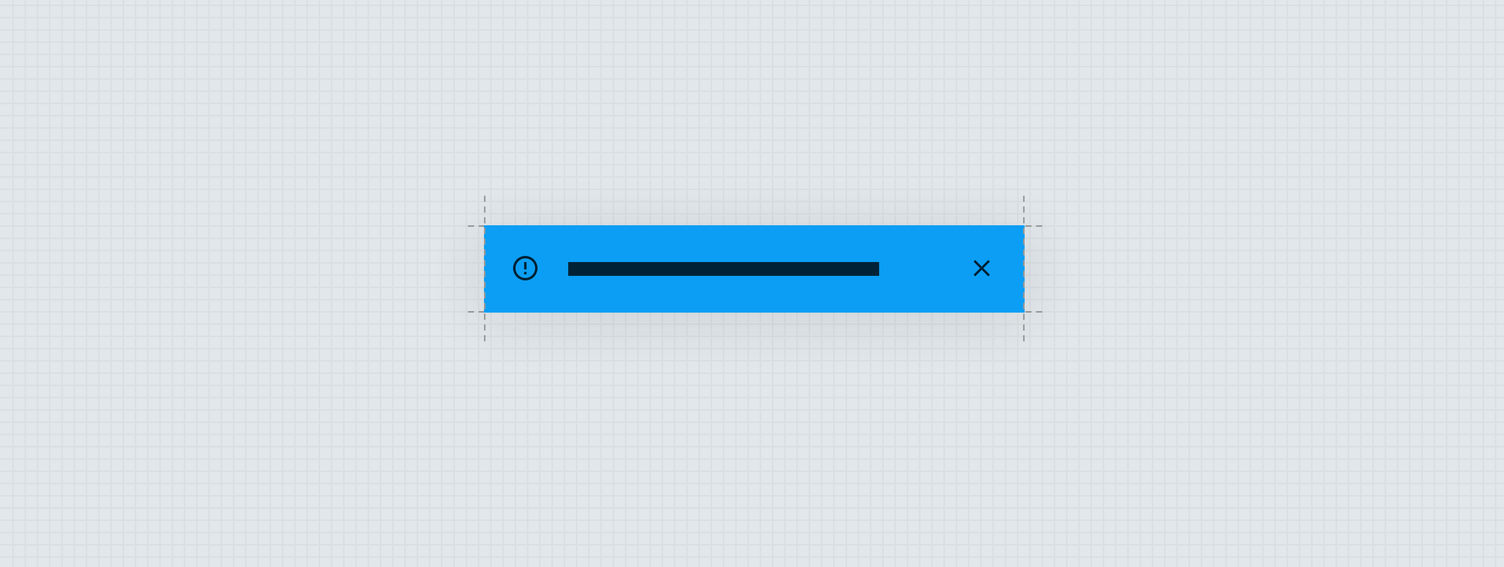
Toast notifications

Toast notifications are raised above the surface and can appear in front of other content. 


  1. Raised surface
  2. Leading icon — Avatar (optional)
  3. Heading — Subtitle 2 (optional)
  4. Messaging copy — Body 2
  5. Close affordance — Quick action button (optional)
  6. CTA — No emphasis button (optional up to two)
  7. Timeout indicator (optional)

Inline notifications

Inline notifications appear within context and push lower content down to make room for itself. 


  1. Resting surface
  2. Leading icon — Avatar (optional)
  3. Heading — Subtitle 2 (optional)
  4. Messaging — Body 2
  5. Close affordance — Quick action button (optional)
  6. CTA - No emphasis button (optional up to two)
  7. Timeout indicator (optional)

Banner notifications

Banner notifications appear at the top of the experience and indicate a system-wide message for the user's benefit.

  1. Leading icon — Avatar (optional)
  2. Heading — Subtitle 2 (optional)
  3. Messaging — Body 2
  4. Resting surface
  5. Close affordance — Quick action button (optional)
  6. CTA— Compact button (optional)

Specs

There are four main areas of specifications for the notification component: color, elevation, min/max and spacing.

Color (dark)

For all of the following labels, “--” is a stand in for the Success, Caution, Error, and Info notification types. For example, an info notification would take a container background (“∆colorBranded--”) color of ∆colorBrandedInfo.


Element Property Value
Container (Info, Error & Success) Background color ∆color--700
Container (Caution) Background color ∆colorCaution300
Timeout bar Background color with alpha ∆colorPlatformGray900,
∆colorPlatformAlpha400
Leading avatar (Info, Error & Success) Icon color ∆color--25
Leading avatar (Caution) Icon color ∆colorCaution700
Trailing quick action button Icon color ∆color--25
Copy (Info, Error & Success) Text color ∆color--25
Button (Info, Error & Success) Text color ∆color--25
Copy (Caution) Text color ∆colorPlatformGray900
Button (Caution) Text color ∆colorCaution700
Trailing quick action button (hover) Background color with alpha ∆colorPlatformGray900,
∆colorPlatformAlpha400
Button (hover) Text color ∆color--100
Button (Caution) (hover) Text color ∆colorCaution900
Trailing quick action button (pressed) Icon color ∆color--25
Trailing quick action button (pressed) Background color ∆colorPlatformGray900,
∆colorPlatformAlpha400
Button (pressed) Text color ∆color--100
Button (Caution) (pressed) Text color ∆colorCaution900

Color (light)

For all of the following labels, “--” is a stand in for the Success, Caution, Error, and Info notification types. For example, a light info notification would take a container background color of ∆colorBrandedInfo50.

Element Property Value
Container Background color ∆color--50
Timeout bar Background color ∆colorPlatformGray900, ∆colorPlatformAlpha400
Leading avatar Icon color ∆color--700
Trailing quick action button Icon color ∆colorPlatformGray900
Copy Text color ∆colorPlatformGray900
Button Text color ∆color--Accessible
Trailing quick action button (hover) Background color ∆color--100
Button (hover) Text color ∆color--900
Trailing quick action button (pressed) Icon color ∆color--Accessible
Trailing quick action button (pressed) Background color ∆color--100
Button (pressed) Text color ∆color-900

Elevation

Note: Elevation is only applied to the toast variant.

Element Property Value
Surface Shadow Y-offset ∆surfacePlatformRaisedShadowY
Surface Shadow opacity ∆surfacePlatformRaisedOpacity
Surface Shadow spread ∆surfacePlatformRaisedSpread
Surface Shadow blur ∆surfacePlatformRaisedBlurResting

Min/Max

In most cases the notification component will respond to the width of its parent container, so no firm min/max definitions are needed; but, when using the toast variant with the anchored placement the max width is 688px. This accounts for the 600px max for Body 2 metering limit in addition to all the padding and margin of atoms and molecules contained within the component.

In general, notifications should relay short and concise messages for the user to easily consume. Multiple lines of copy is discouraged. If more details are needed, consider utilizing a bottom and/or side sheet instead. 

Similarly, if the space is too small to display both buttons inline at the same time, wrap the second button to a second row. Ideally button copy should be limited to one or two words.

Spacing

Content spacing

Button spacing

When the buttons are displayed, the buttons container sits directly on top of the timeout bar, and directly below the content container. The buttons line up with the text keyline.

Timeout bar spacing

The timeout bar, when displayed, increases the notification component height by 4px, and is positioned directly against the bottom of the parent container. 

Alignment

The alignment inside the container will change depending on how many lines of content there are. It is vertically aligned if there is one line of content and top aligned if there is more than one line of content.

Stacking

In some instances, stacking of notifications may occur when multiple may need to show up at once for a user. The notifications will stack vertically with the newest appearing at the bottom and the oldest at the top of the list.


States

The states consideration for the notification component is the treatment of the quick action button (used as a close affordance). When hovering on the close affordance, the background changes. Buttons used within the notification component will follow a low emphasis treatment with the text color changing. 


Theming

Color

No color theming considerations for this component other than what has been called out in the specs section.

Shape

Element Property Value
Container Large component ∆shapeBranded

Spacing

No spacing theming considerations for this component.

Type

No type theming considerations for this component.

Placement

Notifications are a vehicle to deliver medium emphasis messages to the end user, and can be placed within the experience in several different ways: pinned, anchored, and global. It is recommended for light mode, light be used for inline messaging and dark be used for toast messaging. For dark mode, dark will be used for inline messaging and light will be used for toast messaging.

Pinned placement

Pinned placement allows the notification to appear either at the top or bottom of the grouped UI and remain in view as the user scrolls. If the UI is too tall for the entire group to appear on screen at once, the pinned notification will stay visible and will not move until the user scrolls beyond the bounds of the parent container. Only the inline and banner variant can utilize the pinned placement. 

Anchored Placement

When a message needs to imply a relationship to all the UI within view, an anchored placement allows the notification to appear anchored either to the top or bottom of the viewport — and will allow content to pass underneath as the user scrolls. Since there is some elevation implied by content passing underneath, only toast notifications can utilize this placement.

Global Placement

When a message needs to imply a relationship to the entire system (not just the current view), a global placement provides the space necessary to achieve this. When notifications use the global placement, the message is persistent between every view within the experience. Since there is no elevation implied, and the message enforces the shifting of other content around it, only the banner notification can utilize this placement. 

Small screen

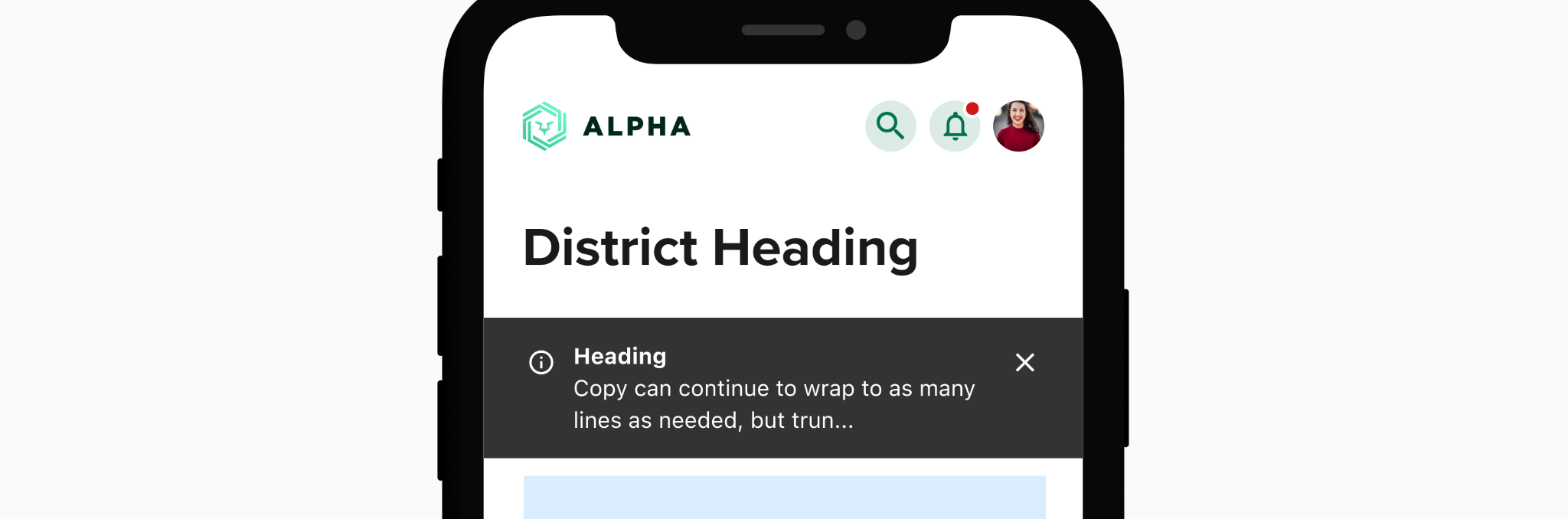
When viewed on mobile devices, the global placement of notifications appears below the mobile top bar, and scrolls with the content. After wrapping to two lines, any additional copy is truncated. Note: If the copy is truncated, tapping anywhere (other than the close affordance) will expand the notification enough to show the entire message.

Wide screen banner

When viewed on wide screen devices, the global placement of notifications appears above the header and inherits the scrolling behavior of the header..
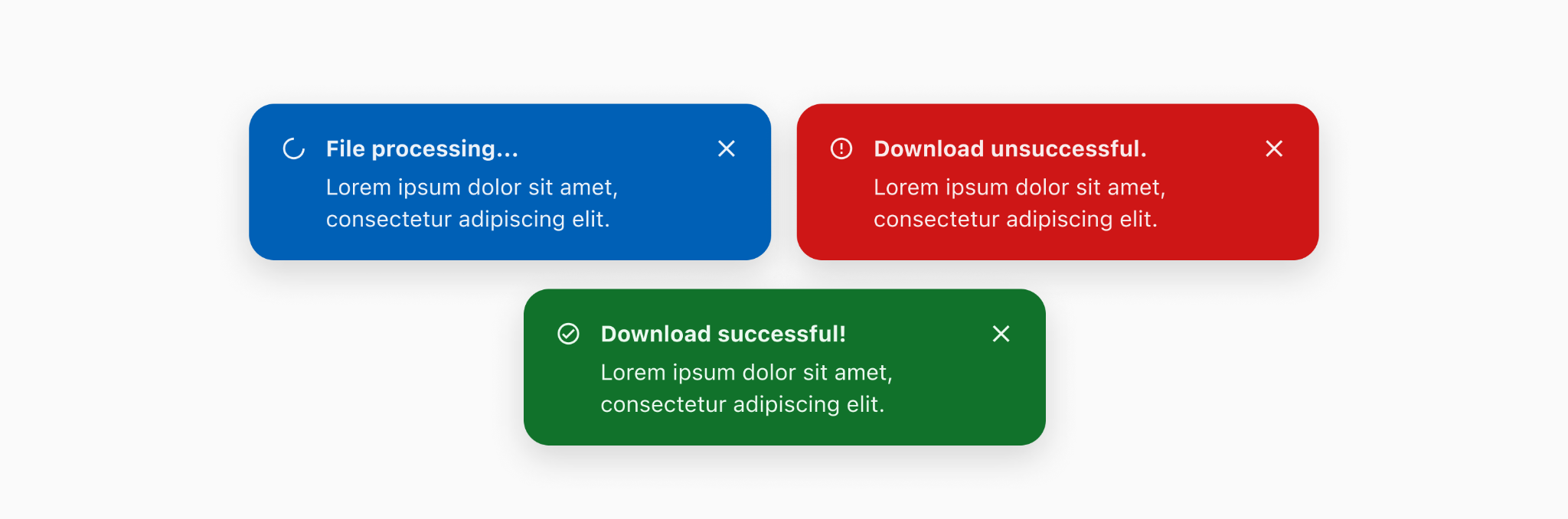
Wide screen toast

When viewed on wide screen devices, the global placement for toast messages will appear on the bottom right of the screen. 


When downloading a file on desktop, a toast message can be used to indicate the stages of the download. 


Behavior

Inline & Toast — Entrance

Inline and Toast notifications share animation styles for Entrance and Exit. The animation is quick and subtle enough to direct the user's attention without being overly distracting.

Interaction Steps Duration Easing Notes Haptics
Entrance 1a. Open ∆motionTimeFast ∆motionEasingStandard Scale component from 96–100%
1b. Fade in ∆motionTimeFast ∆motionEasingStandard The side sheet navigation retracts/closes. Fade opacity from 0-100%


Inline & Toast — Exit

Inline and Toast notifications share the same exit animation style as well. This behavior applies to notifications that are resolved, dismissed, or timed out.

Interaction Steps Duration Easing Notes Haptics
Exit 1a. Scale ∆motionTimeFast ∆motionEasingStandard Scale component from 100-96%
1b. Fade in ∆motionTimeFast ∆motionEasingStandard >Fade opacity from 100-0%


Toast — Timeout

Toast notifications may be set to timeout after 10 seconds. The user may pause this timer by tapping and holding or hovering over the notification.

Interaction Steps Duration Easing Notes Haptics
Timeout 1. Timer scales down 10 seconds ∆motionEasingLinear Timeout notifications take 10 seconds before auto resolving. The timer scales down using the linear curve to represent the constant change in time.


Banner — Entrance

When a banner notification appears it displaces all of the content beneath its surface.

Interaction Steps Duration Easing Notes Haptics
Enter 1. Y Position ∆motionTimeFast ∆motionEasingStandard Move the banner vertically from -56px to 0

Banner — Exit

When a banner notification exits it reverses its entrance animation, resting just off-screen.

Interaction Steps Duration Easing Notes Haptics
Enter 1. Y Position ∆motionTimeFast ∆motionEasingStandard Move the banner vertically from 0 to -56px


Developer Docs

Vue Developer Docs

Component documentation coming soon!