.png)
Tooltip
Tooltip is a raised content block with simple copy used to aid the user in getting more information about a UI element or piece of content in an experience.
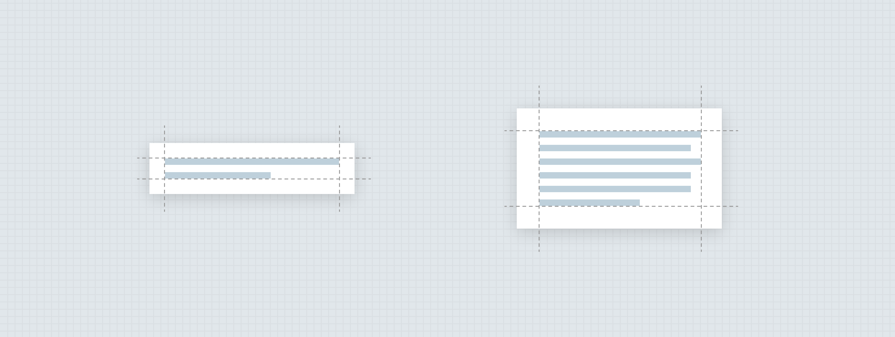
Anatomy
The essential parts of a tooltip are the raised surface and copy contained within the surface. Every tooltip should be short, simple, and to the point; however, sometimes it’s just not possible to keep the copy to a few words. So for this reason, tooltips come in two variants: standard, and large.
Standard tooltip
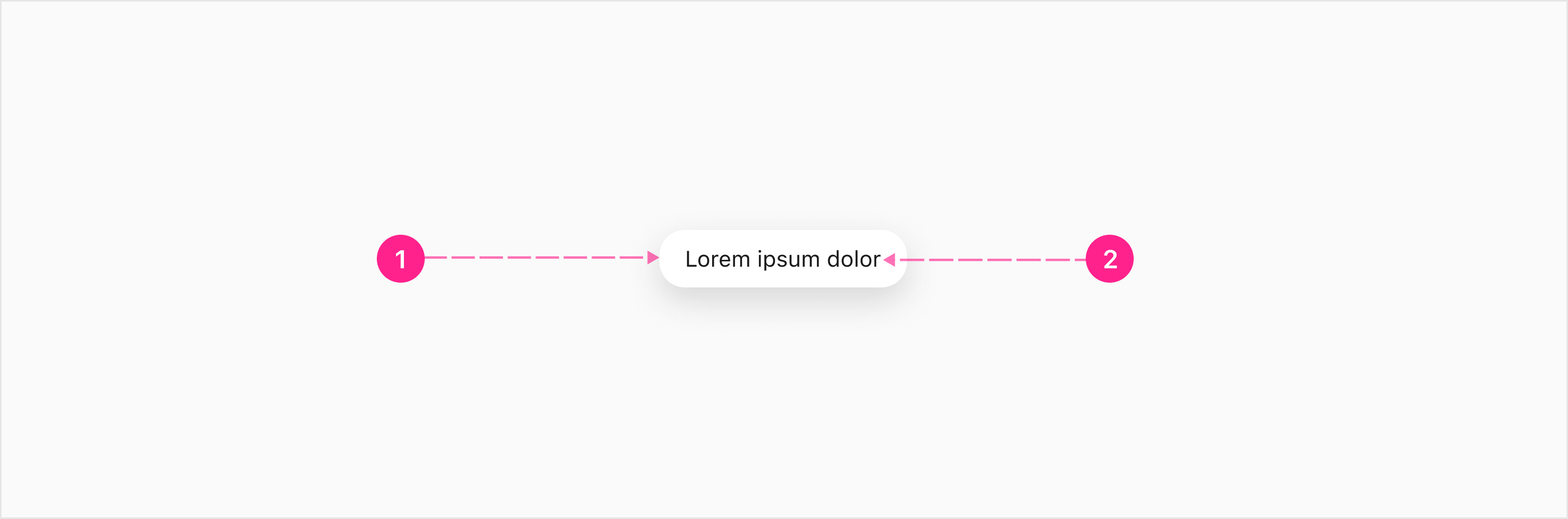
- Raised surface
- Copy — Body 2
Large tooltips
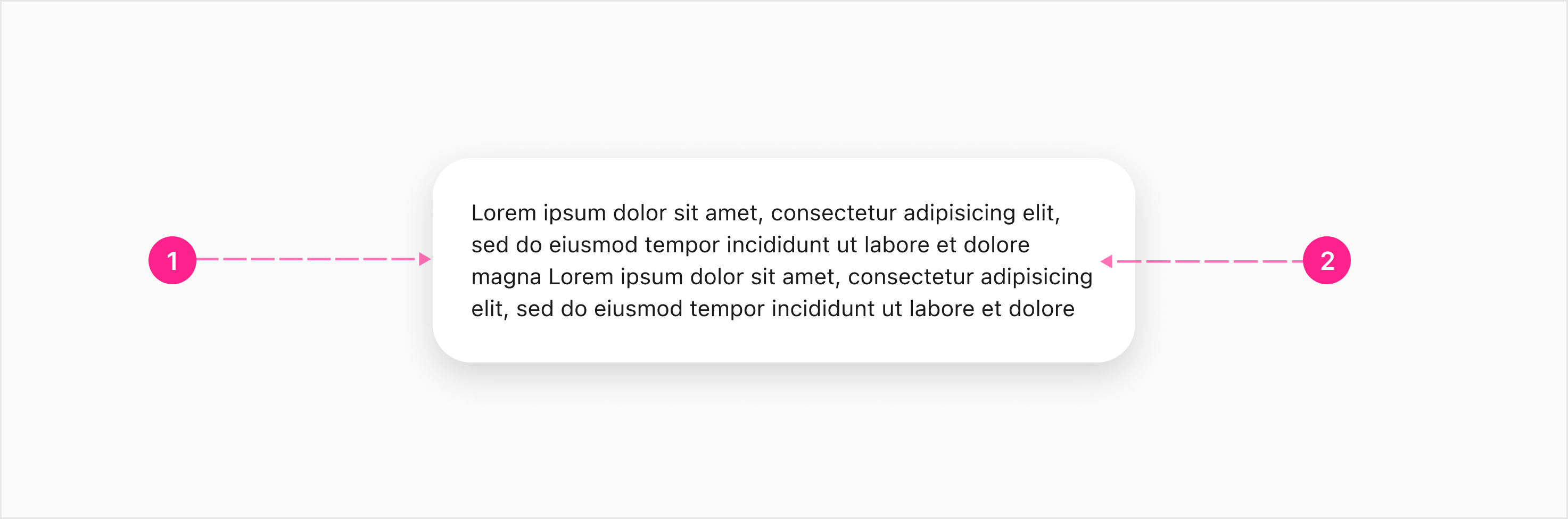
- Raised surface
- Copy — Body 2
Usage
Tooltips are meant to support content and should never get in the way of critical tasks. They provide additional information upon hover, focus, or long press. Always try to keep tooltips as short and simple as possible. Tooltips provide additional surfaces to display information progressively so we can maintain a minimal interface.
When to use
Describing elements or features within the interface.
When not to use
Tooltips should not be used for:
- Displaying rich information and imagery.
- Error messaging or warnings (use Notifications instead)
- Re-stating information already visible in the UI
- Displaying interactive content
Tooltips & Triggers
The tooltip component is triggered by interacting with other components — in most cases the Quick Action Button.


States
There are no state considerations for this component.
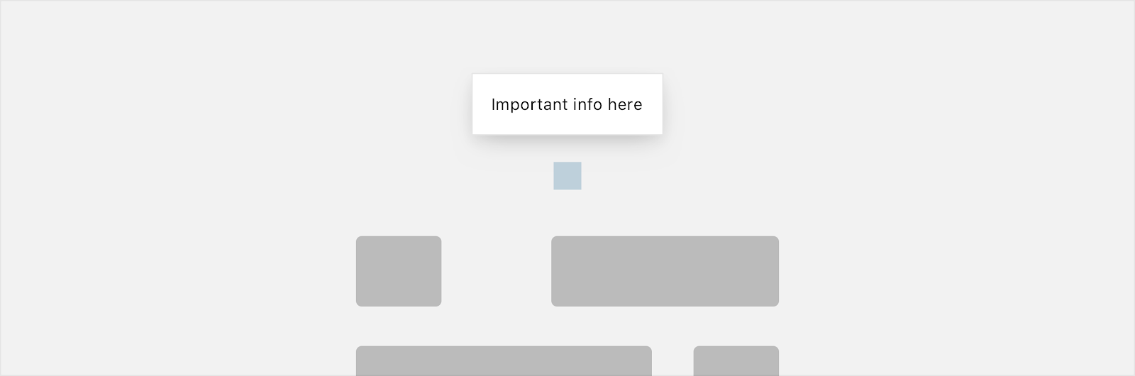
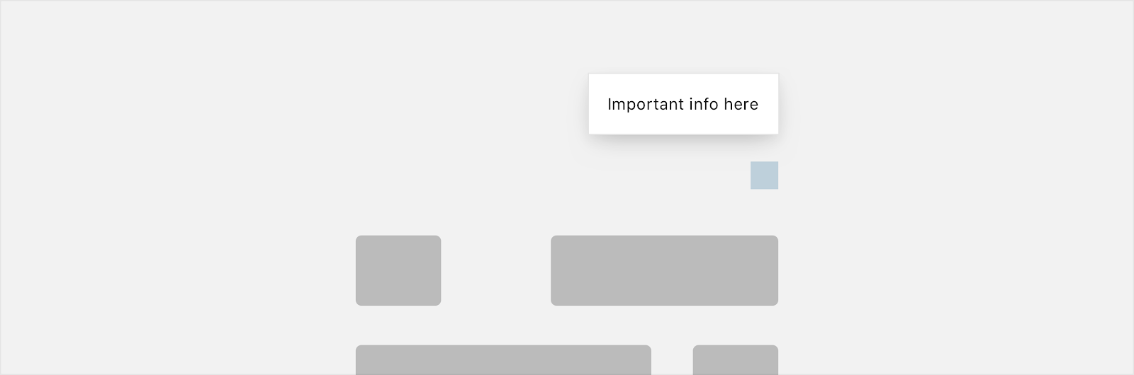
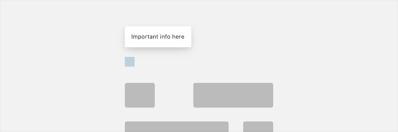
Placement
Tooltips are meant to be used primarily for supplemental details and should appear immediately above the trigger. Ideally, tooltips should be positioned above and centered to the trigger, but if there’s not enough room to display the entire tooltip with this positioning, the tooltip can be either right or left aligned to the trigger. If there is not enough space above the trigger, the tooltip should be placed below the trigger.


Developer Docs
Vue Developer DocsComponent documentation coming soon!