Badge

Done

The badge is an informative supplemental UI element meant to increase the emphasis of another UI element while providing additional information.

Badge

Anatomy

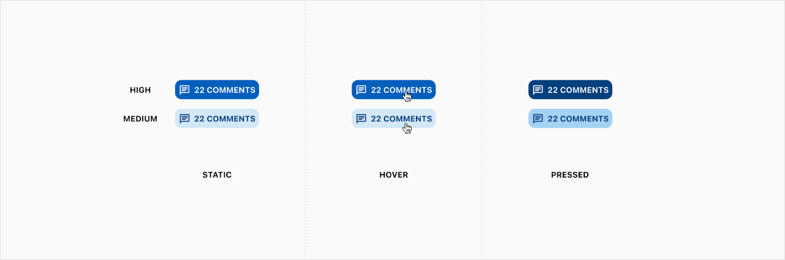
A badge may either be Minimal, Numeric, or Descriptive. Badges also have two levels of emphasis for High and Medium Emphasis except for minimal badges. A badge can be interactive if needed.


External stroke

The external stroke may be turned on to create visual clarity when an appended badge overlaps the attaching object in an unpleasant way. Whenever the optional external stroke is used, its color must be set to match the background color beneath the badge. For the examples below, we show a stroke color that does not match the background color so you can see it, but the stroke should always appear as an “invisible” gap between the badge and the appending object.

Minimal

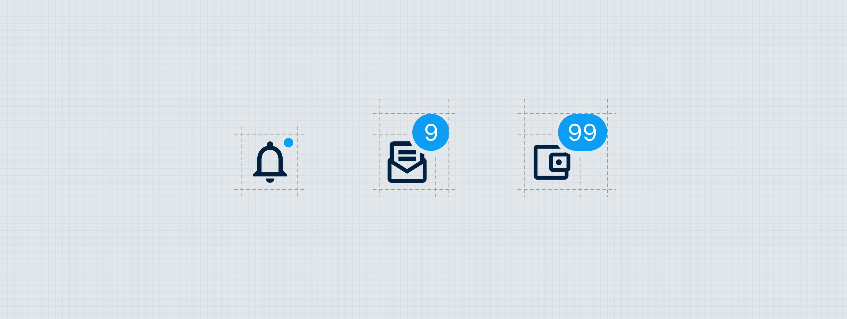
The minimal badge is simply a filled circle that adds emphasis or creates a sense of urgency. This should be used when numeric or descriptive information may be excessive or unnecessary. Whenever the attaching object is 16px or smaller, only a minimal badge may be appended to it.

  1. Container
  2. External 2px stroke (optional)


Numeric

A numeric badge may be used to indicate the number of items that exist under a selection. The max character identifier should be used whenever the numeric value exceeds 3 digits. The max character identifier is a “+” character set in Overline, with the spacing offset to vertically center the glyph.

High Emphasis

  1. Container 
  2. Leading 12px icon (optional)
  3. Label - Overline
  4. Max character identifier - Overline (optional)
  5. External 2px stroke (optional)

Medium Emphasis

  1. Container
  2. Leading 12px icon (optional)
  3. Label - Overline
  4. Max character identifier - Overline (optional)
  5. External 2px stroke (optional)

Descriptive

Descriptive badges may be used to provide supplemental information within a view. These are used to describe the status of an item, often utilizing the branded status messaging colors.

High Emphasis

  1. Container
  2. Leading 16px icon (optional)
  3. Label - Overline
  4. External 2px stroke (optional)

Medium Emphasis

  1. Container
  2. Leading 16px icon (optional)
  3. Label - Overline
  4. External 2px stroke (optional)

Specs

Color - High Emphasis

By default, badges should appear using the branded guidance style. Badges may also utilize any of the following patterns when a branded status message color makes more sense, or variation is needed.

Guidance

Element Property Value
Container Background color ∆colorBrandedGuidance
Leading icon Color ∆colorBrandedGuidanceOn
Label Overline Color ∆colorBrandedGuidanceOn
Max character identifier Color ∆colorBrandedGuidanceOn
External 2px stroke Stroke color Defined at implementation
Container (Hover) Background color ∆colorBrandedGuidanceHover
Leading Icon, Label, Max character indicator (Hover) Color ∆colorBrandedGuidanceHoverOn

Messaging colors 

For all of the following labels, “--” is a stand in for the Success, Caution, Error, and Info notification types. For example, an info notification would take a container background (“∆color--700”) color of ∆colorInfo700


Element Property Value
Container (Info, Error, Success & Bulletin) Background color ∆color--700
Container (Caution) Background color ∆color--300
Leading icon (Info, Error, Success & Bulletin) Color ∆color--50
Leading icon (Caution) Color ∆color--800
Label (Info, Error, Success & Bulletin) Color ∆color--50
Label (Caution) Color ∆color--800
Max character identifier (Info, Error, Success & Bulletin) Color ∆color--50
Max character identifier (Caution) Color ∆color--800
External 2px stroke Stroke color Defined at implementation
Container (Hover - Info, Error, Success & Bulletin) Background color ∆color--800
Container (Hover - Caution) Background color ∆color--400
Leading Icon, Label, Max character indicator (Hover - Info, Error, Success & Bulletin) Color ∆color--50
Leading Icon, Label, Max character indicator (Hover - Caution) Color ∆color--900

Color - Medium Emphasis

Guidance

Element Property Value
Container Background color ∆colorGuidance100
Leading icon Color ∆colorGuidance800
Label Overline Color ∆colorGuidance800
Max character identifier Color ∆colorGuidance800
External 2px stroke Stroke color Defined at implementation
Container (Hover) Background color ∆colorGuidance200
Leading Icon, Label, Max character indicator (Hover) Color ∆colorGuidance800

Messaging colors 

For all of the following labels, “--” is a stand in for the Success, Caution, Error, and Info notification types. For example, an info notification would take a container background (“∆color--100”) color of ∆colorInfo100


Element Property Value
Container Background color ∆color--100
Leading icon Color ∆color--800
Label Overline Color ∆color-800
Max character identifier Color ∆color--800
External 2px stroke Stroke color Defined at implementation
Container (Hover) Background color ∆color--200
Leading Icon, Label, Max character indicator (Hover) Color ∆color--800

Elevation

The badge container should never be displayed as a raised surface. Whenever the badge is appended to another UI element (see Placement below), it should appear on top of the attaching element.  

Spacing - Minimal

Spacing - Numeric

The numeric badge has a minimum width and fixed height of ∆platformSpacingSmall. All content is vertically centered within the container.

Spacing - Descriptive

The numeric badge has a fixed height of ∆platformSpacingBase. All content is vertically centered within the container.

Spacing - Appended badges

When a badge is appended to another UI element, its vertical center should be aligned with the top edge of the attaching element’s container. The badge should be set with ∆platformSpacingNano inset from the right edge.

Shape

Specs - Shape
Element Property Value
Minimal container Border radius ∆platformSpacingTiny
Numeric container Border radius ∆platformSpacingTiny
Descriptive container Border radius ∆platformSpacingTiny

States

There are some instances when badges could be interactive so they would need states.

Theming

No additional theming considerations for this component.

Placement

Badges may either be appended to UI elements or set adjacent to the objects they describe.

Appended

Appended badges are used to add additional emphasis to a particular atom or organism by attaching the badge to the top right corner of the object. Whenever the attaching object is 16px or smaller, you may only append a minimal badge to it.

Adjacent

Badges may be placed in close proximity to the objects they describe. Whenever a descriptive badge appears as a repeated value within a table, it may be placed in its own cell, but always in the same row as the item it describes.

Behavior

Badges have the option to be interactive, and as such should respond to the user's touch with natural movement.

Developer Docs

Vue Developer Docs

Component documentation coming soon!