.png)
Text Fields
Text fields are the primary way users provide input into the system when other input controls (radio buttons, check boxes, sliders, switches, etc.) are not robust enough, or when users need to provide information that the system does not already have.
Anatomy
The essential parts of any text field are the container, focus indicator, label, value, and placeholder. All other elements are optional. Text fields come in 7variants: alpha-numeric, numeric, text area, url, currency, email, password and telephone. Note: Each variant has some unique property or functionality, but each variant can optionally utilize the atoms outlined in the alpha-numeric section.
Alpha-numeric
This is the most commonly used text field, and should always be used for text fields unless there is a specific use-case for one of the other variants covered below. One thing to remember with this text field variant is that when focused on mobile devices, the full soft keyboard will be displayed to the user.
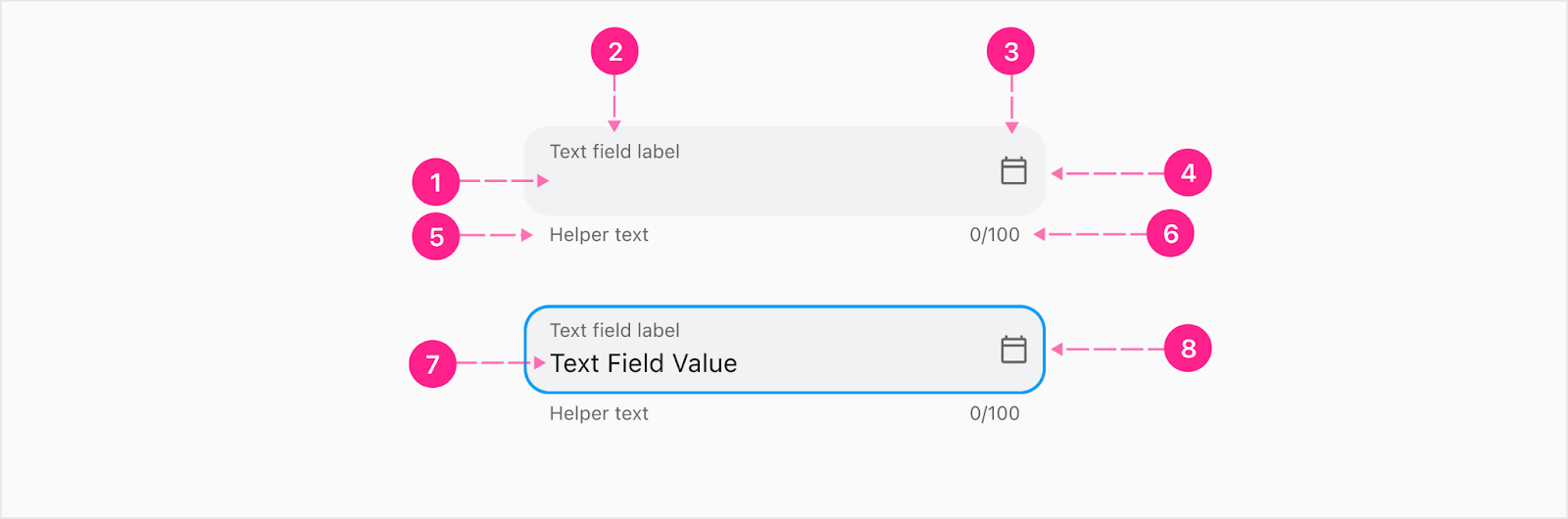
- Empty state of input value
- Input label — Caption
- Trailing icon (optional) - Quick action button
- Surface/container
- Helper text— Caption (optional)
- Character counter — Caption (optional)
- Focus Active indicator
- Input value — Body 1
Numeric
Use this variant when you want the user to input numeric values only. This helps with form validation, but it also provides mobile users with soft keyboards some affordance for what type of information they should be inputting. Mobile users will also appreciate not having to manually switch between alpha and numeric keyboards. Anatomically, everything is the same as the alpha-numeric field. You may also want to consider using the display text field component if this input experience needs to take on a high emphasis placement.
Text area
Similar to the alpha-numeric variant, the text area variant accepts both alpha and numeric values. The unique feature of the text area variant is that values wrap to a new line and do not continue flowing outside the visible bounds of the container. From a visual perspective, an empty text area variant appears exactly the same as the alpha-numeric variant — the magic occurs once the input value needs to wrap to another line.

URL
The URL variant accepts only valid website identification strings, but does not require communication protocols (https://) before the domain or subdomain. It also doesn’t require a forward slash at the end of domain names. Similar to the alpha-numeric variant, the URL variant accepts both alpha and numeric values, but provides visual feedback when the form validation is broken.
Currency
The currency variant is similar to the numeric variant, but automatically places a currency symbol prefix to the input value (default: USD). The decimal will automatically keep all but two digits to the right. As the user types, comma delimiters should automatically be added at the thousandths and millionths place. The idea with automatically adding commas is to prevent the need for the mobile user to manually switch the software keyboard from alpha set to special characters set. Note: The Alkami Platform supports multiple currencies. To switch between currencies, the user can interact with the trailing icon to trigger a bottom sheet with additional currency options. Switching currencies in this way only impacts this particular text field, not the entire user's experience.

- Currency prefix
- Comma delimiter
- Value (all nth places, not just ones)
- Cent amount (optionally automatically placed)
- Currency switcher (optional) - Quick action button
When the text field is defined as an email input, certain validation cases will determine if the user has entered a full email address. Utilizing this specific email variant will also display the email soft keyboard for mobile users. For both Android and iOS users the email soft keyboard prominently features the @ symbol and period to allow users to enter these characters without the need to trigger the shift key to view the entire special character set.
Password
When the password text field is defined, the value is redacted by default. See progress indicator component for the password strength meter.

- Redacted value — Subtitle 1
- Show/hide redacted value trailing icon - Quick action button
- Password strength meter - Progress indicator (optional)
Telephone
When the text field is defined as a telephone number input, certain validation cases will determine if the user has entered a full phone number. Utilizing this specific variant will also display the phone number soft keyboard for mobile users — which arranges the numbers in combination with the applicable alpha touch-tone characters, and displays a shortcut to the pound and star symbols.
Domestic numbers
When inputting domestic (USA) phone numbers, the grouping and characters used to signify the area code, prefix, and line number should automatically be displayed to the user as they type.

- Area code — Subtitle 1
- Prefix — Subtitle 1
- Line number — Subtitle 1
- Trailing icon (used to clear out the value)
International numbers
When inputting international phone numbers, some additional UI is presented to the user so a country can be selected. Auto cleansing and formatting of international numbers follows the E.164 international standard. The selection of the country flag (from the dropdown) will determine the plan-conforming numbers and formatting shown to the user. More details in the Dropdown Documentation. If the flags are not available for the OS or browser, it will just to pull the abbreviation of the country instead.

- Country abbreviation - Body 1
- Country flag — Unicode Standard emoji flags
- Dropdown icon
- Phone number formatted following E.164 standard
- Trailing icon (used to clear out the value) - Quick action button
Leading & trailing icons
Leading icons
Leading icons are used within specific variants as a way to inform the user on what type of information the system is asking for. This is only used at the moment for the international phone number variant.
Trailing icons
Trailing icons should typically only be used if they are providing some action related to the value entered by the user. These icons can take on system status colors (error, caution, success) as a way to provide system feedback to the user.
Examples of when to use trailing icons:
- ‘X’ icon indicating the user can clear out all characters entered with one click
- Eye icon indicating the user can show/hide characters entered for a password
- Arrow icon to see if the characters entered make a unique username
- Arrow icon indicating the user can progress to the next step in a flow
- Date icon indicating a user can click to trigger a date picker instead of manually entering a date
- Info icon indicating a user can get more information about what is needed for that field
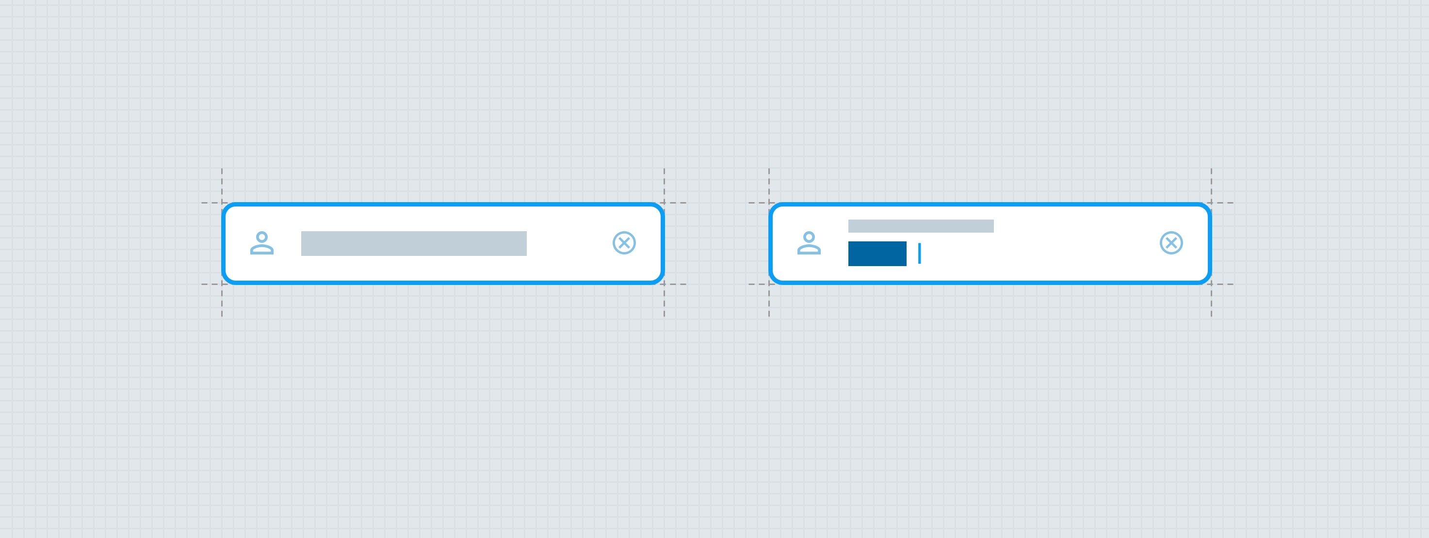
Trailing icons can also be used as a way to communicate system status back to the user based on an input within that field (see graphic below). For example, if a new user types in a username during the registration process, and clicks a trailing icon as a way to check if the username is available, that icon can transform into another icon to provide feedback (loader, green check for confirmed, red x for not available).

Only one trailing icon can be utilized at a time. If there’s a need to display a clear icon (when clicked clears out all the characters entered by the user previously) the icon takes priority and replaces any previously shown icon.
Validation Feedback
The progress indicator can be used as a way to communicate form validation status to the user. One example is when creating a password as a new user. There is a set number of criteria to determine if a new password is strong enough, and as the user types in their new password, the progress indicator can aid in visualizing how strong their entry is compared to the levels of validation set.

Optional Fields
When a text field needs to be optional, “ (optional) ” will be added to the end of the label. When a text field is required, it does not have anything in the label to indicate that so it is assumed that if there are no optional fields, the entire form is required.


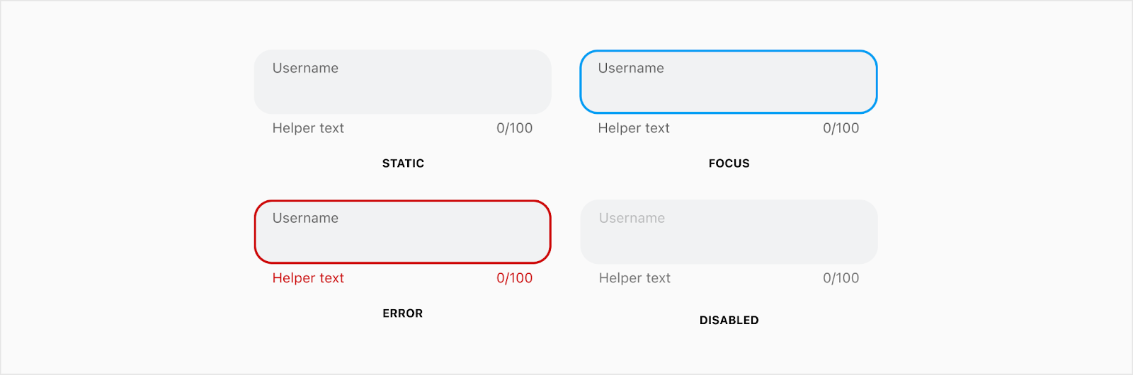
States
The states of the text field are static, focus, error and disabled. The hover state will have a hand cursor when moved on top of the text field.


Placement
Text fields always fill the width of the parent container with a max width of 440px. When the max width is reached, the alignment (centered, left, right) should match the sibling elements contained within the parent container.


Developer Docs
Vue Developer DocsComponent documentation coming soon!