.png)
Button
Buttons provide an affordance for the user to understand an action is possible. With varying levels of emphasis, buttons serve as a call to action.
Anatomy
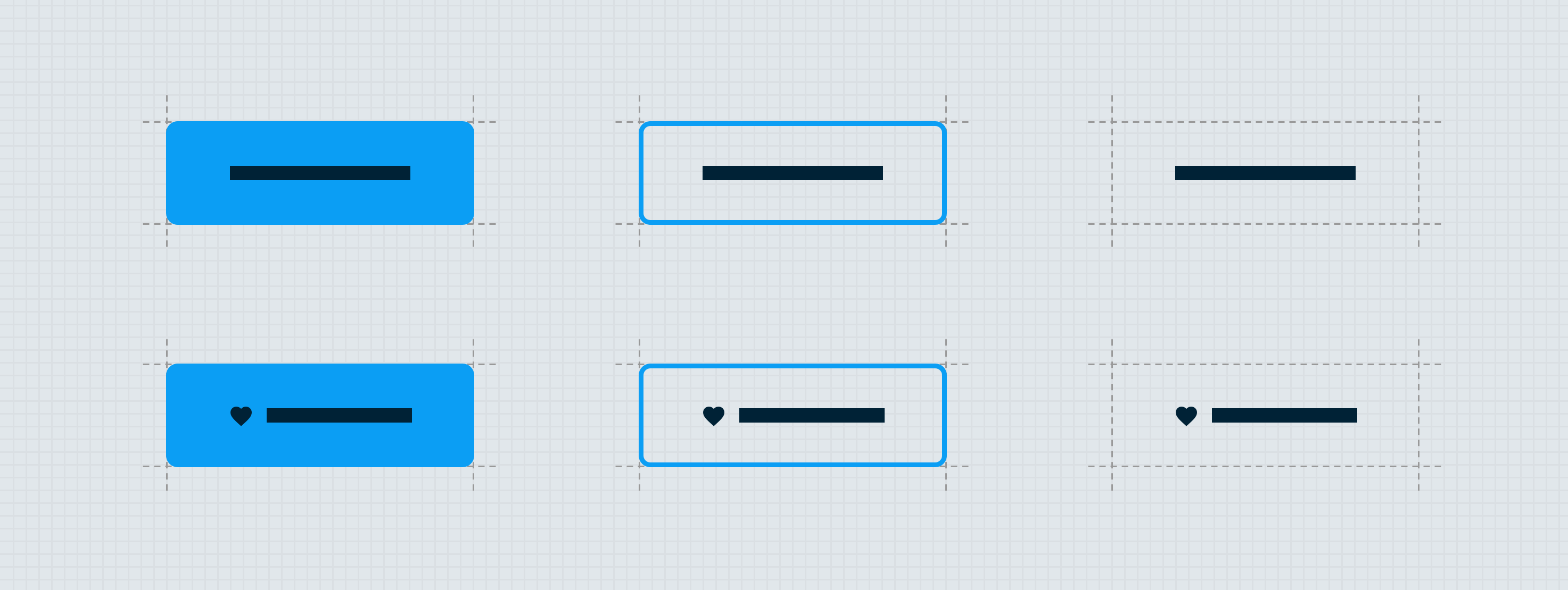
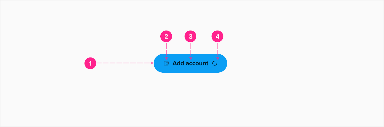
The button component is made up of a surface, label, optional icon, and optional indiscriminate loader — and depending on the needs of the design, comes in three sizes large, medium and small then are in varying levels of emphasis: high emphasis, medium emphasis and low emphasis. In very specific use-cases a compact button can be used when space is limited.
Note: Theoretically two icons can be placed within the button, but in practice only one icon would be shown at a time. The trailing icon is used for showing loading status. When showing the loading status icon, the button text should also change to provide information to the user about the loading status. When this occurs, hide the leading icon.
High emphasis button
Serving as the highest emphasis call to action possible, this level of button should only appear on screen once. The main differentiator for this level of button is the background color is filled and should demand the highest level of attention in the experience.
- Surface/container
- Leading icon (optional)
- Label —
- Large & Medium Button - Subtitle 1
- Small Button - Subtitle 2
- Trailing icon (optional)
Medium emphasis button
Serving as a medium emphasis call to action, this level of button can appear as many times as needed throughout an experience. The main differentiator for this level of button is the transparent background color — and while it still appears as a button providing affordance for the user that an action is possible — the visual treatment allows the button to blend in with the surroundings just enough to not compete with a high emphasis button for immediate attention. Note: Medium emphasis buttons, when appearing on a dark surface, receive a dynamic color treatment (see theming section).

- Surface/container
- Leading icon (optional)
- Label — Button
- Trailing icon (optional)
Low emphasis button
Serving as the lowest emphasis call to action, this level button can appear as many times as needed throughout an experience. The main differentiator for this level of button is the initial lack of treatment to the container. This visual treatment allows the low emphasis button to fully blend into the experience and not compete with any medium or high emphasis buttons present. Note: Low emphasis buttons, when appearing on a dark surface, receive a dynamic color treatment (see theming section).

- Surface/container (transparent)
- Leading icon (optional)
- Label — Button
- Trailing icon (optional)
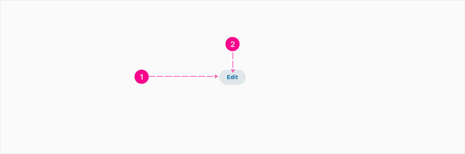
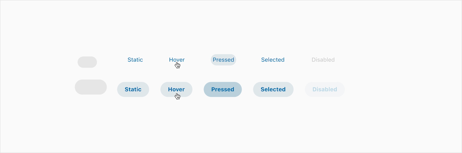
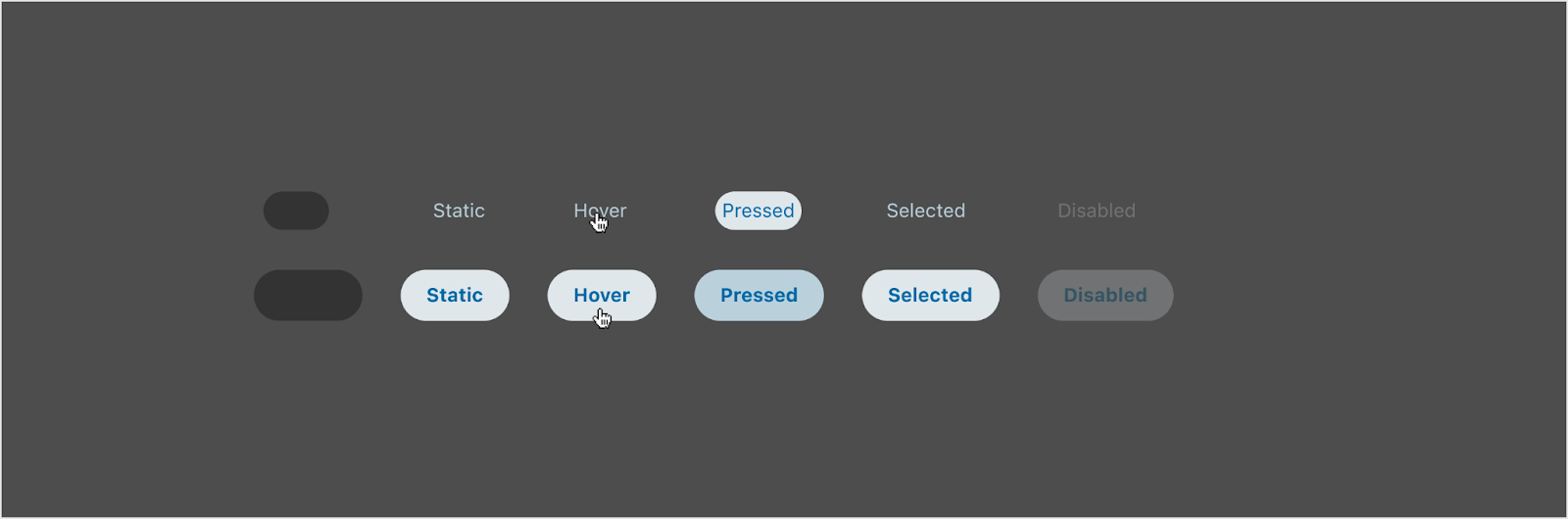
Compact button
When an action is needed to be tucked into a tight spot, a standard size button would just be too big. Fix it to the top corner or vertically align it with a set of other UI elements within a header for a nice little way to clear a form, reset a group of controls, or collapse a section of content.
Medium emphasis
This medium emphasis compact button is used when you need it to stand out a little more than just the low emphasis compact button. Most common placement is the widget heading next to the quick action buttons. Note: The spacing and fonts are different from the low emphasis compact button.
- Surface/container
- Label - 12px Bold
Low emphasis
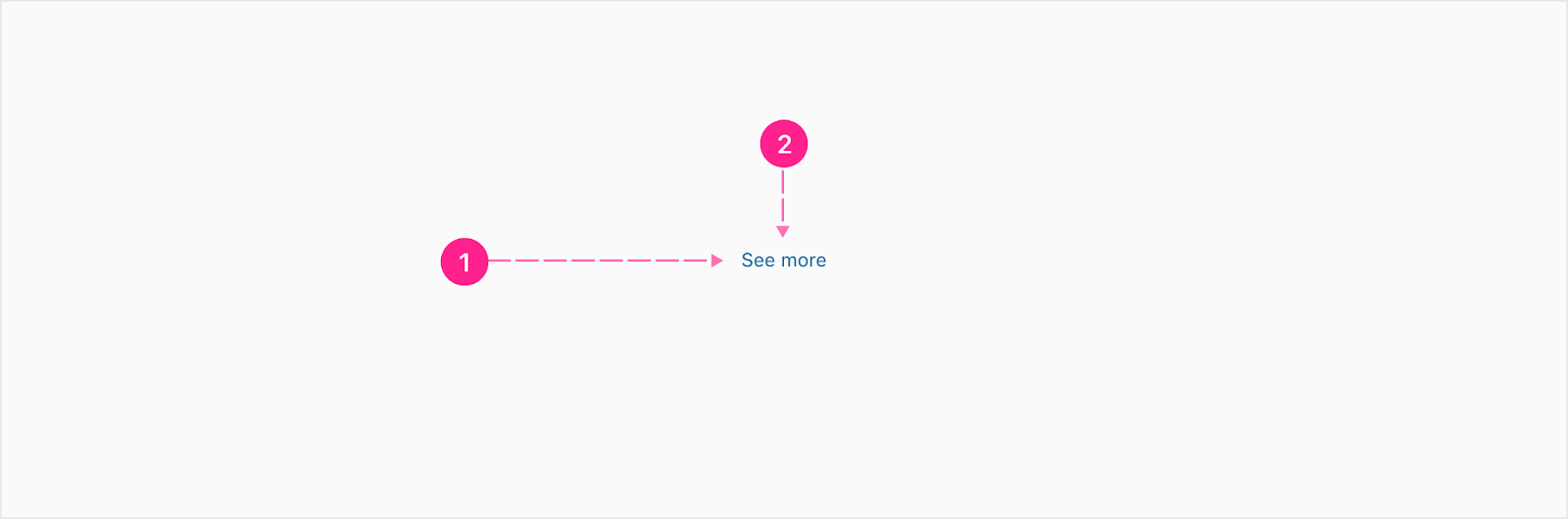
- Surface/container (transparent)
- Label — Caption
Destructive button
A destructive button signals by its appearance that the user should carefully consider whether to continue with their action. An example when using this button is in cases where a user may delete something of value, like their entire account.

- Surface/container
- Leading icon (optional)
- Label —
- Large & Medium Button - Subtitle 1
- Small Button - Subtitle 2
- Trailing icon (optional)
Usage — button copy
As a few general rules of thumb for calls to action:
- Sentence-case capitalization (unless the FI has chosen in Theme Builder to have all-caps button type treatments)
- Use common human language; but full and complete sentences are not necessary
- Begin with a strong action verb
- Provide clear understanding of what interacting with the button will do (If icons are only present on the button without a text label, the icon should universally signify what the button will do if clicked)
- Be as concise as possible — consider keeping text limited to 20 characters or less
- Copy should never wrap to two lines
- Copy should always be centered within the button unless an icon is used


States
Depending on the platform one is designing or developing for (iOS, Android, HTML/CSS), the naming convention for states is wildly different. The following explanations attempt to identify all the major states that buttons could have on the major platforms, but ultimately we will refer to button states using the following terminology: active, disabled, focused, hover, pressed, selected, skeleton and static for experiences on the Alkami Platform.
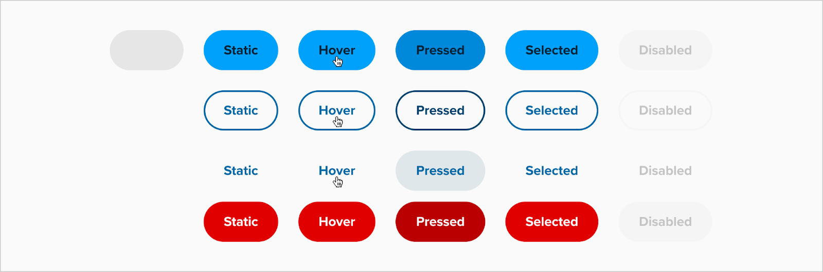
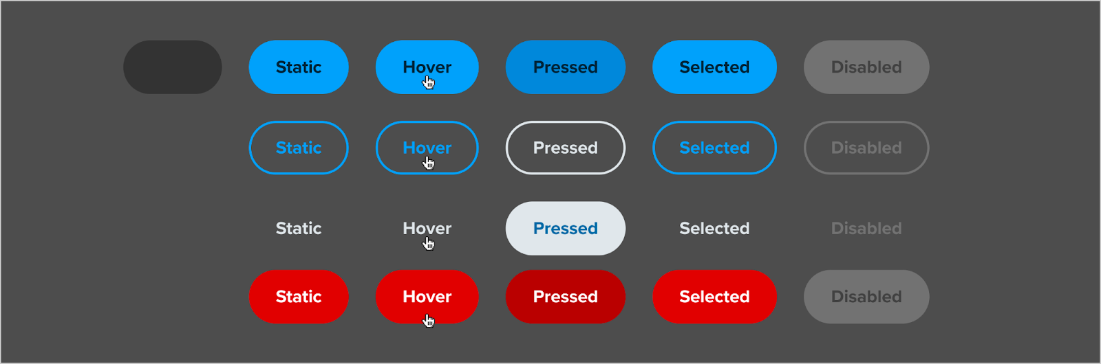
Active/Pressed
Active buttons are the state in which a user is actively pressing the mouse button down, and only applies to mouse users. This state is essentially the same as the pressed state for touch users — which is when a user is actively resting a finger on the button.
Disabled
Disabled buttons are the state in which a user can see a button interaction is possible in some situations, but not for the current situation. As a general rule, it’s best to display disabled buttons when you can provide information to the user on how they can achieve an active button, or unless you want the disabled button to serve as an affordance that a step or process is incomplete and needs additional work to complete the task. In most cases compact buttons should only be used to clear out form groups, reset filters, or otherwise impact user selections within the current view. For this reason, compact buttons should generally not be displayed to the user unless the linked action is readily available.
Focused
The focused state occurs when a keyboard user tabs onto a button, or when a mobile user utilizes the accessibility gestures to target a button (not shown above). The visual treatment of buttons when focused via navigating through the document using the keyboard or mobile OS-level accessibility gestures, is handled by either the OS or the browser, and is not styled in any special way. When interacting with buttons using either a touch or mouse event, the focused state is not applied.
Highlighted
Specific to iOS, the highlighted state is equivalent to the pressed state.
Hover
When mouse users hover over the button with their pointer, the button needs to visually change — indicating an action is imminent if a click event occurs.
Normal
Specific to iOS, the normal state is equivalent to the static state.
Selected
Selected buttons are the state in which a user has already pressed/clicked the button and is awaiting the system to react. This is when a loading icon could be present.
Skeleton
Skeleton states are used when an UI element is present in the experience, but it is taking the system time to dynamically populate the button content and/or destination.
Static
Static buttons are buttons in which a user interaction is possible, but has not yet been acted upon.


Placement
There are two distinct patterns when it comes to the placement of buttons within an experience: F-pattern and Z-pattern.
F-pattern placement
The F-pattern is the natural way to progress through content in an unconstrained container. The user will go through the content line by line, arriving at a call to action at the end.
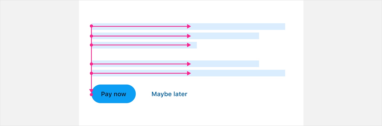
Center aligned
In some instances it makes sense to center align the button if the content and layout call for a centered experience. Only center align content if it’s easily scannable. A good rule of thumb is to ensure copy does not wrap to more than two lines. Once copy becomes a paragraph of information, center aligning makes it difficult for the human eye to successfully track between line breaks.
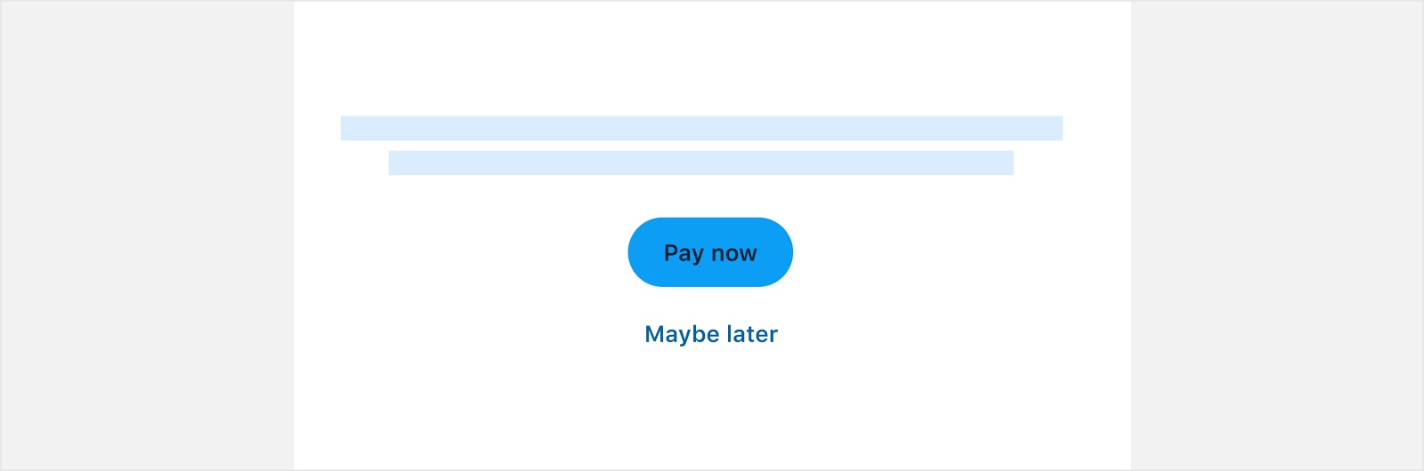
Mobile vs widescreen
In mobile experiences, layouts are often designed in single columns, and the button should span the full width of the screen unless intentionally designed to be responsive to the button label (see notification component as an example).


Developer Docs
Vue Developer DocsComponent documentation coming soon!