Checkbox

Done

The checkbox is a multi-select UI control. A checkbox may either be Large or Small. Checkboxes should only be used when the user may select one or more options within a list, or as a way to acknowledge disclosures. Due to their small tap targets, checkboxes should not be used in mobile experiences whenever possible. In general, a cloaked checkmark is better suited for touch experiences.
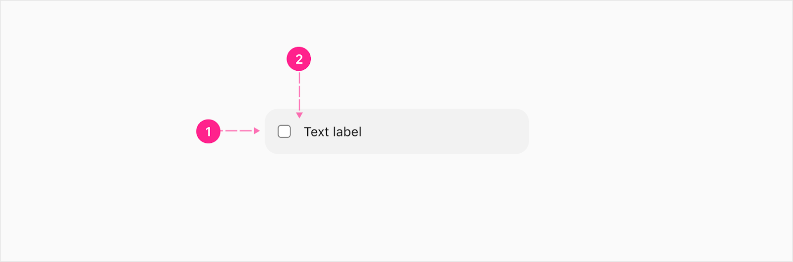
Checkbox

Anatomy

Label

The checkbox input with the label next to it is the default. 

  1. Checkbox input
  2. Label - Body 1 or Caption (Optional)

Slot

The checkbox input with a slot next to it lets the input be attached to anything. What is inside the slot is determined by the design.

  1. Checkbox input
  2. Slot (optional)

Size

Checkboxes may either be Large or Small depending on the use case. The Large variant utilizes our Body 1 type style, so it is preferable in most use cases. The Small version may be used when the Caption type style and smaller imprint is preferable. 

  1. Checkbox input
  2. Label - Body 1 (Optional)
  1. Checkbox input
  2. Label - Caption (Optional)
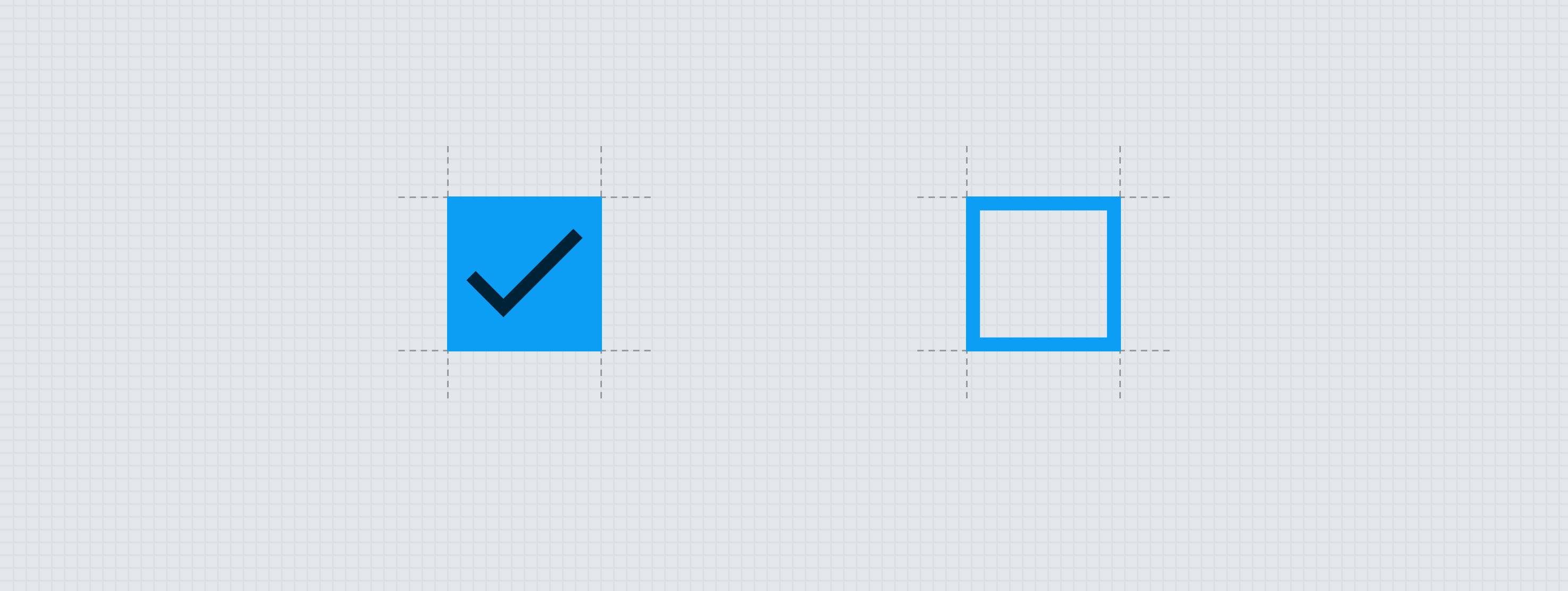
Checkbox input

The checkbox input displays the current status of the input. The checkbox input is made of two atoms:

  1. Surface
  2. Icon

Container

For mobile, it makes sense to have a bigger hit space for the radio button. The radio button will be housed in a container to give it more of a native look but also allow the user to be able to select easier.

  1. Container
  2. Checkbox - Label or Slot Variant

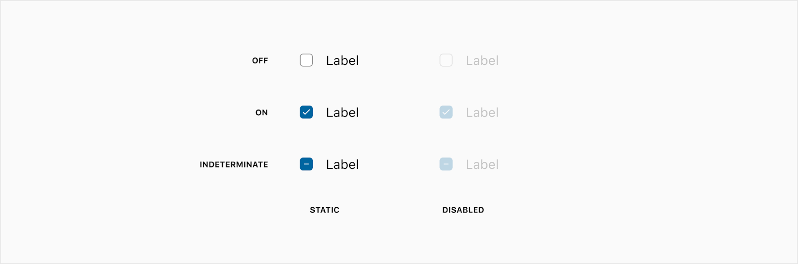
A checkbox input may either be Off, On, or Indeterminate. For each of these statuses, the icon shown within the input will vary. The colors of the checkbox input will change based on the state of the checkbox (see States below). The size and treatment of the icon will also change depending on the Checkbox size and state. The indeterminate state is for a parent child relationship when grouped together. If 2 out of 3 children are selected in a group, the group title will have an indeterminate state to show not all children have been selected.

Specs

Color

Element Property Value
Label Text color ∆colorPlatformGray900
Checkbox input (off) Background color ∆colorPlatformWhite
Checkbox input (off) Border color ∆colorPlatformGray600
Checkbox input (on or indeterminate) Background color ∆colorBrandedAffordanceAccessible
Checkbox input icon Icon color ∆colorPlatformWhite
Checkbox input (off disabled) Border Alpha ∆colorPlatformGray600
∆colorPlatformAlpha400
Checkbox input (on disabled) Background Alpha ∆colorBrandedAffordanceAccessible
∆colorPlatformAlpha400
Checkbox input (on disabled) Icon Alpha ∆colorPlatformWhite
∆colorPlatformAlpha400
Checkbox label (disabled) Icon Alpha ∆colorPlatform900
∆colorPlatformAlpha400

Elevation

No elevation considerations needed for this component.

Spacing

Wrapping

States

Theming

Shape

Element Property Radius
Sharp Shape 0px
Soft Shape 2px
Squircle Shape 4px
Rounded Shape 4px


Placement

Checkboxes should always be left-aligned within their parent containers. When a checkbox appears without a label, it may be positioned as needed. When a group of checkboxes appear under a parent checkbox, the children should be left-aligned to the keyline created by the parent checkbox’s label.


Behavior

The checkbox is an interactive component. The following selection animations help make a user’s experience with the checkbox responsive and delightful. While these selection transitions utilize timing and animation to exaggerate their effect, the hover and pressed state changes should be immediate so the experience doesn’t feel sluggish.

On

The On and Indeterminate statuses utilize similar animation patterns to create a consistent sense of timing. 

Interaction Steps Duration Easing Notes Haptics
On 1a. Checkbox input state update ∆motionTimeExtraFast ∆motionTimingFunctionStandard The states transition using the tokens described above. Light on trigger (Flutter: Selection Click)
  1b. Icon draws on ∆motionTimeExtraFast ∆motionTimingFunctionStandard The icon draws on following the animation above.  

Off

The off animations use similar timings with subtle differences in the icon animation to create a sense of progression while keeping the overall pace of feedback consistent. 

Interaction Steps Duration Easing Notes Haptics
Off 1a. Checkbox input state update ∆motionTimeExtraFast ∆motionTimingFunctionStandard The states transition using the tokens described above.  
  1b. Icon draws off ∆motionTimeExtraFast ∆motionTimingFunctionStandard The icon draws off following the animation above.  

Icon update

When a checkbox changes status from On to Indeterminate or vice versa, the icon animations should be offset in time so they don’t overlap.

Interaction Steps Duration Easing Notes Haptics
Update 1. Icon draws off ∆motionTimeExtraFast ∆motionTimingFunctionStandard The current icon draws off following the animation above.  
  2. Icon draws on ∆motionTimeExtraFast ∆motionTimingFunctionStandard The new icon draws on following the animation above.  

Developer Docs

Vue Developer Docs

Component documentation coming soon!