Switch

Done

The switch component is a simple control that provides a way for the user to toggle between two options. The switch can be used within forms, but is more frequently used as a way to turn features (or entire feature sets) on or off.

Switch

Anatomy

Switch

The essential parts of a switch are the container (or the rail) and the handlebar. Note: The switch can be accessible and will show an on/off indicator if accessibility is turned on for their device.
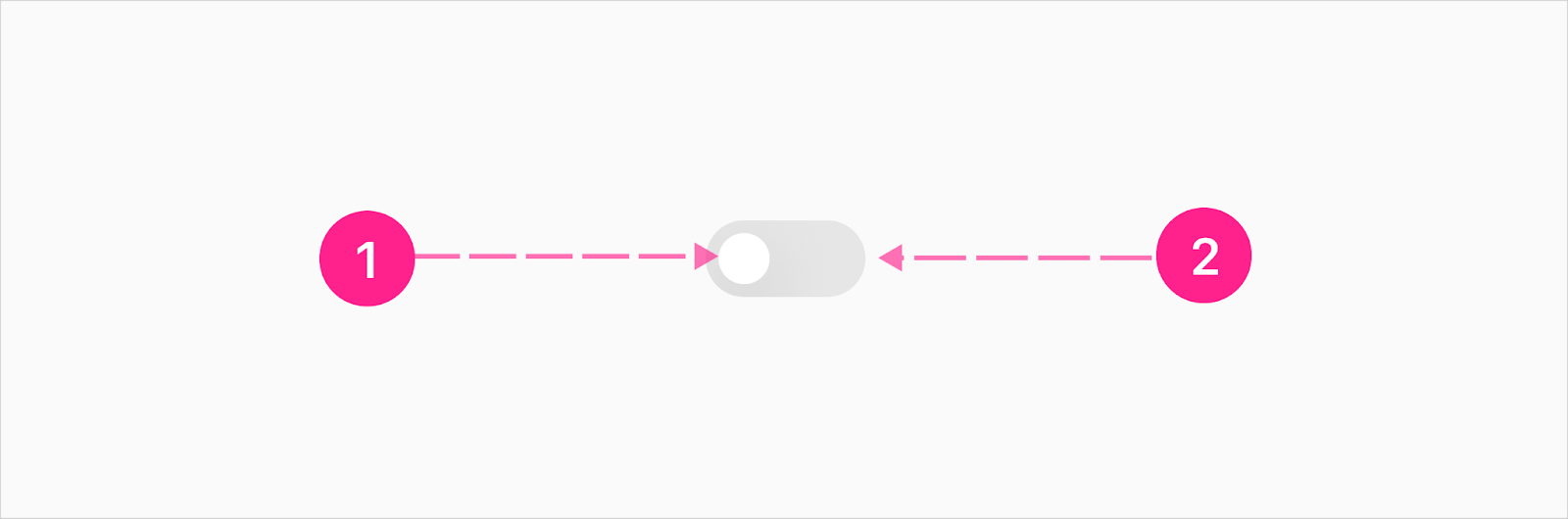

  1. Knob (16px)
  2. Rail (50px)

Slot Switch

A switch with a slot next to it, on either the left or right, lets the switch be attached to anything and allows the entire section to be clickable to activate the switch. What is inside the slot is determined by the design.
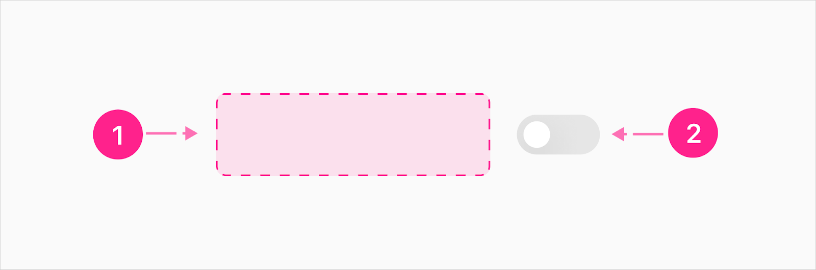
  1. Slot
  2. Switch

Accessibility Concerns

The accessible switch is for users that have turned on accessibility settings on their device, and the platform supports it. Currently only iOS is known to support this.  
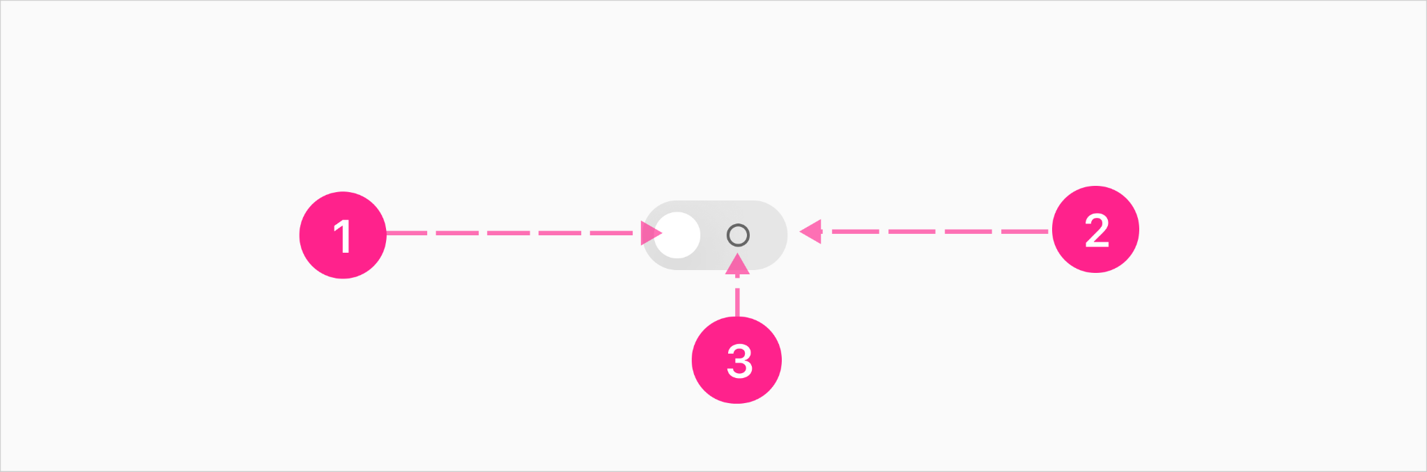
  1. Knob (16px)
  2. Rail (50px)
  3. On/off indicator (8px) (iOS only)

Specs

Color

Element Property Value
Knob (Static/Inactive) Background color ∆colorPlatformWhite
Rail (Static/Inactive) Background color ∆colorPlatformGray100
On/off indicator (accessible variant) (Static/Inactive) Border color ∆colorPlatformGray600
On/off indicator (accessible variant) (Static) Background color ∆colorPlatformAlpha0
Knob (Static/Inactive disabled) Background color with alpha ∆colorPlatformGray100 ∆colorPlatformAlpha400
Rail (Static/Inactive disabled) Background color with alpha ∆colorPlatformGray100 ∆colorPlatformAlpha400
On/off indicator (accessible variant) (Static/Inactive disabled) Background color ∆colorPlatformGray600
Knob (On) Background color ∆colorPlatformWhite
Rail (On) Background color ∆colorBrandedAffordanceAccessible
On/off indicator (accessible variant) (On) Background color ∆colorPlatformWhite
Knob (Selected disabled) Background color with alpha ∆colorPlatformWhite ∆colorPlatformAlpha400
Rail (Selected disabled) Background color with alpha ∆colorBrandedAffordanceAccessible
∆colorPlatformAlpha400
On/off indicator (accessible variant) (Selected disabled) Background color with alpha ∆colorPlatformWhite
∆colorPlatformAlpha400
Loader Background color ∆colorAffordance300

Elevation

No elevation considered for the switch component.

Spacing


States

Theming

Shape

Note: shape is a selection made by the FI within Theme Builder (sharp, soft, round, squircle), and the radius is based on the size of the component. The switch component is considered to be a small component.

Element Property Value
Rail Border radius ∆shapeBrandedSmall
Knob Border radius ∆shapeBrandedSmall

Placement

Generally a switch can be used as a form input or as a way to turn a featureset on or off, and should follow the placement/alignment of any sibling content. As an example, when placed within a form, the switch should be left aligned if the other form elements are left aligned, centered if the other form elements are centered, or right aligned if the other form elements are right aligned. If the switch appears in a list where other list items have labels left aligned and controls right aligned, the switch should maintain the pattern and be right aligned. Ultimately the switch doesn’t have any placement and/or alignment opinions, and should be controlled by the parent container.

Behavior

When toggling a switch, the related action should occur immediately; changes should take effect right when the user interacts with the switch without the need to interact with a save or submit button. Any changes resulting from interacting with the switch should persist until the user flips the switch again.  

Select

Interaction Steps Duration Easing Notes Haptics
Selected state 1a. X position ∆motionTimeExtraFast ∆motionTimingFunctionStandard Move the knob horizontally from 0px to 52px Selection click
Rail transition 1b. State fade ∆motionTimeExtraFast ∆motionTimingFunctionStandard Fade rail color token into selected state  

Select —Accessibility Indicator

Interaction Steps Duration Easing Notes Haptics
Selected state 1a. X position ∆motionTimeExtraFast ∆motionTimingFunctionStandard Move the knob horizontally from 0px to 52px  
Off indicator 1b. X position ∆motionTimeExtraFast ∆motionTimingFunctionStandard Move the indicator horizontally from 0px to 24px  
  1c. Fade out ∆motionTimeExtraFast ∆motionTimingFunctionStandard Fade opacity from 100–0%  
On indicator 1d. X position ∆motionTimeFast ∆motionTimingFunctionStandard Move the indicator horizontally from -24 to 0px  
  1e. Fade in ∆motionTimeFast ∆motionTimingFunctionStandard Fade opacity from 0–100%  

Deselect

Interaction Steps Duration Easing Notes Haptics
Deselect 1a. X position ∆motionTimeExtraFast ∆motionTimingFunctionStandard Move the knob horizontally from 52px to 0px Selection click
Rail transition 1b. State fade ∆motionTimeExtraFast ∆motionTimingFunctionStandard Fade rail color token into inactive state  

Deselect — Accessibility Indicator

Interaction Steps Duration Easing Notes Haptics
Selected state 1a. X position ∆motionTimeExtraFast ∆motionTimingFunctionStandard Move the knob horizontally from 52px to 0px  
On indicator 1b. X position ∆motionTimeExtraFast ∆motionTimingFunctionStandard Move the indicator horizontally from 0px to -24px  
  1c. Fade out ∆motionTimeExtraFast ∆motionTimingFunctionStandard Fade opacity from 100–0%  
Off indicator 1d. X position ∆motionTimeFast ∆motionTimingFunctionStandard Move the indicator horizontally from 24 to 0px  
  1e. Fade in ∆motionTimeFast ∆motionTimingFunctionStandard Fade opacity from 0–100%  


Loading — Indeterminate 

Interaction Steps Duration Easing Notes Haptics
Knob transition 1a. X position ∆motionTimeExtraFast ∆motionTimingFunctionStandard Move the knob horizontally from 0px to 52px  
Off indicator 1b. X position ∆motionTimeExtraFast ∆motionTimingFunctionStandard Move the indicator horizontally from 0px to 24px  
  1c. Fade out ∆motionTimeExtraFast ∆motionTimingFunctionStandard Fade opacity from 100–0%  
On indicator 1d. X position ∆motionTimeFast ∆motionTimingFunctionStandard Move the indicator horizontally from -24 to 0px  
  1e. Fade in ∆motionTimeFast ∆motionTimingFunctionStandard Fade opacity from 0–100%  

Loading Complete — Indeterminate 

After the loading is complete the selected static switch will be enabled.

Interaction Steps Duration Easing Notes Haptics
Selected state 1. State transition ∆motionTimeNano ∆motionTimingFunctionStandard Fade all parameters to selected state  

Developer Docs

Vue Developer Docs

Component documentation coming soon!