.png)
Mobile Top Bar
The mobile top bar serves as a guide for users to orient themselves from one view to another. The mobile top bar houses the back stack navigation, current view headings, and, depending on the variant, global or contextual activities. The mobile top bar is a part of the mobile chrome.
Anatomy
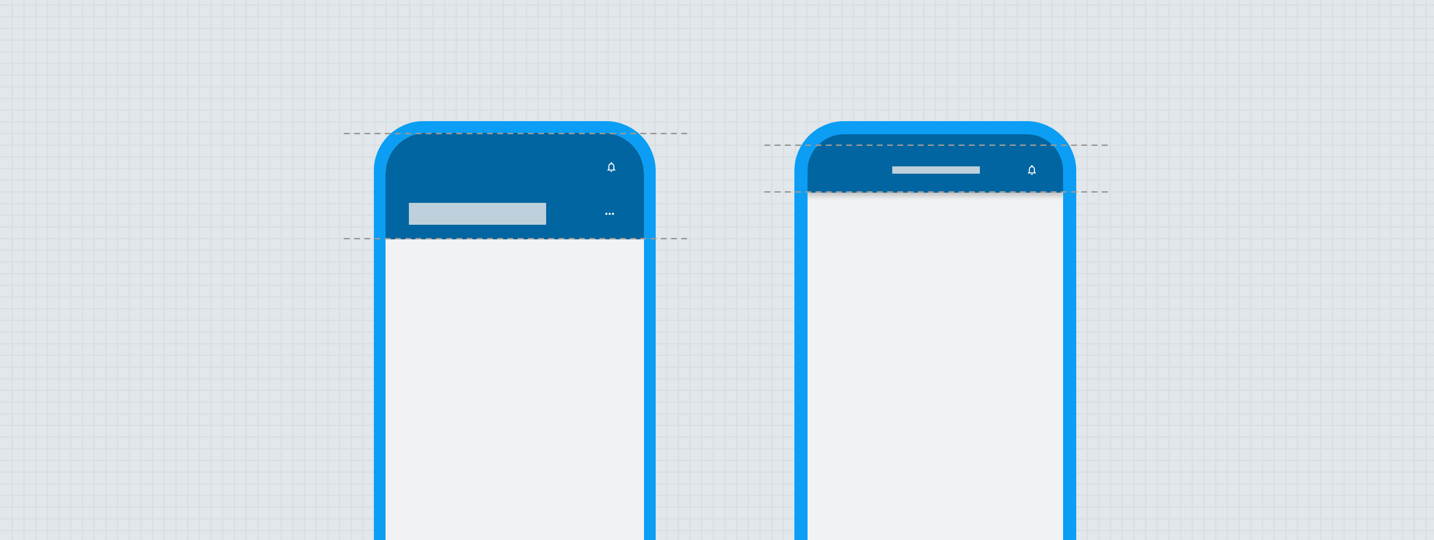
The mobile top bar has two variants: Primary and Secondary. The top bar variant is pinned, meaning it never leaves the view, elevating itself over other content within the view.
Primary
High Emphasis
High emphasis primary mobile top bar is used for high traffic main widget pages and will be defined by design for which pages will utilize it.
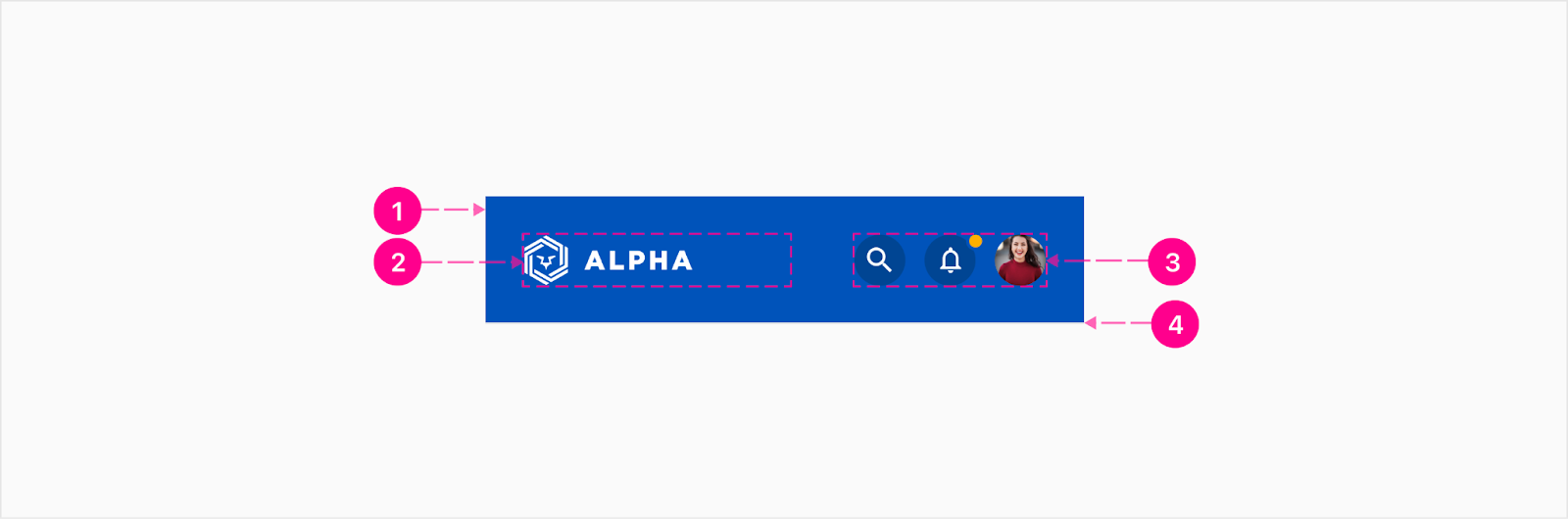
- Container
- Logo container
- Quick action button group — Embedded medium emphasis small quick action buttons (Optional)
- Divider (Optional)
Medium Emphasis
Primary top bars only identify the primary landing screen of a bucket or widget view within the shortcut bar.
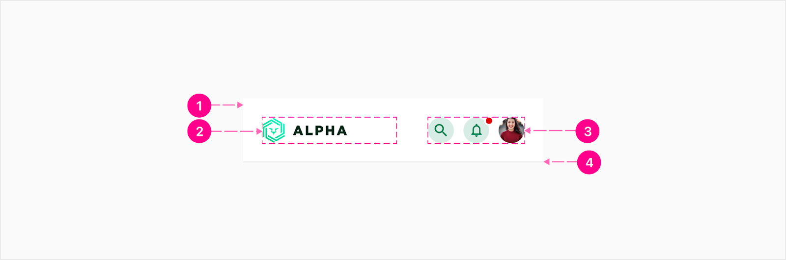
- Container
- Logo container
- Quick action button group — Embedded medium emphasis small quick action buttons (Optional)
- Divider (Optional)
Logo container

The logo container gives the FI an opportunity to present their branding prominently on key landing views within the experience. The logo asset should be anchored to the left center of the container and set to fill the container vertically or horizontally, whichever happens first. The logo asset should maintain its original proportions. The vertical height of this container is set to match the height of the small quick action buttons (32).
Primary quick action button group

The primary top bar may display up to three quick action buttons. These actions should prioritize global features such as notifications, profile management, or a global search experience.
Secondary
Secondary top bar guides the user through workflows, subviews, and contexts that are not the primary landing page of a bucket or widget.
High Emphasis
High emphasis secondary mobile top bar is used within high traffic workflows and will be defined by design for which pages will utilize it.
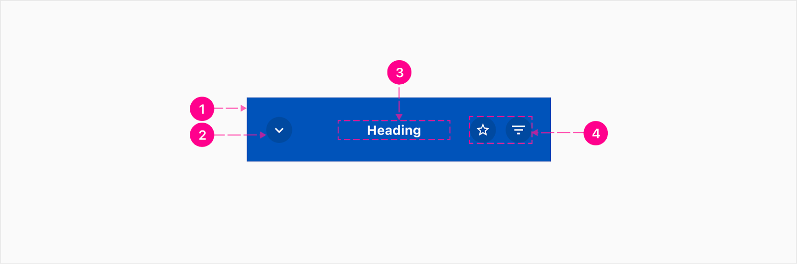
- Container
- Backstack quick action button — Embedded medium emphasis small quick action button (Optional)
- Heading — Subtitle 1 (Optional)
- Quick action button group — Embedded medium emphasis xsmall quick action buttons (Optional)
Medium Emphasis
Medium emphasis secondary mobile top bar is used within subviews or review screens.
- Container
- Backstack quick action button — Embedded medium emphasis small quick action button (Optional)
- Heading — Subtitle 1 (Optional)
- Quick action button group — Embedded medium emphasis xsmall quick action buttons (Optional)
- Divider (Optional)
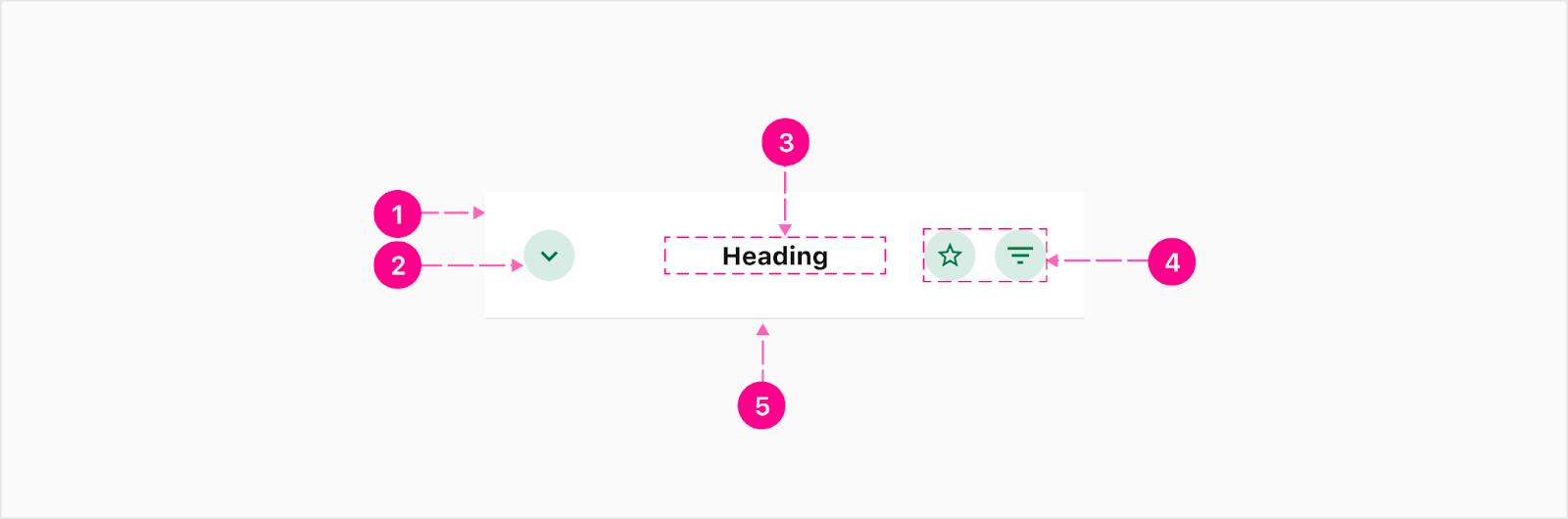
Backstack quick action button
The backstack quick action button should include a caret icon reflecting the direction of backwards movement within the platform. This quick action button should always utilize the guidance color variant. This action should always return the user to the context they previously navigated away from.
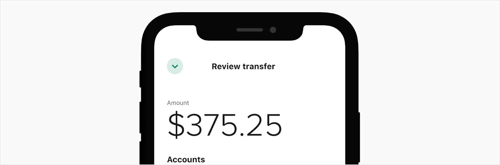
The icon should be set to a downwards caret when the subview is an expanded or a raised context.

The icon should be set to a leftwards caret when the subview is a drill-in view.
Secondary quick action button group
The quick action button group in the secondary is reserved only for contextually relevant tasks. For example, a user might need a quick action button for searching or filtering within a view. This group may display up to two quick action buttons. The rightmost action may be replaced with a menu dropdown trigger quick action button which will open a partial bottom sheet.

Secondary heading

The secondary heading should be as short as possible to avoid truncation. The heading should be truncated with an ellipses as the text exceeds one line.


States
There are no states considerations for this component.
Placement
All mobile top bars should appear at the top of the experience and should be covered by more elevated contexts, including: interstitial experiences, low and medium emphasis webviews, or views that appear on elevated contexts (such as expanded cards or bottom sheets).


Developer Docs
Vue Developer DocsComponent documentation coming soon!