.png)
Switchboard
Switchboard is used when there is a need to offer the user the ability to switch between different types of content or between views.
Anatomy
Tabs
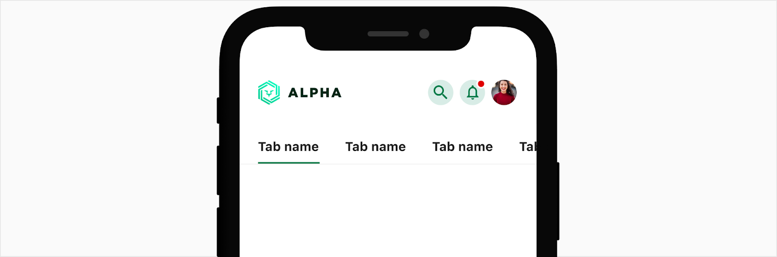
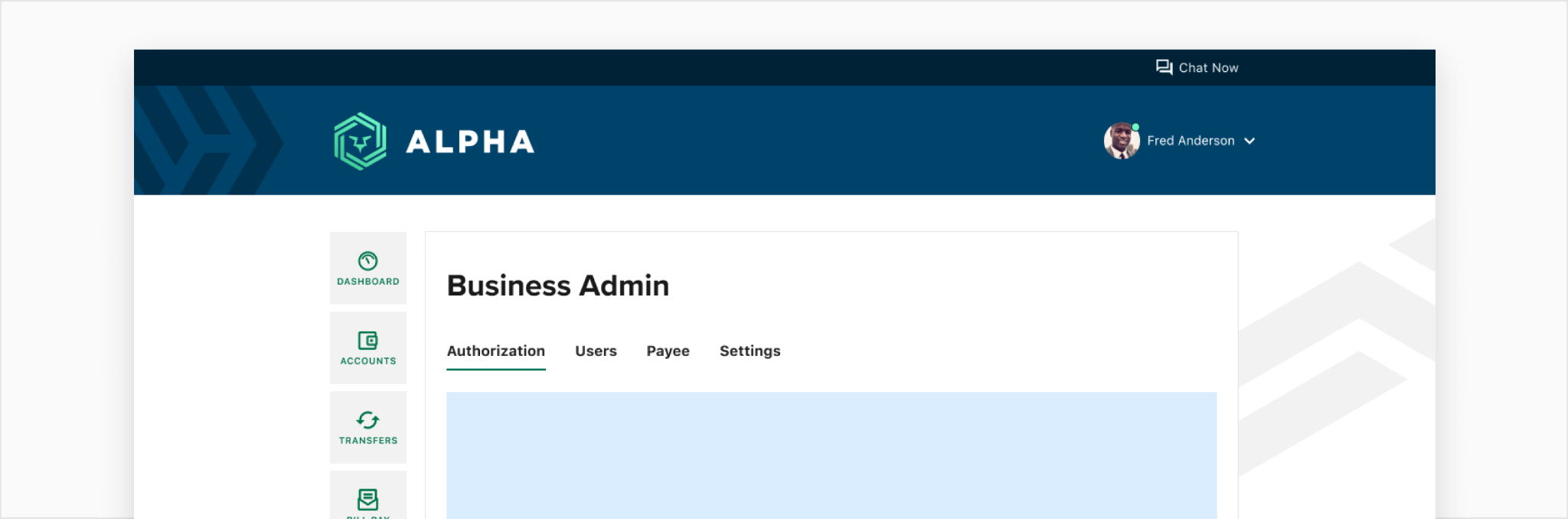
Tabs are used to organize content for a section across multiple pages to separate out the content into more digestible sections. Tabs can be used for desktop and mobile devices but should be used on native mobile as a last resort. Each tab will follow one after another with the active indicator.
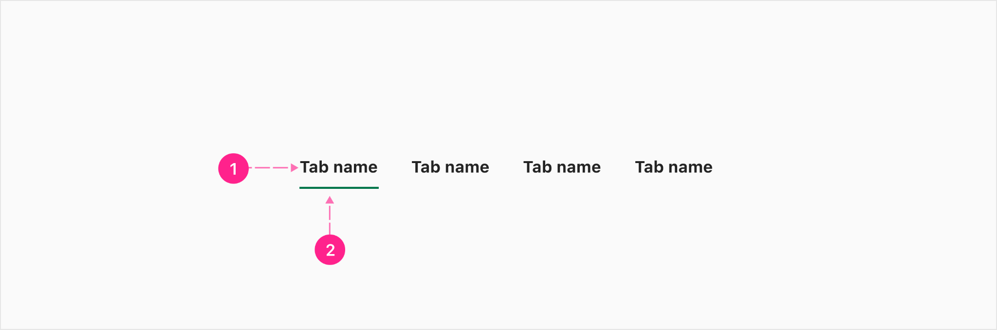
- Text label - Subtitle 1
- Tab indicator - 2px
Grouped tabs (Mobile)
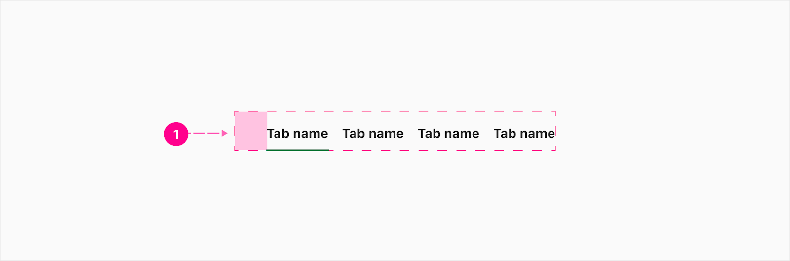
To ensure the tabs align with the heading and mobile margin, a leading alignment spacer is necessary.

- Leading alignment spacer - 24px (optional)
Grouped tabs (Desktop)
To ensure the tabs align with the heading and desktop margin, a leading alignment spacer is necessary.
- Leading alignment spacer - 40px (optional)
Switchboard
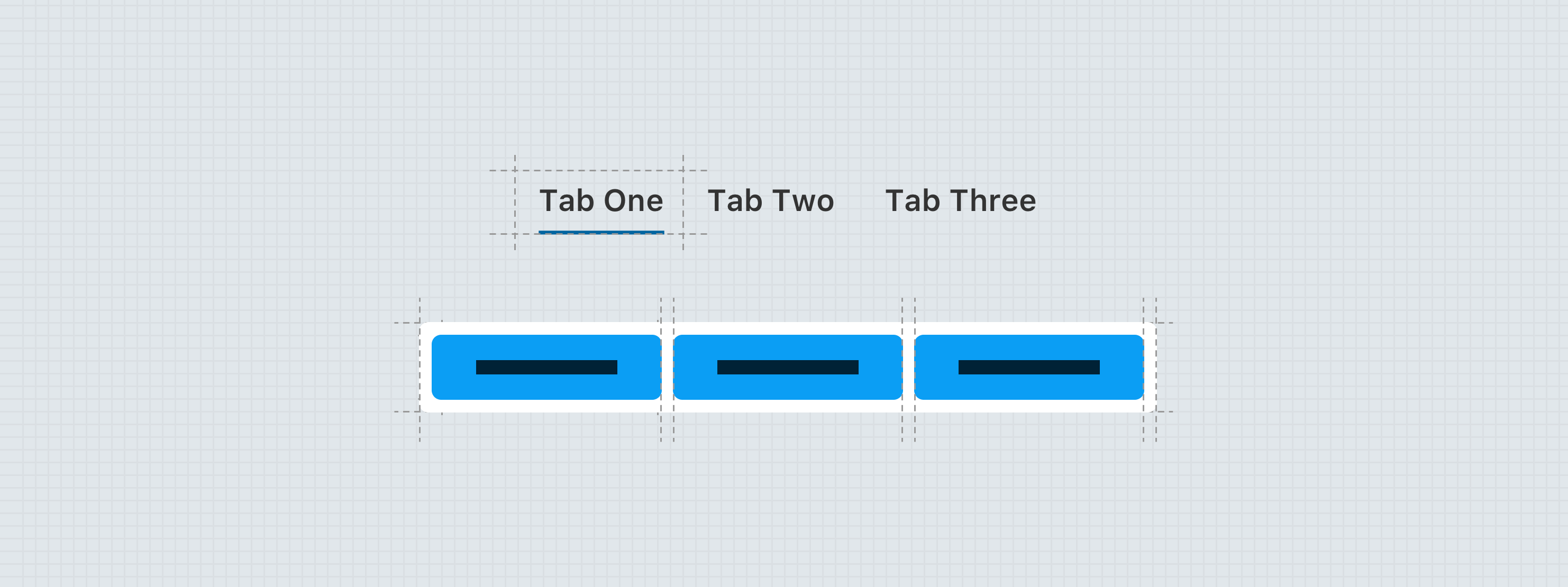
Switchboard has two sizes, large and small with two variants for each size: alpha/numeric and icon only. The small switchboard is recommended to take the place of tabs on mobile devices when possible. The overall height for the large variant is 48px and 40px for the small variant.
Large Alpha/numeric
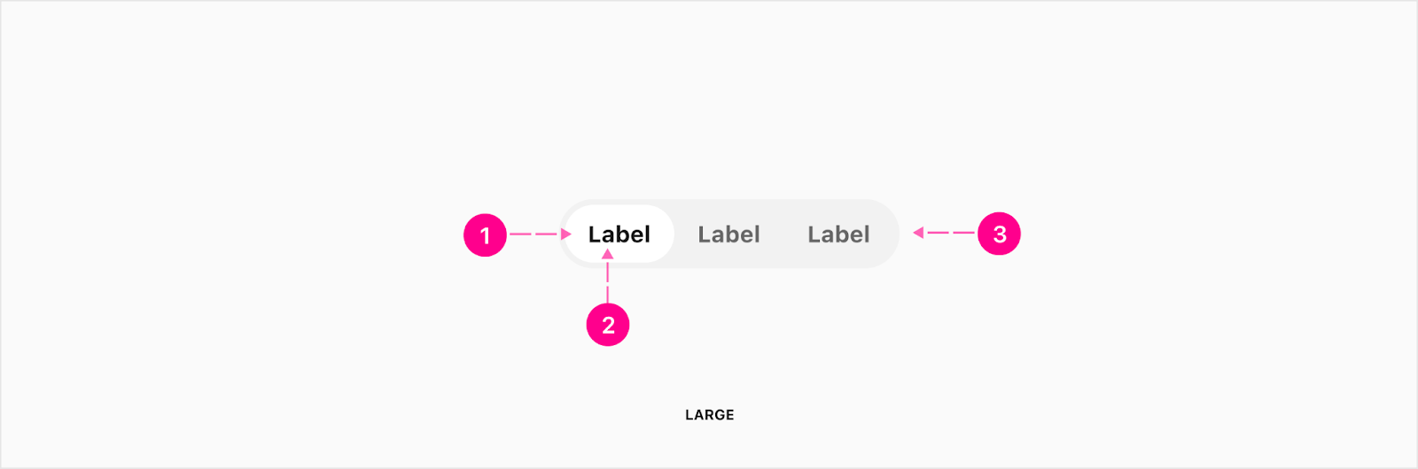
- Selected surface/container
- Text label - Subtitle 1
- Surface/container
Small Alpha/numeric
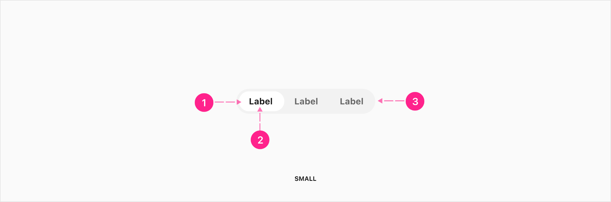
- Selected surface/container
- Text label - Subtitle 2
- Surface/container
Large icon only

- Selected surface/container
- Icon - Medium avatar 40
- Surface/container
Small icon only

- Selected surface/container
- Icon - Small avatar 32
- Surface/container


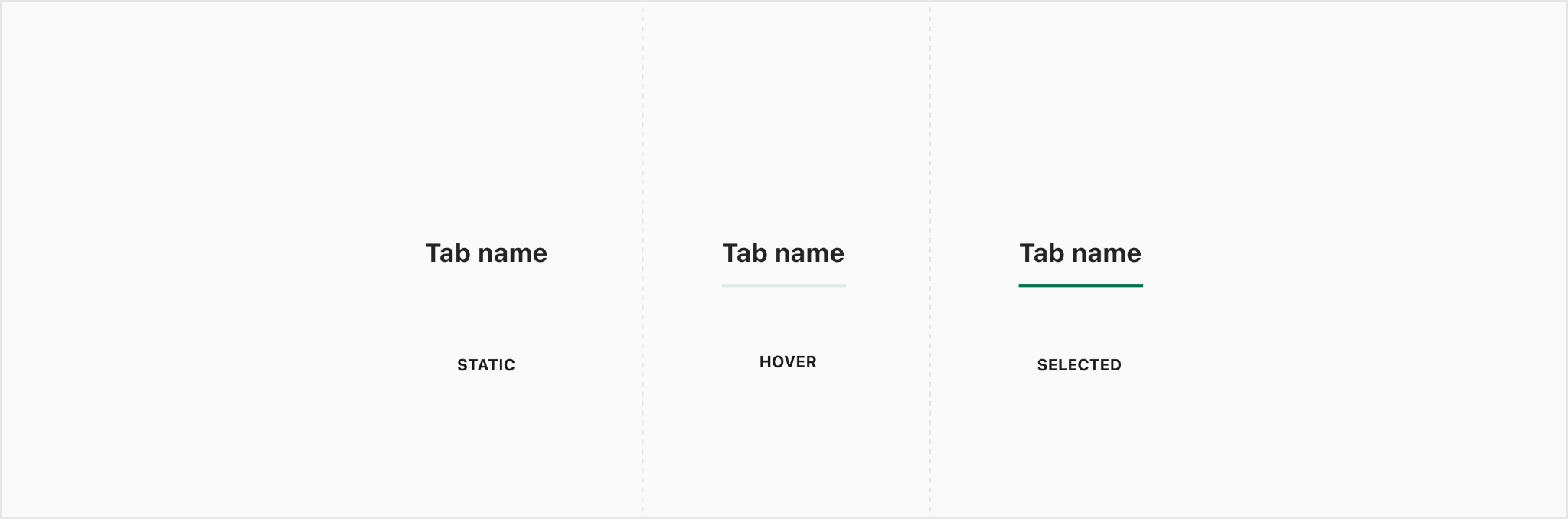
States


Placement
Tabs
Tabs are always placed below the heading title because they are subsections of the main page. This placement applies to mobile and desktop. Tabs can either be auto width or full width placement.
Auto width
Auto width tabs are where the tabs can run off the screen to accommodate as many tabs as needed. The indicator will span the width of the text label.

Full width
Full width tabs are when you have less than enough space to fit inside the container with the tabs not going off the screen. Once you have more than can fit, it will switch to auto width tabs. The indicator will span the width of the tab container.

Full width title wrapping
When the title becomes too long, it will wrap to another line. It is recommended to use the auto width tabs if you know the tab title will be too long, which will allow it to stay on one line.

Page scrolling
When scrolling on mobile, the tabs will be pinned underneath the mobile top header.
Desktop
Toggle
Toggles can either be auto width or full width placement.
Auto width
Auto width toggles are where they are not confined to a container and will be aligned with the rest of the content in the area, reinforcing the overall alignment framework of the context. In most cases, this will mean that toggle should be left-aligned so as to reinforce the primary keyline.

Full width
Auto width toggles will fill the width of the container they are in. These will often be used for mobile to replace the need for tabs on a mobile experience.


.gif)
Developer Docs
Vue Developer DocsComponent documentation coming soon!